MedixScan
Neharika Sidda
See it On Campus: Level 2
Visitor Info.
MedixScan
Making Over-the-counter Drugs Comprehensive & Accessible.
.
What is MedixScan?
MedixScan is a mobile application created to provide easy access to drug facts labels (DFLs) for over-the-counter (OTC) medications. Created through participatory UX processes and maintaining a strong focus on user-centric design principles, MedixScan aims to empower users to make informed decisions about their medication usage by delivering clear, concise, and accessible drug information right at their fingertips.
MedixScan exists to:
∘∘∘
Encourage Safe Usage of OTC Medications
Misuse of Over-the-Counter (OTC) medications is a prevalent problem arising due to misconceptions about the ‘risk-free’ nature of OTC drugs.
MedixScan aims to empower users to make safe, informed decisions about their medication purchases and usages.
∘∘∘
Bridge Communication Gaps
There exsits a flow of communication between; healthcare professionals, pharmacists, and patients regarding the purchase and usage of OTC drugs.
MedixScan can play an important role in helping facilitate these interactions and bridge the gaps currently in exsistence.
∘∘∘
Create a Supplemental Digital Solution
Years of research and iteration have gone into the design of the current Drug Facts Table (DFT).
MedixScan is not a redesign, it is introduced as a digital solution to supplement the current state of the DFT, by making use of design research and participatory design methodologies.
How does MedixScan Work?
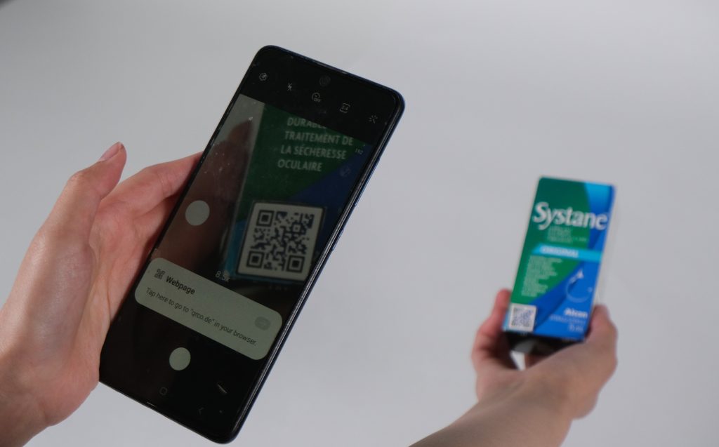
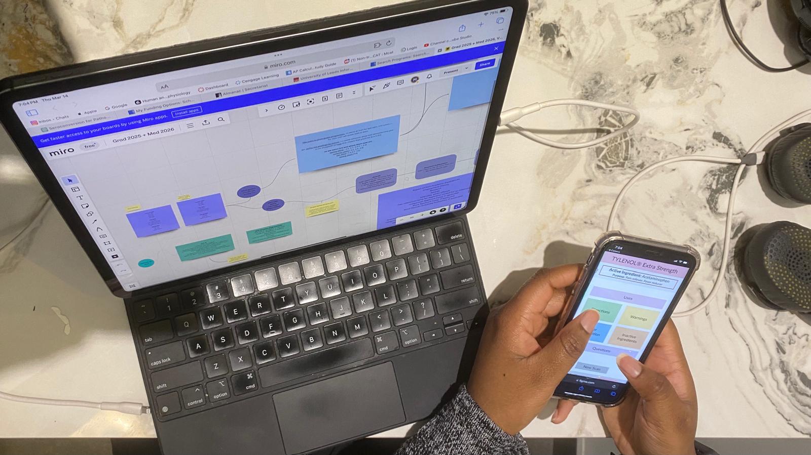
MedixScan is designed as a reliable and user-friendly interface where individuals can quickly retrieve essential information about OTC drugs, including; active ingredients, dosage instructions, warnings, and usage precautions. MedixScan is built into a mobile interface and with the help of quick-response (QR) codes scanned from OTC drug packaging, streamlines the process of accessing drug facts labels.
MedixScan in application – At home (OTC drug usage):
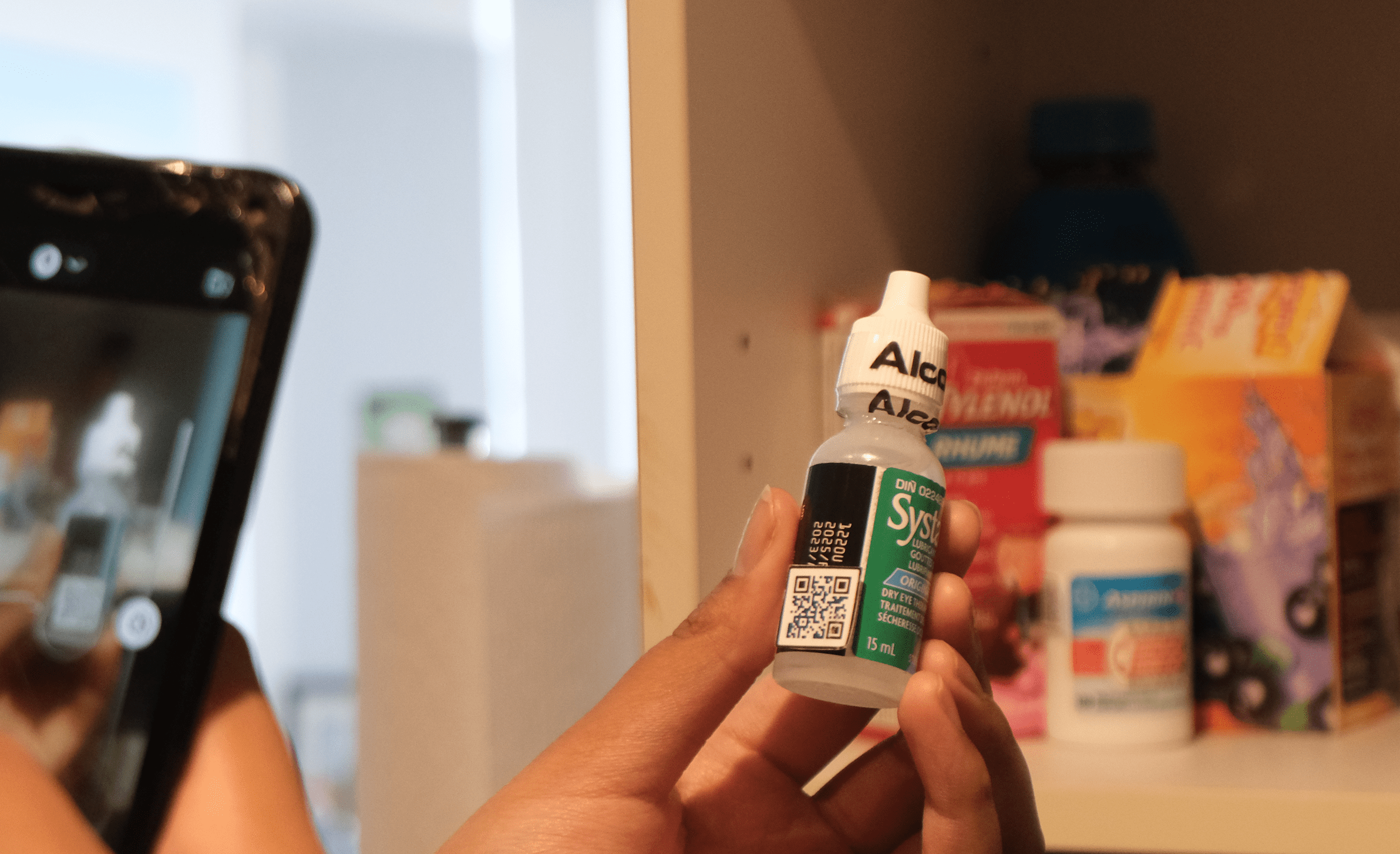
◘ QR code is present on physical bottles so access to the DFT isn’t lost upon unpackaging.
◘ re-checking Drug Facts
◘ logging expiration dates
◘ cross-referencing medical details
MedixScan in application – In pharmacies/drug stores (OTC drug purchasing):
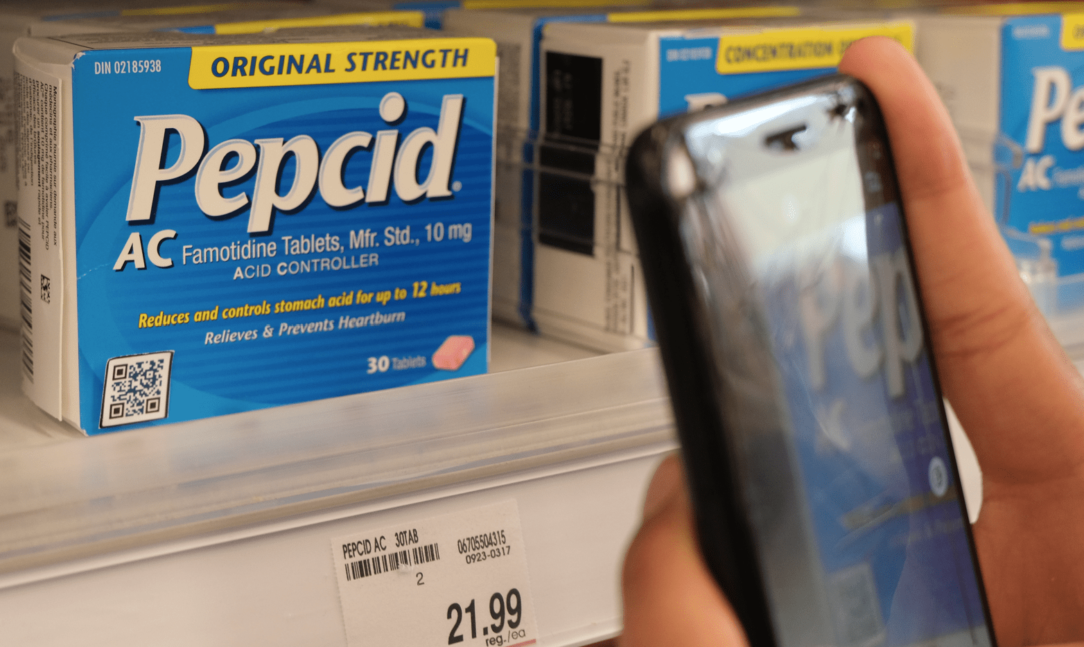
◘ accessing Drug Facts quickly
◘ easily viewing information in English or French.
Why is MedixScan important?
MedixScan replaces and/or supplements the need to read small print on packaging or search through websites to correctly and effectively administer OTC drugs.
→ The process below shows the full scope of the project and the research & design phases that came together to bring MedixScan to life.
Throughout my project I will be using acronyms, some are commonly used, others may not be.
Below is a a short glossary to refer back to if any of the acronyms used are unfamiliar.
◖ACRONYM
◖ OTC
◖ DFL
◖ DFT
◖ CDFT
◖ FDA
◗ MEANING
◗ Over-the-counter: Products with active ingredients that can be purchased without a prescription
◗ Drug Facts Label: a required label for over-the-counter products containing regulatory information.
◗ Drug Facts Table: the same as a Drug Facts Label, this term is more commonly used in Canada.
◗ Canadian Drug Facts Table: the official name for governmentally issued Drug Facts Tables.
◗ The United States Food and Drug Administration: created the DFL regulations that Canada follows.
The Problem
Misuse of Over-the-Counter (OTC) medications is a prevalent problem arising due to misconceptions about the seemingly risk-free nature of OTC drugs1.
Drug Facts Labels (DFL) on OTC medications are often ignored and lead to dangerous outcomes for patients who ignore allergens or administer incorrect dosages.** This problem can be attributed to many factors, with some of the most common ones being; communication, legibility, language, education.*
Tackling this problem through a design lens, led to the conception of MedixScan.
The Solution
Make over-the-counter medications more accessible; through digitising the Canadian Drug Facts Table.

MedixScan consists of two parts:
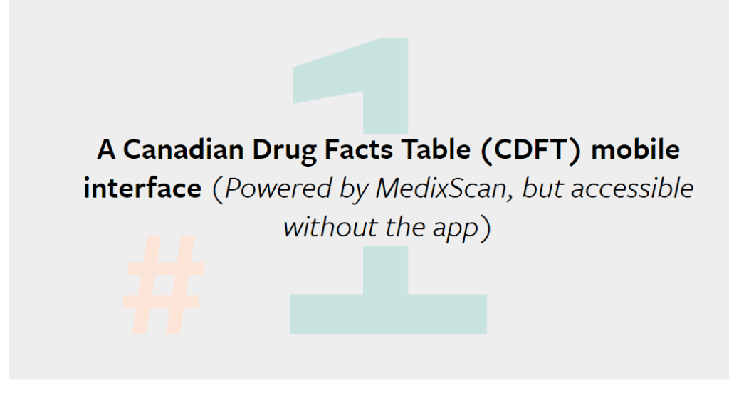
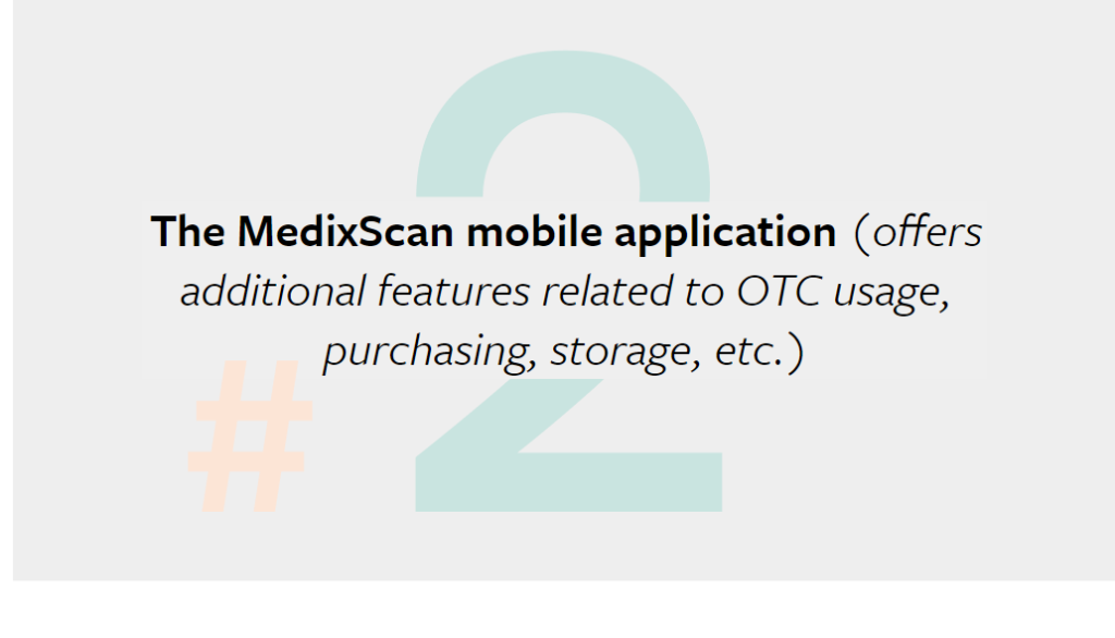
I focused heavily on the CDFT interface before moving into building the MedixScan application, based on all the research I collected in the process of building the CDFT.
Research
MedixScan’s research was conducted in phases and in accordance with every iteration being designed. The initial research consists of primary research collected to better understand the semantics and regulation of OTC drugs, while the rest of the research phases can be categorised under participatory design methods employed during the course of making MedixScan.
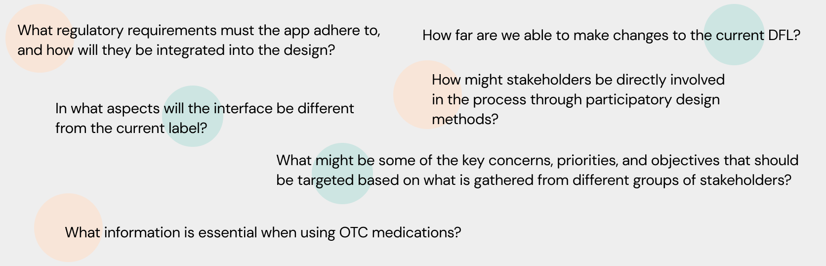
Guiding Questions
In order to further solidify a direction to take and to clarify its purpose, the following guiding questions helped identify some of the key issues, opportunities and challenges that arose and need to be addressed through the course of this project.
Literature Review
The current CDFT references the “United States Food and Drug Administration’s (FDA) applicable monographs”.3 The FDA’s OTC monograph establishes the conditions for an OTC drug to be given a therapeutic category (e.g., allergy products, sleep aid).4
To recieve these categorisations and be sold commercially, OTC labeling must go through regulatory standards defining an OTC drug’s; active ingredients, purpose, uses, dosage, administration, etc,.4
To understand these terms and my role in finding design solutions, I began my initial research phases with an in-depth study learning about all the different regulatory bodies and organisations that come together to make these labels.
Primary Research
Looking at OTC drugs in local drug stores and pharmacies helped begin ideation for my digital CDFT design.
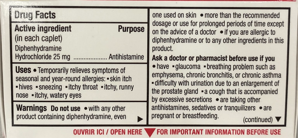
By collecting a range of different medications & products with DFLs, I was able to compile their sections & characteristics into a spreadsheet. The areas marked in red are as seen on the respective DFL. This spreadsheet helped gauge colour usage through the packaging designs and identify trends that could possibly be integrated into my design, such as the following:
◘ In addition to black & white, the colour red was used, but quite sparingly, limited to sections indicating ‘warnings’, ‘keep out of reach of children’, and ‘active ingredients’.
◘ Another notable trend was how common it was for an OTC medication to have an ‘open for more’ label, requiring purchasing to access the DFT information. This is something the digital interface would theoretically attempt to minimise, letting customers access all the DFT information first-hand before making the decision to purchase it.
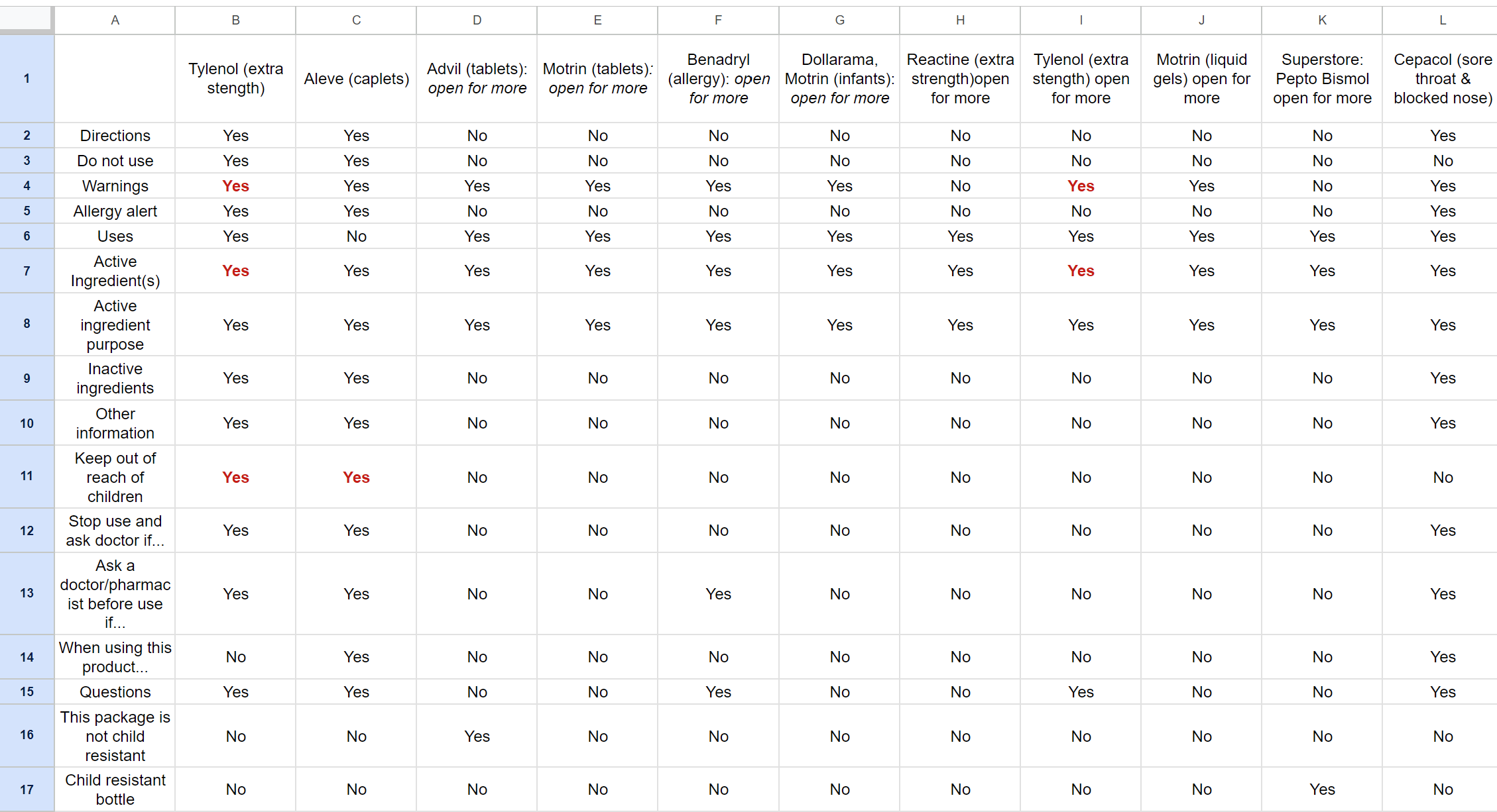
Using the information from the spreadsheet, I begain grouping together sections to build the sections to be displayed on the mobile interface. The sections being grouped are only those that weren’t found specified in CDFT regulations.8
This process of grouping and colour coding helped figure out the sections to be displayed in the mobile interface.
Prototype #1
These initial research phases led to my first protoype. Using this prototype, I was able to test the design with a wide range of users and try using these insights to further refine my ideas and find new features in the process
Prototype #2
The first protoype was made to create an idea of my concept for the DFT interface, but the colours (only chosen to differentiate between categories for myself) proved to be too distracting for everyone I tested the design with.
For my second prototype, I used colours originally found on the OTC drug I was designing for, and added very rough transitions to guage how people felt with interactions within the interface.
I also collected insights on what features can be added, improved, and removed for the second iteration.

Prototype #3
This version of my prototype included all the changes I’d been testing up till this point. This prototype was based entirely on the testing and feedback I’d gotten until then and helped build my ‘final’ prototypes as the project drew to a close.
Design Considerations
Noting the trends in the changes made to the Canadian Drug Facts Table over the years8 gave me a marker to begin recognsing the extent of how I was able to design the digital Drug Facts Table.
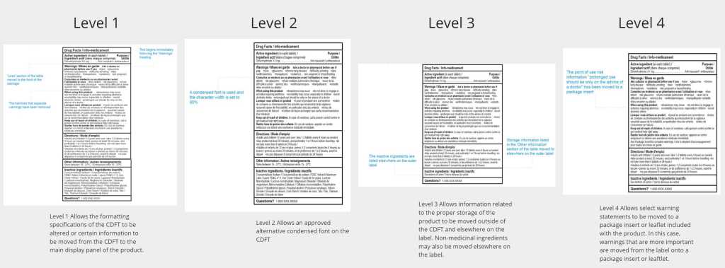
When dealing with the possibilities of design solutions for the DFL it was important to stay close to the original design of the DFL even in a digital format. The current DFL is rooted in years of research, iteration, and careful considerations to make its current design*.
Therefore, most of the digital solutions employed for MedixScan involve very deliberate design changes, being mindful and recognizant of the original DFL & its considerations.
The following are some of the key design considerations kept throughout the making of MedixScan, showing its parallels with the current DFL design.
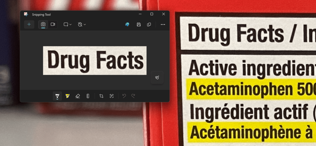
◓ Colour: Drug Facts Label
The current DFL uses very little colour, its palette consists of a white background, black text, and occasional usage of red to highlight certain information*.
◒ Colour: MedixScan
In the MedixScan DFL interface, usage of colour is very intentional, the background uses colours taken from the packaging being scanned -to help differentiate products between scans- while the information cards maintain the usage of black and white as the original.
Red is rarely used throughout the application’s interfaces to maintain its significance, and is placed in the same format (ex. Icon, font, highlight) as seen in the drug’s original DFL.
◓ Typography: Drug Facts Label
The typeface used for most CDFTs are often a standard sans serif font such as Arial or Helvetica. These typefaces generally have a large x-height and adequate spacing between characters.*
◒ Typography: MedixScan
The typeface used for MedixScan is DM Sans. Sans serif fonts appear cleaner for digital interfaces and may be better for comprehension in medical contexts.5 The font styles throughout the digital CDFT interface imitate the font styles in the original DFLs, such as bolded headings, maintaining the same text emphases through both interfaces. The size of the font is also taken into consideration to make a comfortable reading experience even without using text adjustments.6
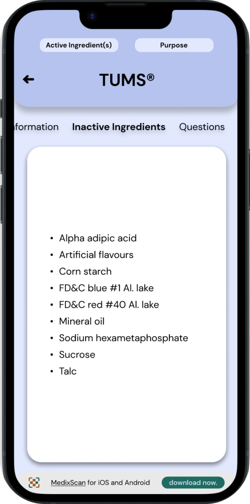
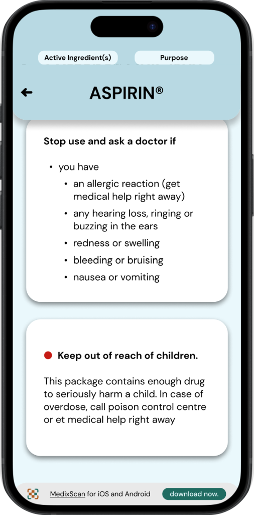
◓ Active Ingredients: Drug Facts Label
Active ingredients for OTC drugs are displayed in two areas of a drug’s packaging.
1. On the front of the Drug’s packaging.
2. On the Drug Facts Label.
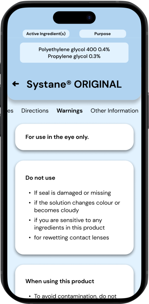
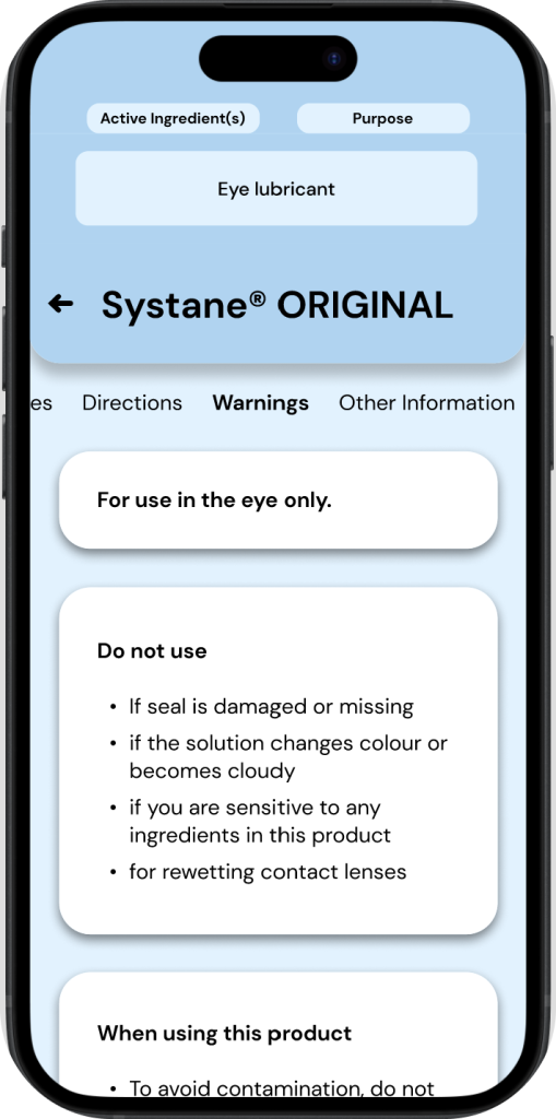
An OTC drug’s ‘Active ingredients’ is always paired with its ‘purpose’, these two sections have a strong emphasis throughout drug fact labels*, oftentimes even being highlighted.
◒ Active Ingredients: MedixScan
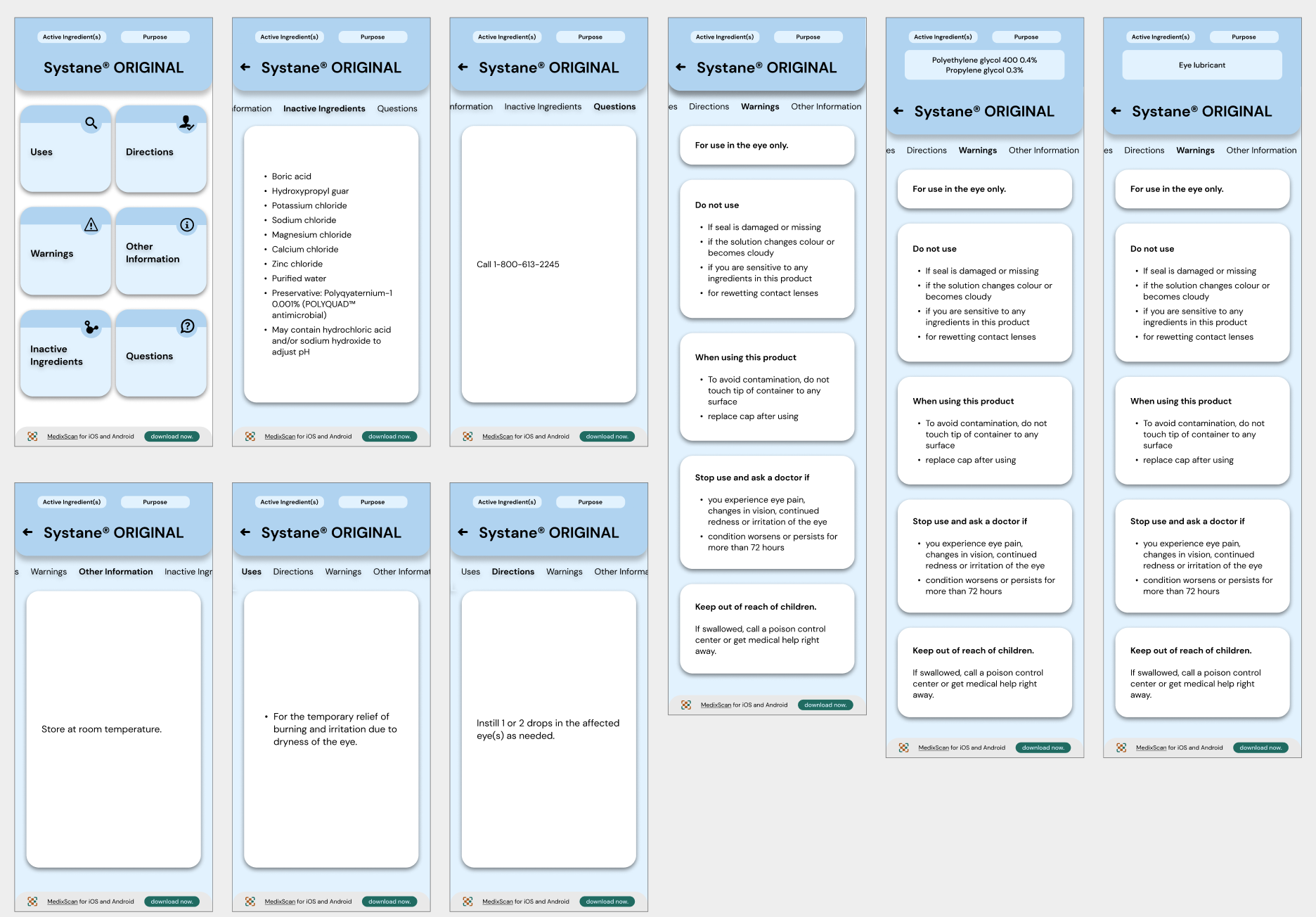
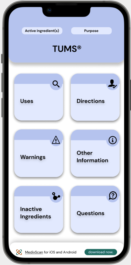
To maintain a similar emphasis on active ingredients & purpose as the DFL, MedixScan displays this information in a section at the very top of the interface. This is designed to be expandable/collapsable and is present throughout all the screens of the DFL to allow access to this information at any time.
Final Iterations
The following screens & protoypes are the final workings of the MedixScan & DFT interfaces.
The main changes being worked on at this stage are:
∘ Making the active ingredients/purposes more simple & accessbile throughout the DFT interface.
∘ Configuring user flows for the MedixScan app.
∘ Highlighting key features of the application & refining them.
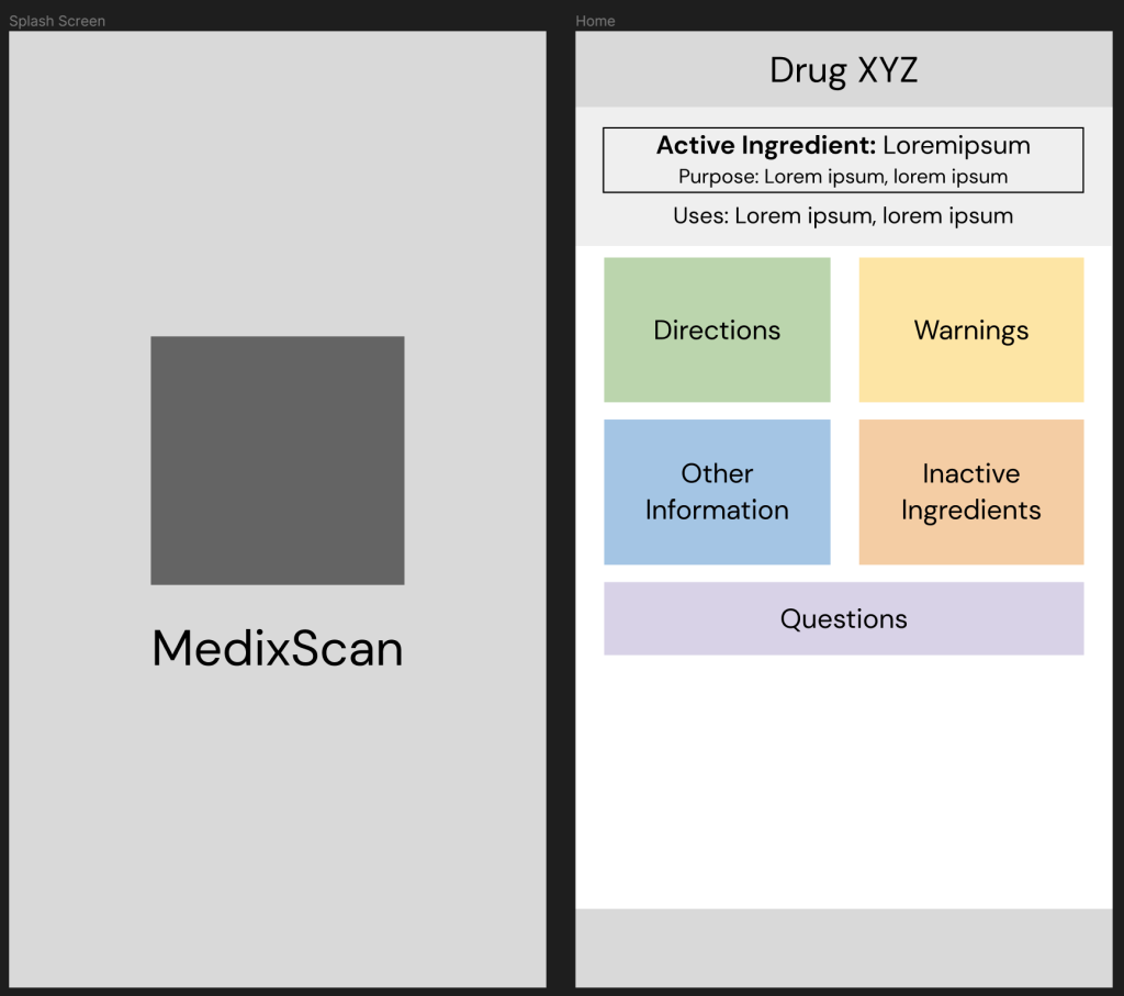
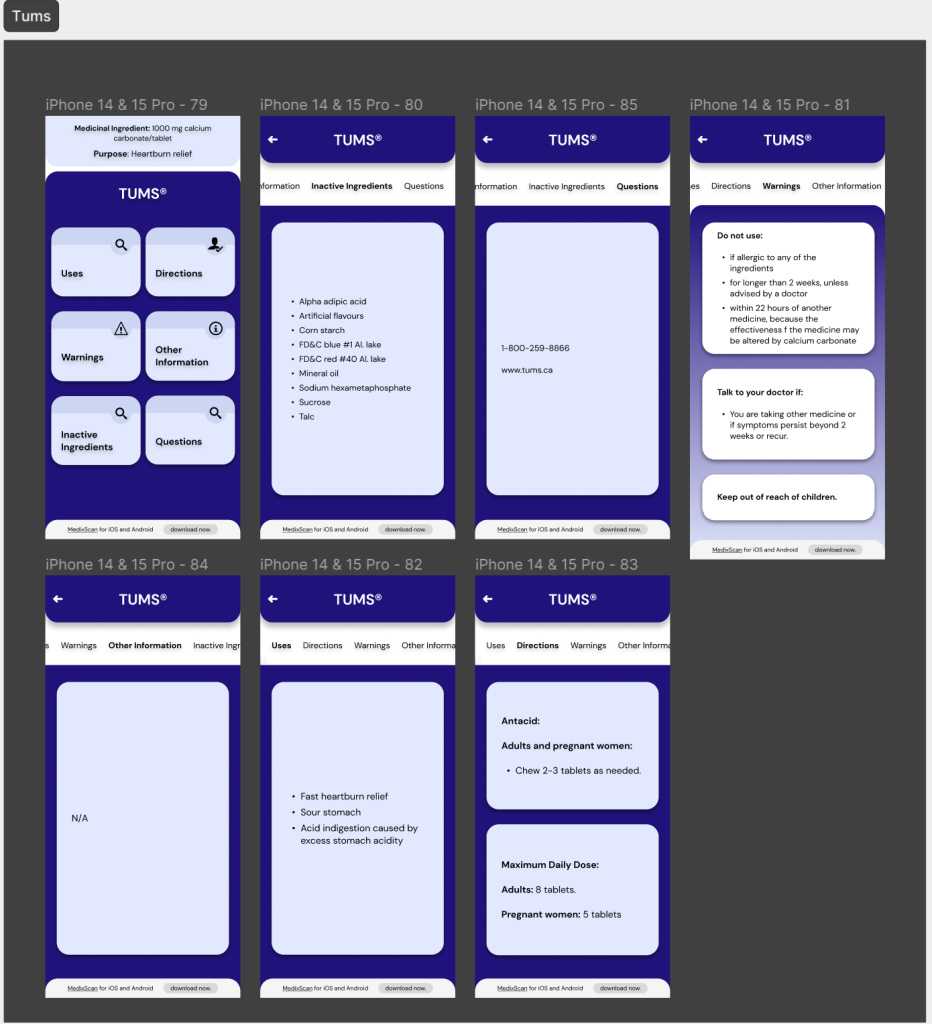
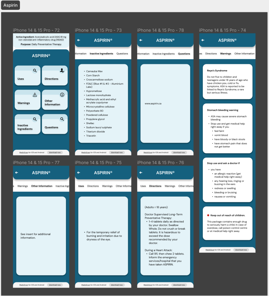
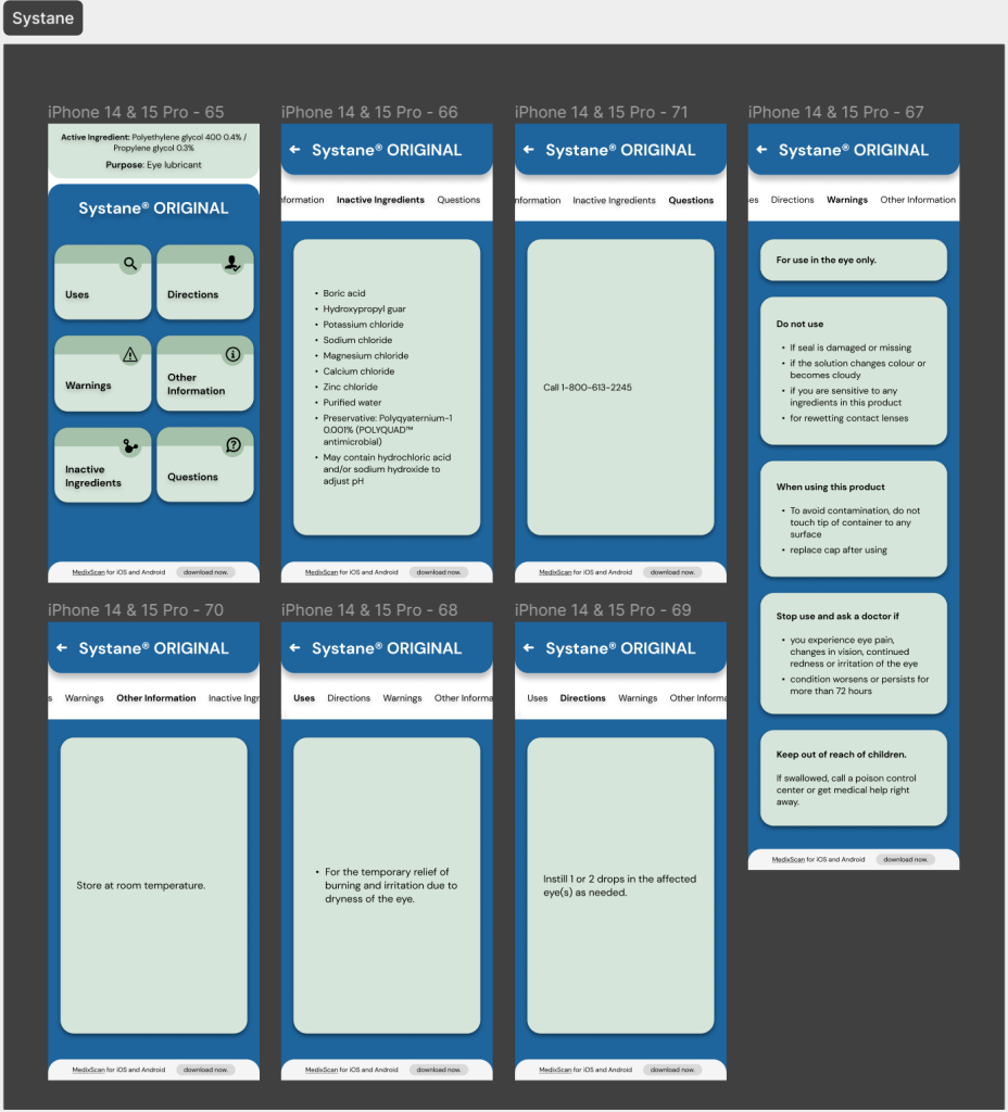
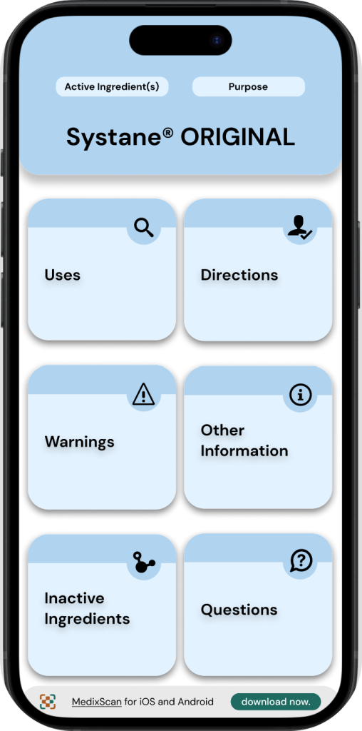
SCREENS:
DFT Interface
SCREENS:
MedixScan Mobile App
PROTOTYPE:
DFT Interface
PROTOTYPE:
MedixScan Mobile App
MedixScan Features (mobile application)
The following are features that have been integrated into MedixScan through the course of identifying pain points and communication gaps in the usage and purchase of OTC products, during participatory design activities & interviews.
These concepts were built with consideration to various stakeholders such as physicians, pharmacists, drug store employees, and a wide range of potential users (elder adults, students, parents, etc.).
FEATURE 1:
Legibility
Problem: Some of the most common questions that pharmacists and pharmacy assistants receive is centred around issues in legibility.
Solution: MedixScan’s on-boarding process for the mobile application; asks users to input their preferred text size, while direct access through the QR code has the option to change these variables
FEATURE 2:
Language
Problem: Language barriers can greatly impact the usage of OTC drugs, applicable especially to those who struggle understanding English or French.
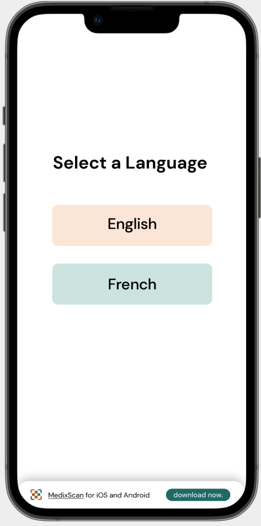
Solution: The current CDFT is standardised in Canada’s national languages; English and French, as such, MedixScan only offers these languages as options.
Language as an accessibility barrier can open possibilities for MedixScan’s expansion as more languages can be integrated.
FEATURE 3:
Consistency
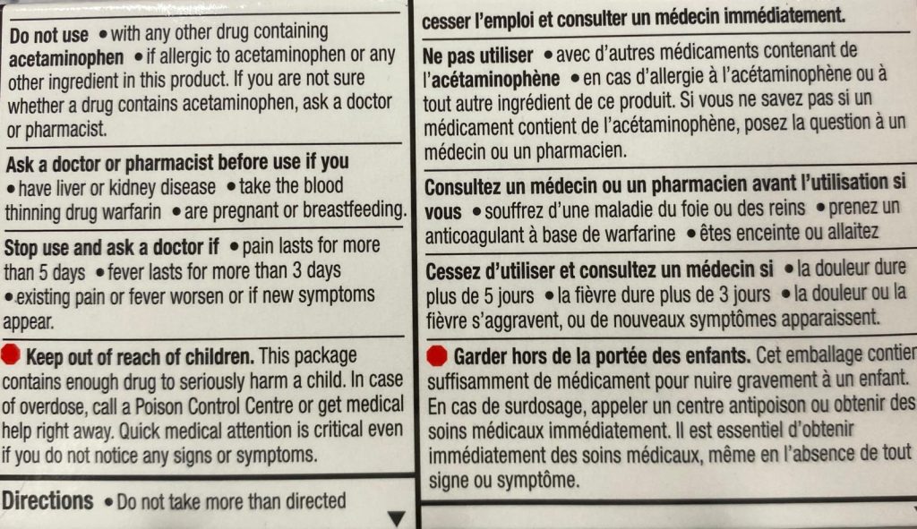
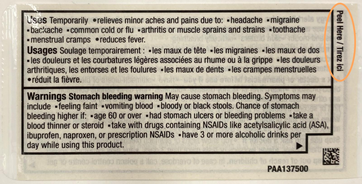
Problem: While DFT requirements are standardised, inconsistency in format, clarity, and full access of DFL information is still a problem.
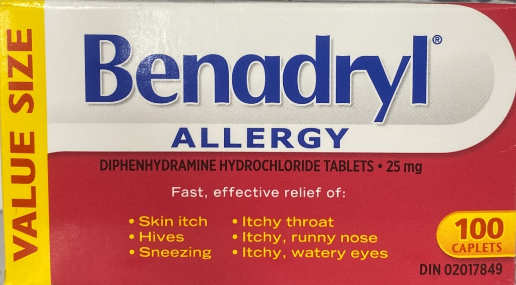
For example, this Advil label that you are only able to fully access upon purchase, which limits our understanding of what we are purchasing & using.
Solution: The MedixScan DFT interface clearly shows all
the categories as specified by CDFT regulations.
It also maintains the same interface and touchpoints across all OTC products with the information depending on their respective DFTs, minimising inconsistency & confusion.
FEATURE 4:
Medical Information
Problem: Medical information databases, only accessible through Provincial Health authorities is difficult to implement into a design, due to the sensitive nature of the information being collected.
Solution: Instead of having the integration of medical information databases, MedixScan users are able to tag their information in a ‘Notes’ section in their profile.
This allows users to tag details such as; allergies, medical conditions, diet, etc. to share with physicians/pharmacists when purchasing and/or using OTC products
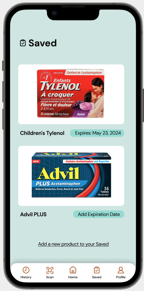
FEATURE 5:
Expiration Dates
Problem: The CDFT interface only displays an OTC product’s regulatory information. As expiration dates are implemented by manufacturers and based on external factors to the OTC product, it makes it difficult for a scan to include this information.
Solution: Users of the MedixScan mobile application can save scanned OTC products, and upon saving, they are able to add an expiration date for the product and access that information at any time as they re-visit their ‘Saved’ tab.
Participatory Design
MedixScan began with the goal of bridging communication gaps between healthcare professionals and patients about over the counter medication. In order to fully encompass a wide range of perspectives and design challenges, participatory co-design methods played a large role*.
Interviews
I led interviews with medical professionals such as doctors, and local pharmacists and pharmacy assistants to gather insights on some of the common questions they receive from patients/customers.
By involving a diverse range of stakeholders in the process of designing in a participatory manner, I was able to gather a well rounded perspective on the gaps in communication that exists between healthcare professionals and patients.
Feedback
Since the early stages of design & research, I consulted peers, professors, friends, and family to gain feedback. This helped me understand where my design was lacking, and having such a wide range of people to get feedback from helped me gather lots of individual perspectives, specific to one’s; experiences with medication, digital literacy, well-being, age, etc.
Testing
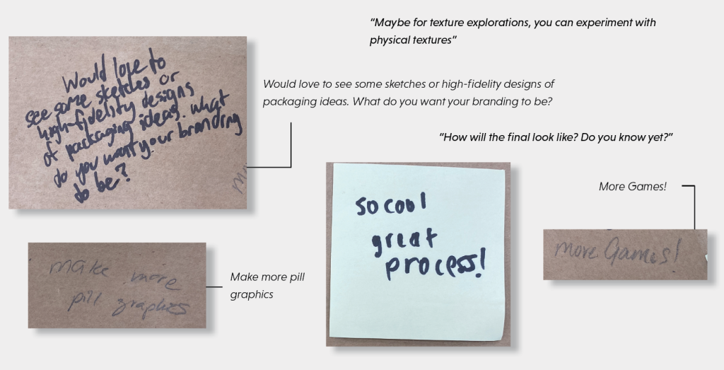
With each iteration of my digital DFL interface, I made sure to test it with those around me. Usability testing allowed me to achieve the following:

Throughout all the phases of testing MedixScan, I asked participants to narrate their thoughts, opinions, and behaviors as I took notes alongside my discussions with them.
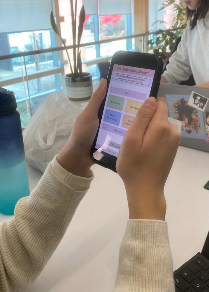
Testing Prototype #1
Testing Prototype #2
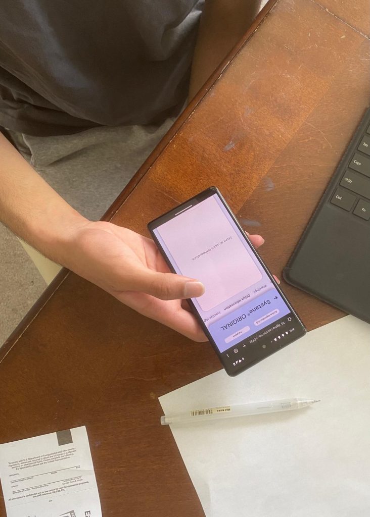
Testing Prototype #3
This created a collaborative and engaging environment for me to learn through the behaviour of others and continue building my design to create better user experiences.
Personas
Based on the research I collected through the course of building MedixScan’s DFL interface, I collected a lot of user research on the needs and wants for a wide range of users. Moving away from the DFL interface, which was the very basis of MedixScan, I began begin building the mobile application of MedixScan based on the following personas:
These personas were created through all the information I personally collected paired alongside statistics and studies that I’d been referencing through the course of this project. This helped me gain a wide scope of the interface needs for the mobile application of MedixScan, and helped in the creation and implementation of specific features to meet these needs.
Branding
The branding for MedixScan began with looking at current medical & related companies, organisations and brands to gather some of the commonly used colours in the medical industry.
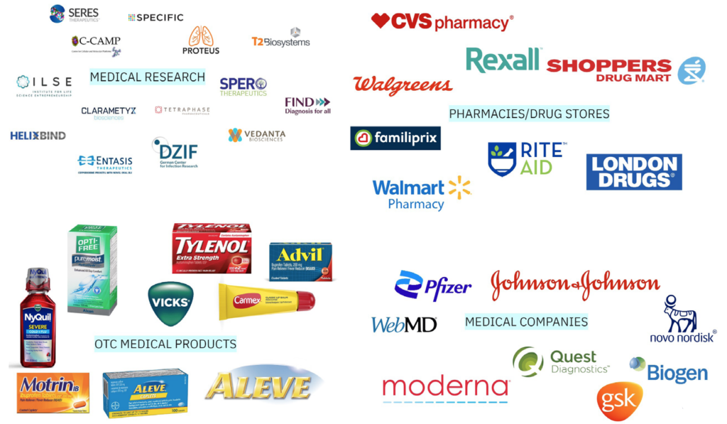
The most commonly used colours were:
BLUE
RED
YELLOW
GREEN
I used this to rule out colours for MedixScan, mainly blue & red as they are some of the most frequently used colours for existing packaging and using these colours did not serve my concept for MedixScan well as it may be confusing when scanning packaging.
Colours:
The colours that represent MedixScan are:
Orange
#FDE6D6
#F6A461
#AF5826
Orange can be attributed to well-being and health due to its association with the fruit of the same name, and in design contexts it draws attention without being as overwhelming/strong as the colour red.
Teal
#C9E5E1
#18AA99
#106D61
Teal is a combination of the blues and greens often seen in healthcare design and maintains a neutral connotation in its applications while also being a colour that promotes health and wellness.
These colour decisions were very important in the context of MedixScan; as explained above, the usage of colour throughout MedixScan is deliberate and intended to guide users rather than to add to the design’s aesthetics.
Web Accessibility Guidelines:
These colours were also passed through Web Content Accessibility Guidelines (WCAG), a series of web accessibility guidelines published by the World Wide Web Consortium (W3C). These guidelines were built in cooperation with organisations worldwide to create a standard for web content accessibility, which was pertinent to my project when considering the usage of OTC drugs and DFL readability.
I used WCAG checker, WebAim to ensure my colors all passed WCAG 2.0 level AA, which requires a contrast ratio of 3:1 – 4.5:1 for different text sizes & iconography. To test all my contrast levels and ensure I met level AA, I tested colours in the contexts I was designing in.
References
1. ↗
Overuse and Misperceptions of Nonsteroidal Anti-inflammatory Drugs in the United States.
Cryer B, Barnett MA, Wagner J, Wilcox CM.Am J Med Sci. 2016 Nov;352(5):472-480. doi: 10.1016/j.amjms.2016.08.028. Epub 2016 Sep 21. PMID: 27865294.
2. ↗
Experimental study on legibility of typographic information of ventilator interface January
Jiang Shao, Ketong Yan, Ke Liu, Chengqi Xue2022International Journal of Industrial Ergonomics 87(19):103249 DOI:10.1016/j.ergon.2021.103249
3. ↗
Guidance Document: Drug Facts Table for Non-prescription Drugs
Government of Canadahttps://www.canada.ca/en/health-canada/services/drugs-health-products/public-involvement-consultations/natural-health-products/guidance-document-drug-facts-table-non-prescription-drugs.html#a111
4. ↗
Over-the-Counter (OTC) Drug Review | OTC Monograph Reform in the CARES Act
Center for Drug Evaluation and Researchhttps://www.fda.gov/drugs/over-counter-otc-nonprescription-drugs/over-counter-otc-drug-review-otc-monograph-reform-cares-act
5. ↗
Do particular design features assist people with aphasia to comprehend text? An exploratory study.
Wilson L, Read J.Int J Lang Commun Disord. 2016 May;51(3):346-54. doi: 10.1111/1460-6984.12206. Epub 2015 Nov 27. PMID: 26611362.
6. ↗
Text legibility and the letter superiority effect.
Sheedy JE, Subbaram MV, Zimmerman AB, Hayes JR.Hum Factors. 2005 Winter;47(4):797-815. doi: 10.1518/001872005775570998. PMID: 16553067.
7. ↗
The Effectiveness of Nonprescription Drug Labels in the United States: Insights from Recent Research and Opportunities for the Future.
Catlin JR, Brass EP.Pharmacy (Basel). 2018 Oct 26;6(4):119. doi: 10.3390/pharmacy6040119. PMID: 30373134; PMCID: PMC6306891.
8. ↗
Labelling requirements for non-prescription drugs guidance document
Government of Canadahttps://www.canada.ca/en/health-canada/services/drugs-health-products/natural-non-prescription/legislation-guidelines/guidance-documents/labelling-requirements-non-prescription-drugs.html