nowhere at all
Siri Gusdal
See it On Campus: Level 2
Visitor InfoECU Award Recipient
Glenmore Custom Print + Packaging Award – Honourable Mention
PROJECT OVERVIEW
Storytelling Through Design and Creative Writing
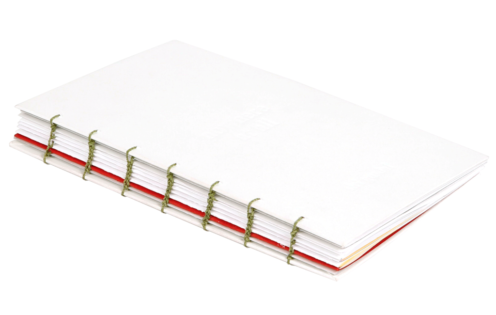
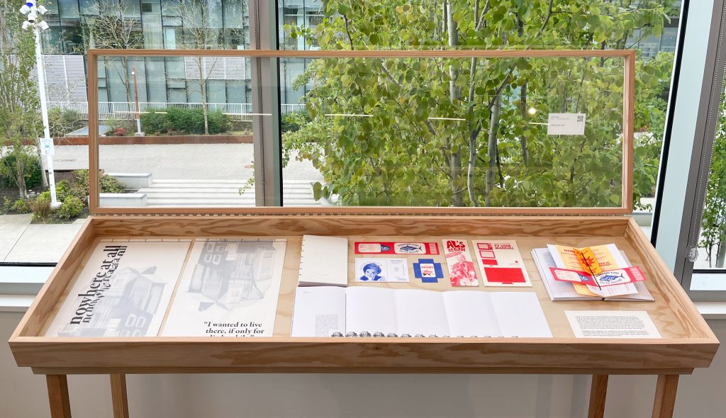
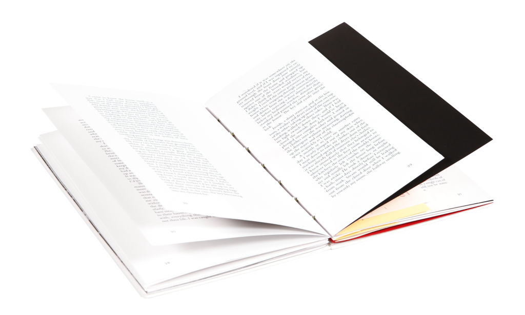
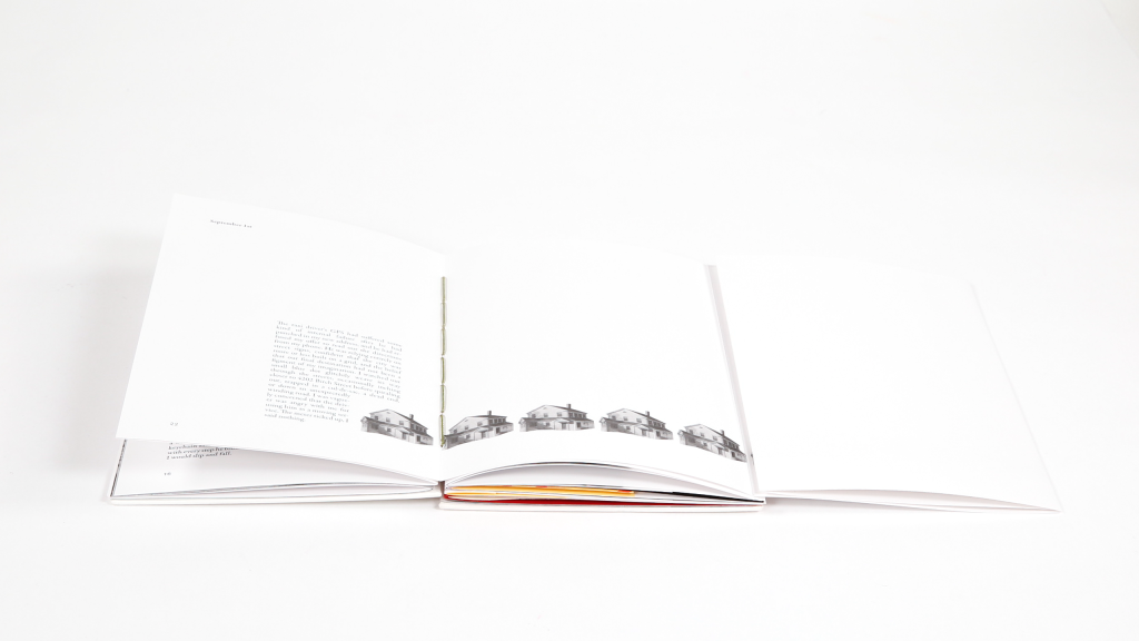
nowhere at all is a short story I wrote that explores the unsettling experience of living within a liminal, or transitional, space. Hand-stitched with a debossed cover, I designed the printed book so that its material form would act as a storytelling device, rather than just as a container for the text. Each individual page responds to the narrative in some way, using a combination of distorted imagery, collage, negative space and repetition to reflect the absurd atmosphere of the story.

The story follows the narrator, Agnes, directly after she graduates university and finds herself with no friends, no money, no career ambitions, and nowhere to live. While looking for a room to rent, she finds herself inexplicably drawn to 4202 Birch Street, the last house on a dead end street at the centre of a labyrinthine suburban neighbourhood.
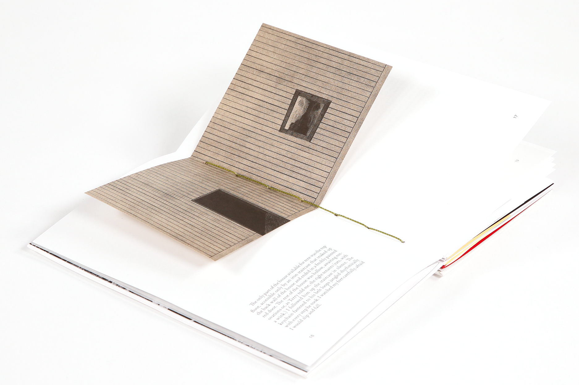
The main floor of the house is gutted and awaiting renovations, leaving only the top floor available for rent. Agnes notes that each room upstairs feels frozen in a different time, as if every few decades someone had decided the whole house needed to be updated according to the current trends but had been consistently prevented from completing more than a single room. It feels less like a home and more like a disjointed collection of individual places. She agrees to rent one of three empty rooms, without knowing who she will be living with.


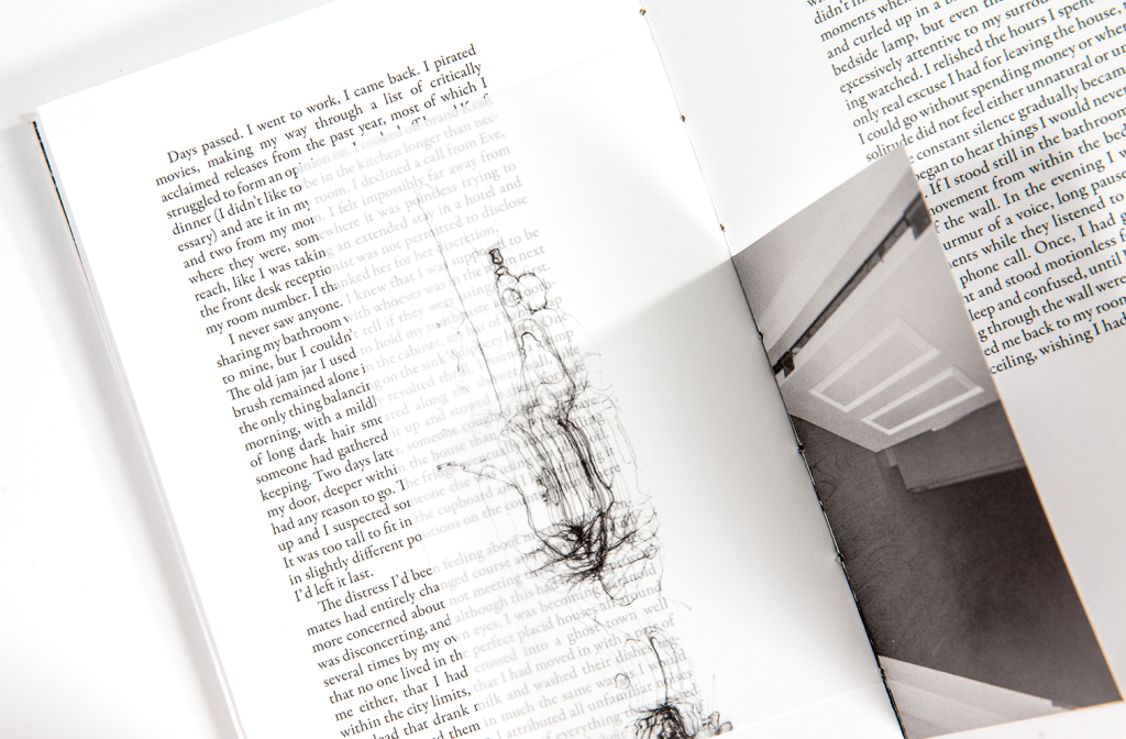
The day she moves in, the house is eerily still and her roommates are nowhere to be found. Agnes ends up staying in the house for six months without ever seeing the people she lives with, but comes to know them through the rhythms of their routines and the traces of their lives she collects from the trash. She is simultaneously unnerved and comforted by her lack of relationship to them, obsessed with getting to know them, but totally unwilling to let herself be known by them.

READ THE FULL STORY HERE
simplified digital version of the book pages (split into 2 parts)
PROJECT ORIGINS
When I began this project last fall I was focusing on the relationship between design and creative writing, with the end goal of curating and designing an anthological literary magazine with work from multiple writers. In order to come up with a theme for my publication, the first thing I did was try to define what stories are most interesting to me, and why. Originally this felt important to do so that I could properly describe what I was looking for when soliciting writing submissions, but in the end it just sparked an excitement to explore the themes I identified in my own writing practice, as well as through design. This, along with research into DIY zine culture, and visits to the ECU artist book collection, broadened my vision for what my publication could be, and my goal shifted from curating an anthology to creating a publication out of my own writing.
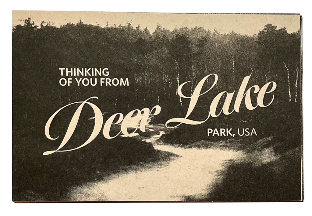
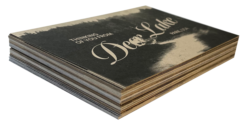
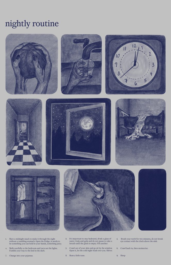
As part of my research process in the fall, I turned some of my old creative writing pieces into small experimental publications, including For Ana (below) which is an approximately 1000 word story written in the form of a letter. Using a mixture of digital and analogue collage, I designed a set of postcards and printed the story on the back, playing around with the traditional format of a book. I also illustrated a poster for the short list poem Nightly Routine (right), then reproduced it as a one colour risograph print.
DESIGN PROCESS
I spent the spring semester writing nowhere at all and thinking about the book design at the same time, which made for a really experimental process where my visual explorations would inform the writing, and vice versa. My main objective in both the design and writing was to develop a strong sense of atmosphere and to take the mundane and twist it into something strange and unfamiliar.
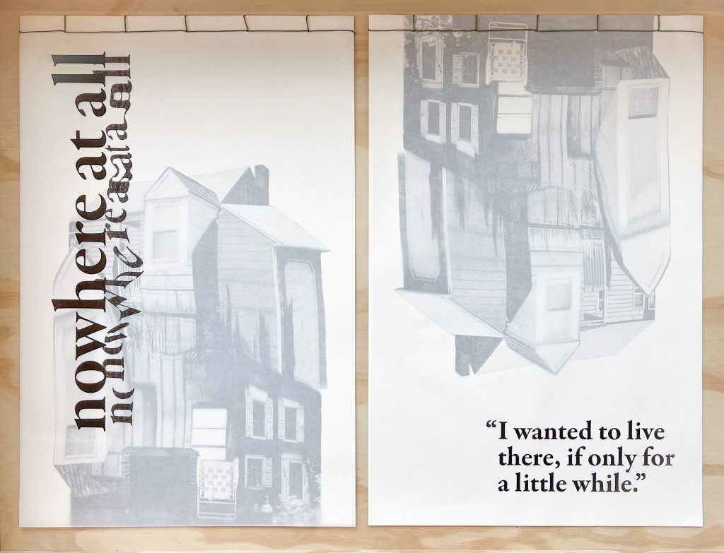
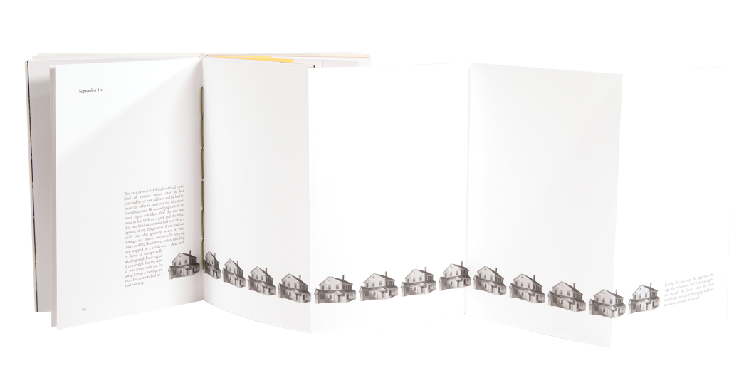
I was interested in how I could disrupt the traditional novel format and purposely draw attention to the physical book. One way I did this was by utilizing a variety of different paper sizes, textures, and weights, that echo what is happening in the narrative, and alter the way the pages can be flipped. For example, this fold-out spread takes place at the point in the story where Agnes’ taxi driver gets lost in the neighbourhood of identical homes on the way to 4202 Birch Street. I wanted to communicate a sense of endlessness, so every time you unfold the page it’s like turning a corner in the road and only finding more of the same.
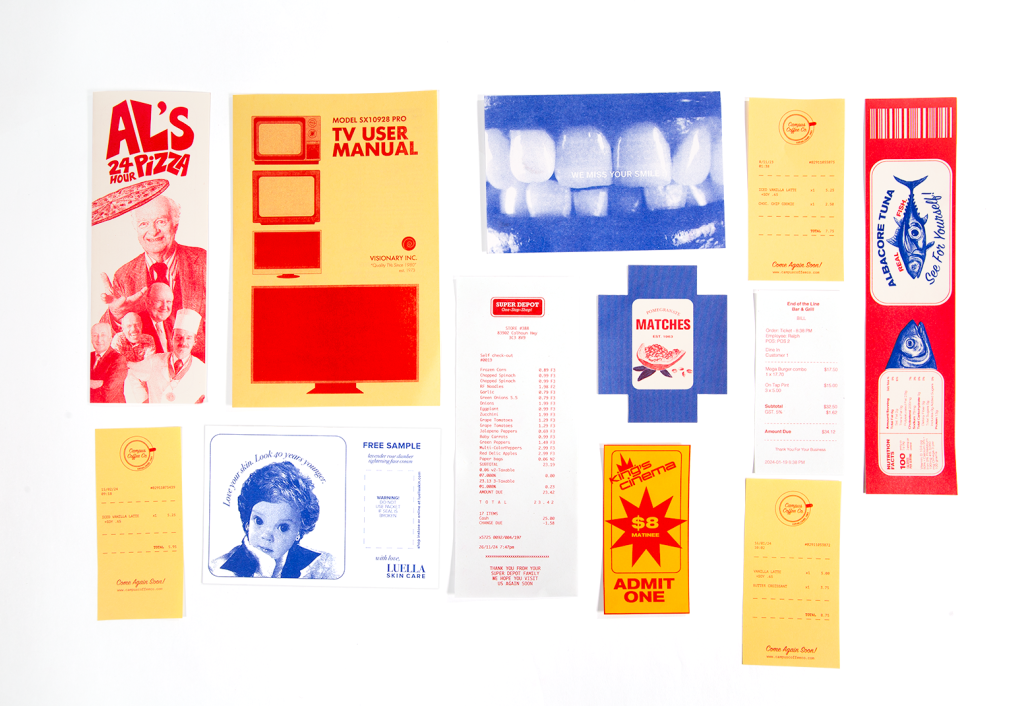
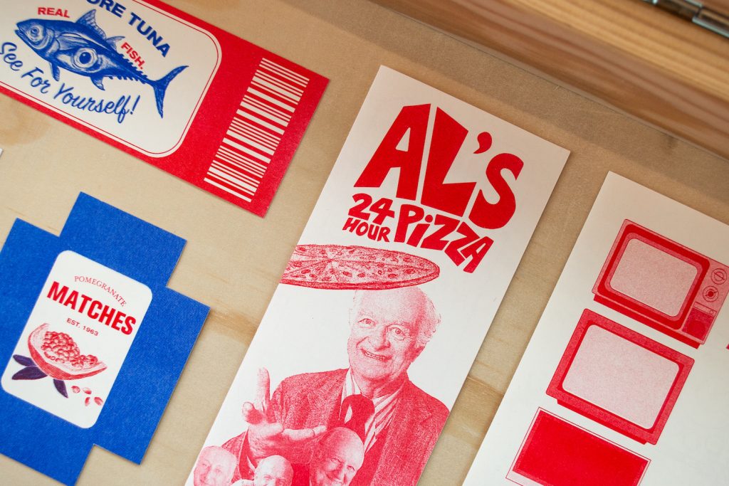
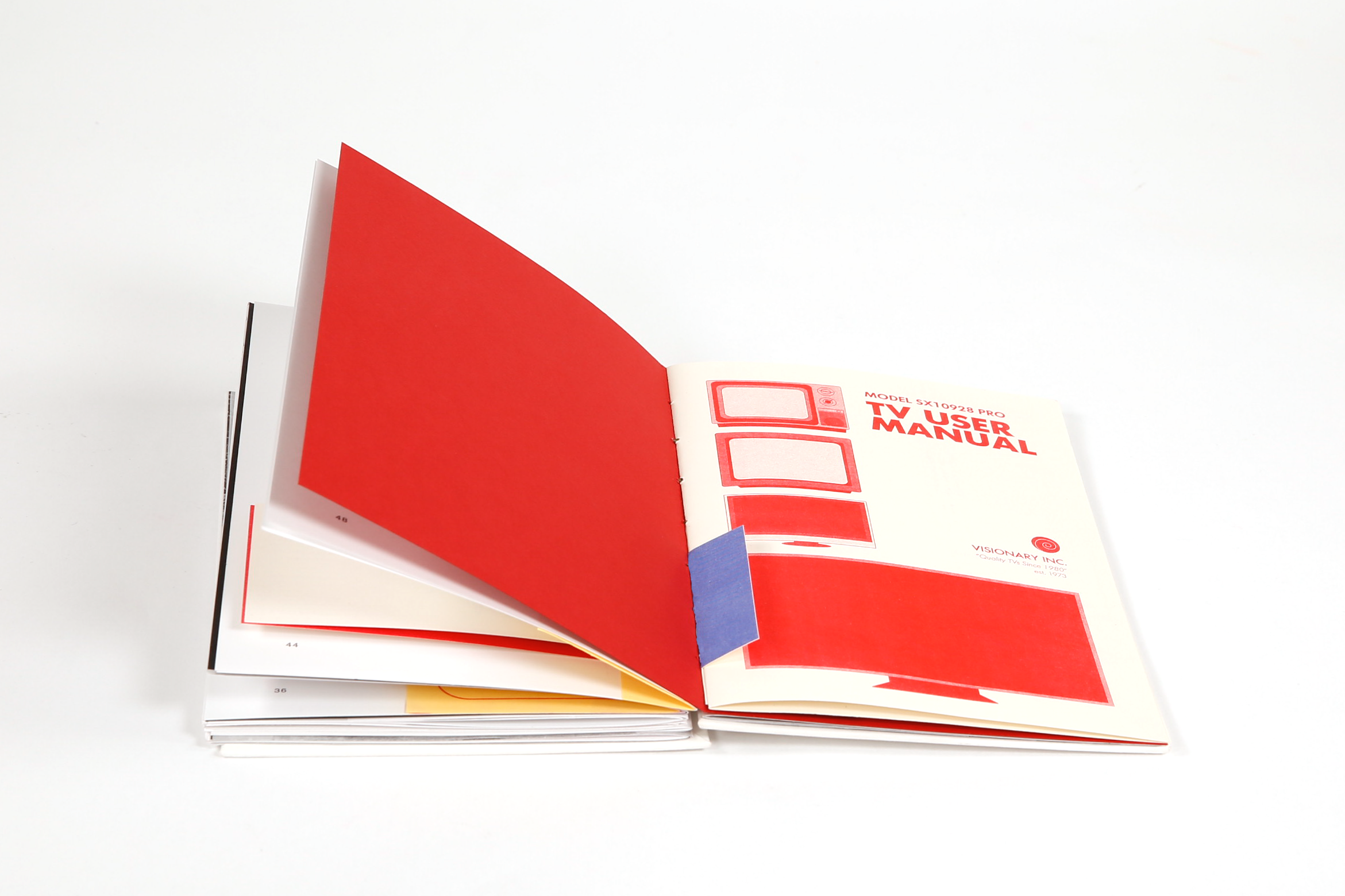
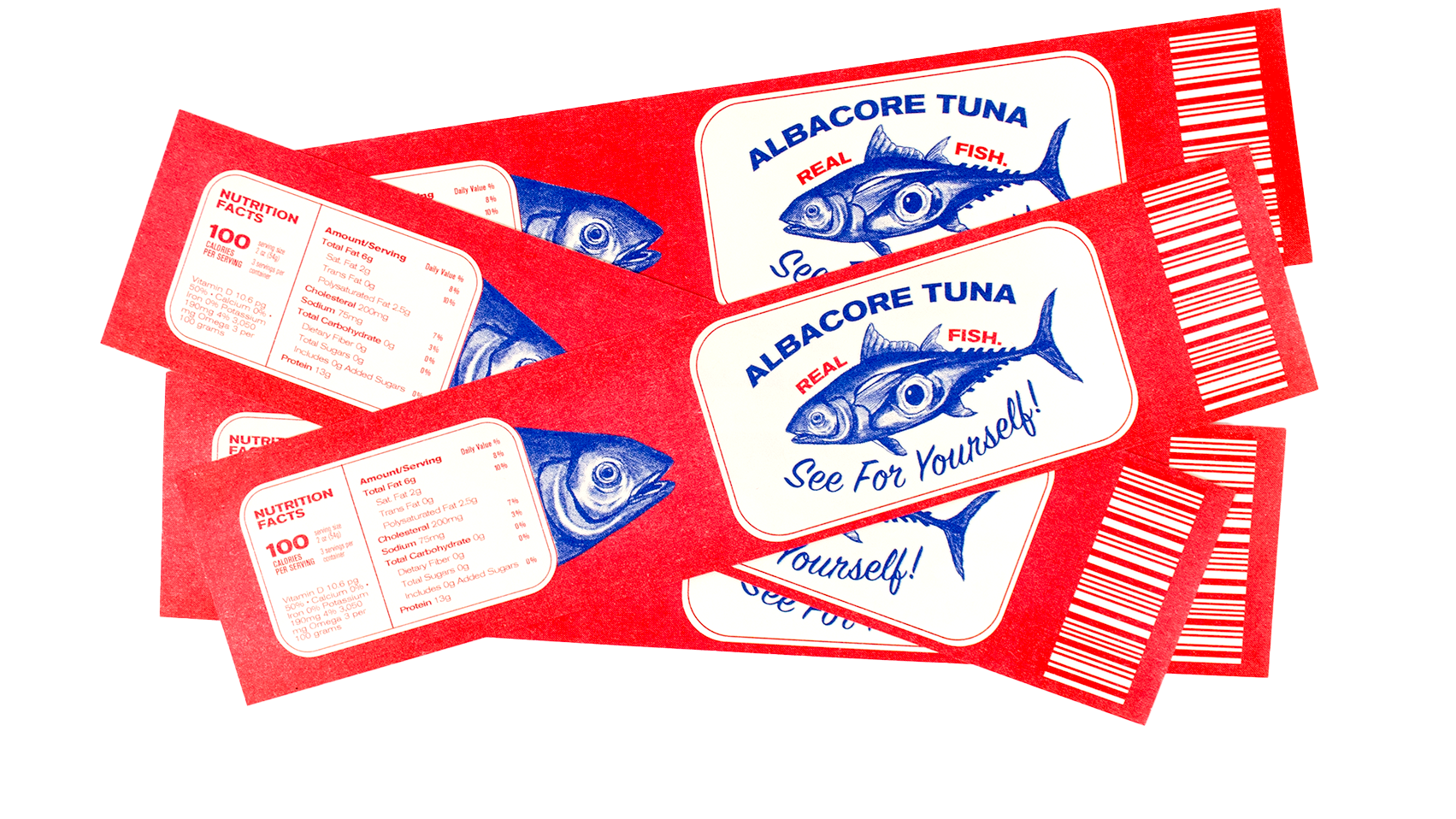
The book includes several pieces of the printed ephemera and bits of packaging that Agnes pulls out of her roommates trash in the story. Some of the items are referenced in the writing but some are not, allowing the reader to draw their own conclusions about what they’re looking at and what it might tell them about the person who threw it away.
I wanted the ephemera to convey a sense of an altered reality: debris from a world that is familiar but not exactly the same as the one we know.
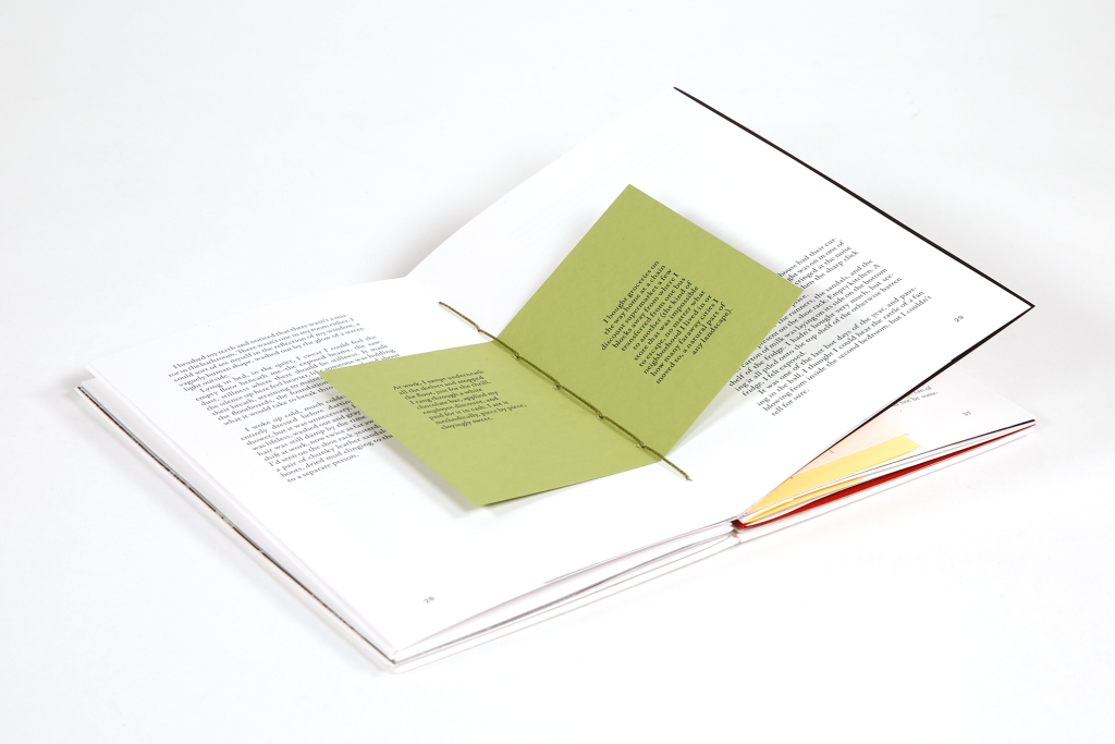
For the binding, I used the coptic stitching method and hand sewed all the different elements together using olive green thread (the same colour as the house in the story.) I left the spine exposed as another way to draw attention to the book as an object.