Type Is Black But What Is Black In Type: Exploring The Black Female Experience
In my creative practice, I harness the power of typography within zine creation to confront the pervasive influence of Eurocentric design norms in media and society. I perceive striking parallels between typography and racism, as both elements envelop us and shape our daily interactions. For black women, navigating through the intersecting challenges of colorism, classism, racism, and sexism underscores the urgent need to acknowledge and dismantle these systemic injustices for the advancement of a more equitable society. I explore how the use of playful and decorative typefaces can foster increased engagement with my work. However, I recognize that the typefaces I employ may not always align with the narrative I aim to convey. My artistic endeavors are deeply rooted in experimental typography within editorial design, with a primary focus on print media such as zines and posters.
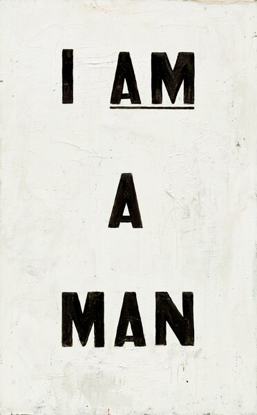
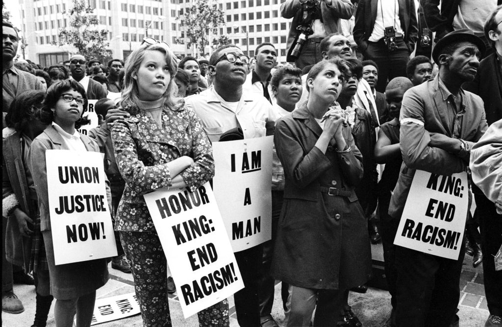
Drawing inspiration from a rich legacy of subversive activism posters, particularly those from the 1970s and 1980s, I seek to channel the spirit of socio-political dialogue surrounding issues of racism, sexism, and prejudice against black individuals. These posters often utilized typography as a potent tool for communication, such as the iconic “I AM A MAN” movement, which employed bold, plain sans serif typefaces to demand equitable treatment for black men in the workforce. This juxtaposition invites the reader to engage with my zines on multiple levels, sparking curiosity and provoking thought through contrasting tones of loudness and playfulness. Ultimately, my goal is to open up spaces for dialogue and reflection, challenging existing norms and fostering a more inclusive and critical engagement with design and typography.
MEET THE DESIGNER:
I am Natasha Assma Kowo, a first-generation Zimbabwean-Canadian, currently on the cusp of attaining my master’s degree, having already secured two previous degrees. My journey unfolds against the backdrop of my upbringing as a black woman in Harare, Zimbabwe, raised by a resilient single mother of Zimbabwean-Mozambican heritage. In the heart of Harare, I witnessed the unwavering commitment of my mother, from the first light of dawn until the shadows of dusk, gracefully navigating not only her 9-to-5 responsibilities but also juggling various side hustles. Her dedication went far beyond ensuring my own education; she generously extended her care and support to others. As a Zimbabwean-Mozambican single mother, she seamlessly embraced the roles of both mother and father, exemplifying resilience in the face of adversity. In my younger years, the complexities of her sacrifices eluded my understanding. However, with the passage of time, I’ve come to appreciate the profound depth of her commitment and sacrifice. My mother embodies the quintessence of what we honor as a Strong Black Woman, a paragon of strength, resilience, and unwavering determination.
Project 01: YOU SO BLACK (2023)
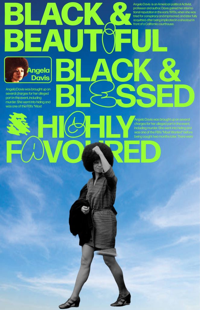
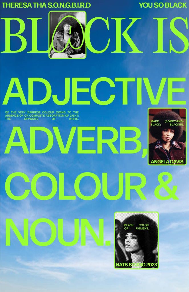

This project had me asking myself “Why do we use typography, what is the purpose of typography? Is there a purpose to typography, do people understand it? what does typography me to as a designer?” This project was inspired by Theresa tha SONGBIRD, a spoken word called “YOU SO BLACK”. From the spoken word, I hear the praise of being, I hear the praise of the colour Black, and I hear the presence of being Black. From the spoken word I captured 3 parts “Black is Touch, Black is Hard to do”, “Black is Beautiful, Black & Bless & Highly Favoured”. These words resonated deeply with me, sparking a profound reflection on how I want to portray Black women.
Inspired by these sentiments, I embarked on a creative journey to craft a series of posters featuring the iconic Angela Davis. Davis epitomizes the essence of blackness, embodying resilience, intellect, and empowerment. To amplify the impact of the message, I experimented with playful and ornate typefaces, aiming to foster greater engagement with the subject matter. I pivoted towards a mix of display typography, serifs, and sans serifs, accompanied by a vibrant color palette. The inclusion of a bold neon green hue in the typesetting introduced elements of repetition, rhythm, and cohesion. Against a backdrop reminiscent of a cloudy sky, symbolizing unity and liberation, the juxtaposition of Black and white elements in the composition evoked a sense of intrigue and contemplation. Through this visual storytelling, I endeavor to provoke thought and inspire dialogue on the multifaceted experiences of Black women in society.
Project 02: I AM A MAN (1988)
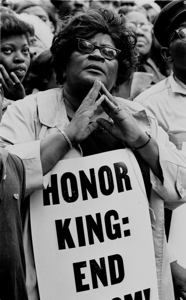
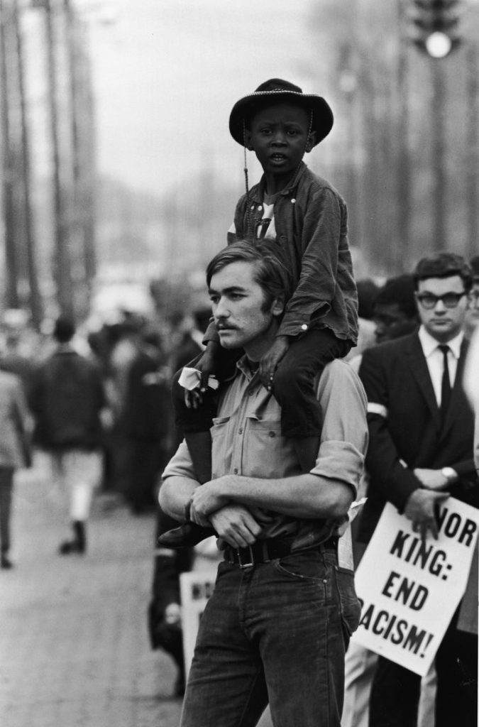
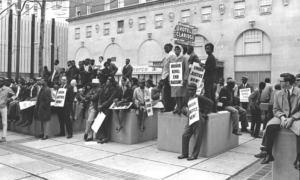
I AM A MAN: MARTIN is a non-violent typeface inspired by remnants of the Memphis Sanitation Strike of 1968. Memphis sanitation workers, the majority of them Black, went out on strike on February 12, 1968, demanding recognition for their union, better wages, and safer working conditions after two trash handlers were killed by a malfunctioning garbage truck.
Martin Luther King Jr. joined the cause, speaking to a crowd of 6,000 in late March and returning on April 3rd to deliver one of his most famous speeches, “I’ve Been to the Mountaintop.” King placed the strike in a larger context, declaring, “The masses of people are rising up.”
King was assassinated at Memphis’s Lorraine Motel the next night, just one day before a massive rally was planned. On April 8, four days after King’s assassination, his widow, Coretta Scott King, led some 20,000 marchers through the streets of Memphis, holding copies of another poster that read, “HONOR KING: END RACISM!” The strike ended on April 16, with the city agreeing to union recognition and raises.
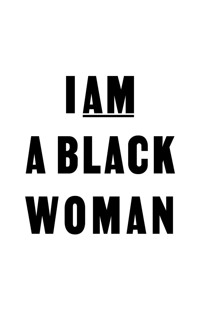
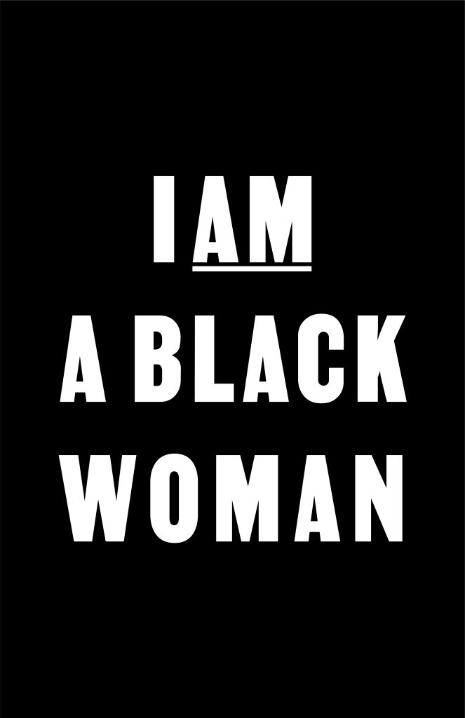
PROJECT 02.1: I AM A BLACK WOMAN (2024): inspired by I AM A MAN (1988): A revised version of the slogan tailored to Black women:
“I AM A BLACK WOMAN”
This slogan, inspired by the historic “I AM A MAN” declaration, not only stands as a rallying cry against oppression but also plays a significant role in the lives of Black women. Just as the original slogan represented the demand for dignity and equality for African American men during the Civil Rights Movement, “I AM A BLACK WOMAN” asserts the rights, worth, and agency of Black women in society.
For centuries, Black women have faced intersecting forms of discrimination based on both race and gender. They have been subjected to systemic inequalities, marginalized in various spheres of life, and often rendered invisible in narratives of social change. Despite these challenges, Black women have been at the forefront of movements for justice, equality, and empowerment.
The “I AM A BLACK WOMAN” slogan encapsulates the multifaceted struggles and triumphs of Black women. It asserts their right to be seen, heard, and valued as equal members of society. It acknowledges their resilience, strength, and contributions to shaping history. It challenges stereotypes, dismantles barriers, and paves the way for a more inclusive and equitable future.
“I AM A BLACK WOMAN” is not just a statement; it is a declaration of identity, empowerment, and solidarity. It affirms the unique experiences and aspirations of Black women and calls for recognition, respect, and justice for all.