Ki Ayo?
Prachi Popat
See it On Campus: Level 2
Visitor InfoFlip through my book! Located in the Reading Room in the ECU Library.
Self-exploration through making. Tackling themes of migration, culture, language, appearance, and their power dynamics at play.
This practice space is aimed at reconnecting with my Kutchi culture—finding new ways to engage with its dialect and traditions keeping today’s socio-cultural context in mind.
Ki Ayo? is a common greeting in Kutchi which translates to ‘How are you?’
PROBLEM SPACE
This project is a response to the lack of representation of the visual communication styles of India in the academic discourse on design. Being a communication design major, I have only ever studied the communication strategies of those within a western, urban sphere. But what about those outside it?
For Kutch—a region where every 10 kms the dialect and sub-cultures change— non-verbal / visual communication is a necessity. This was apparent to me when I returned to Kutch 3 years into my degree, and saw in front of me what I’d been trying to learn through countless design briefs, projects and essays. A visual language.
I had seen this scene many times before—nomadic Rabaris walking on the side of the highway in their brightly coloured, intricately embroidered attire with their tattooed, bejewelled camels—but now I had the tools and vocabulary to understand it. I understood that their Trajva tattoos marked belonging to a specific family, tribe or region, and that the motifs they embroidered reflected their mythology, rituals, and culture.
This probed a deeper investigation into the term ‘design’ and why certain forms of making are excluded from this term. Why are certain forms of making placed on a pedestal, why are they all western-oriented ideologies, and why does my design curriculum reinforce it?
OBJECTIVES
Ki Ayo aims to re-center design as making. The emphasis on making serves as a form of resistance against the colonial legacies that have shaped design education and practice.
My main objective with this project was to actively seek out non-western perspectives on design to inform my work. To challenge academically accepted forms of design, and to also challenge my own notions of ‘good’ design.
The aim of this project is to bring you along on my journey as a designer, trying to find my voice in blending my design and curatorial practices together.
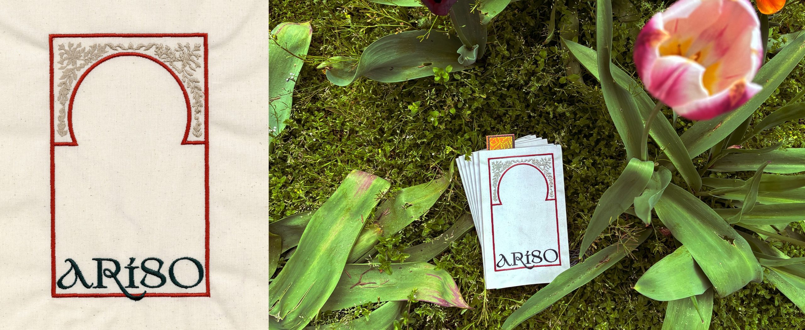
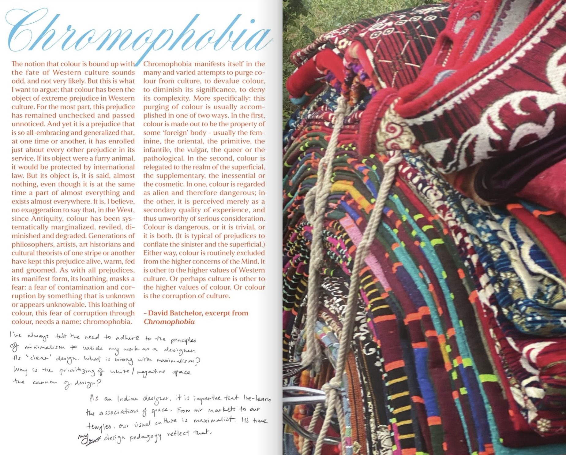
Visual reflections on identity and belonging through colour and texture.
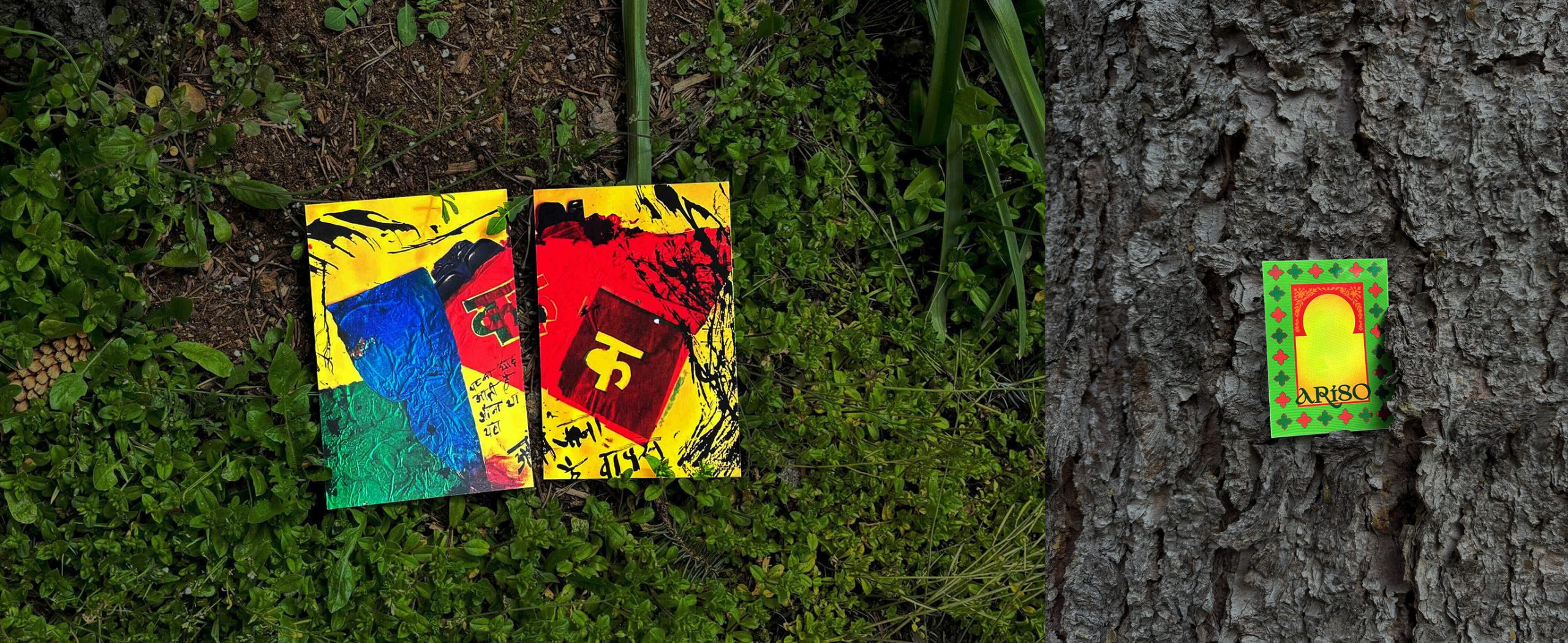
My book Ariso is the culmination of my practice space. It explores the politics of identity markers such as language and dress. It is guided and supplemented by research essays, reflections and creative writing, all geared toward elaborating on Indian perspectives on design. Ariso means Mirror in Kutchi.
The book cover emulates traditional designs of Indian mirrors, taking visual cues from Indian embroidery styles. It is embroidered onto fabric, giving the cover a textural quality. The colours red, green and gold—common colours of traditional Indian attire such as sarees— are used to represent renewal and divine blessings.
THEMES AND STRATEGIES
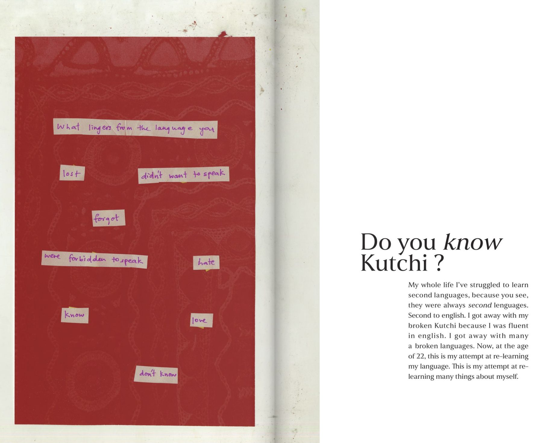
REFLECTIONS ON LANGUAGE
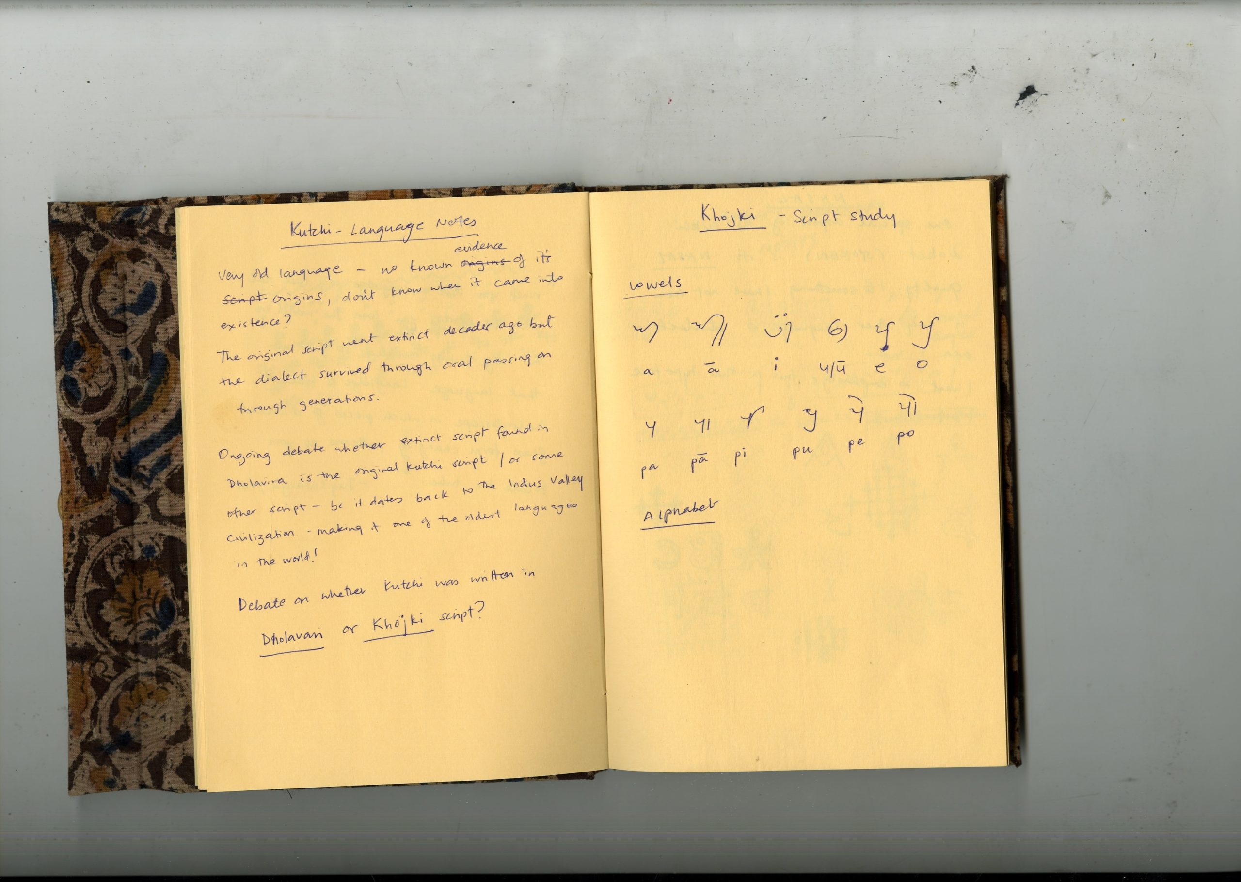
My exploration began from Language. I was interested in the different dialects of Kutchi and their written expression in the Gujarati script, since Kutchi has no script of its own. This echoed my own confused expression of ethnic identity through language.
With the aim of investigating the hierarchies of my languages, I began reflecting, writing, and researching the linguistic superiority of English. I found that power differences also existed within national and regional language dynamics.
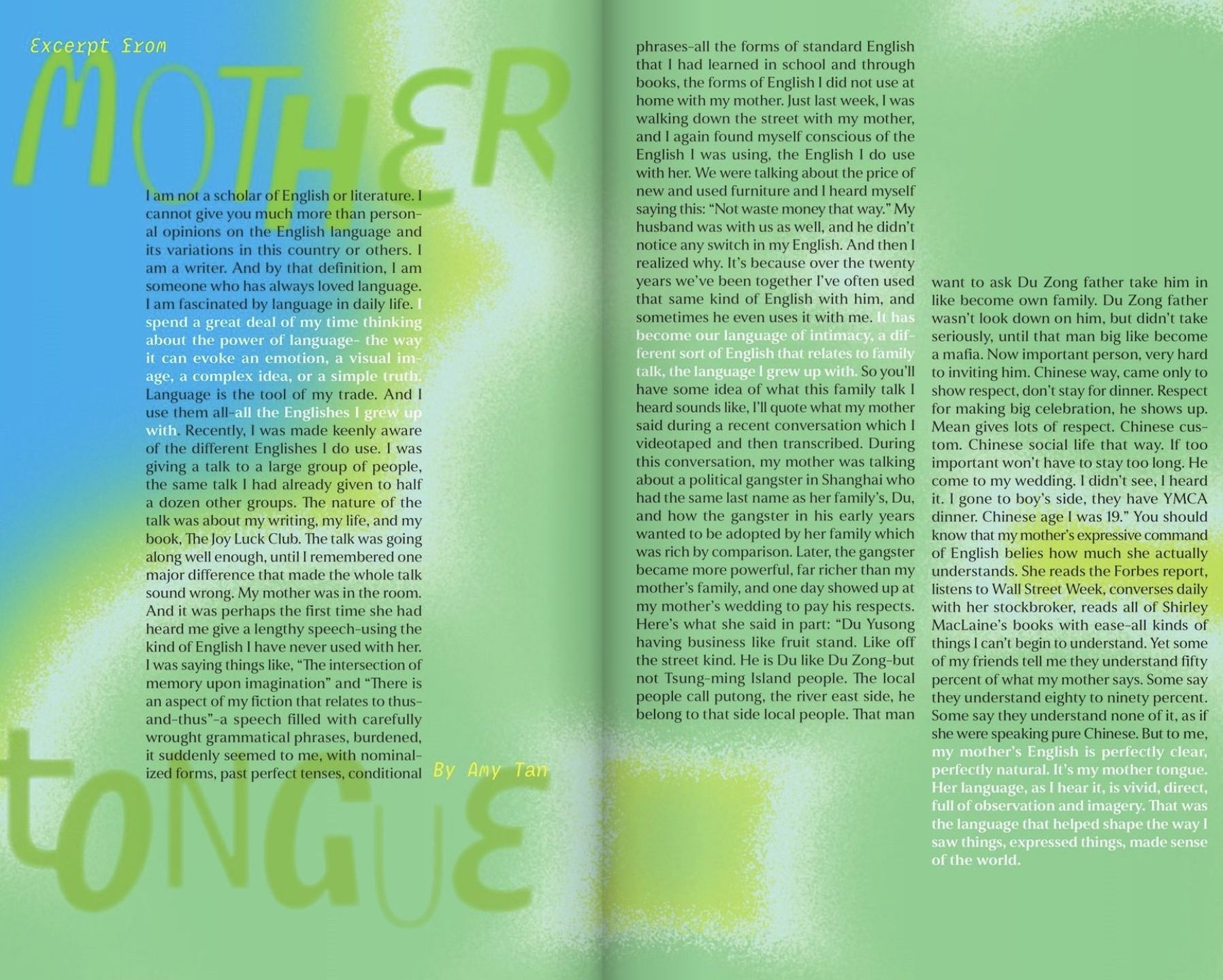
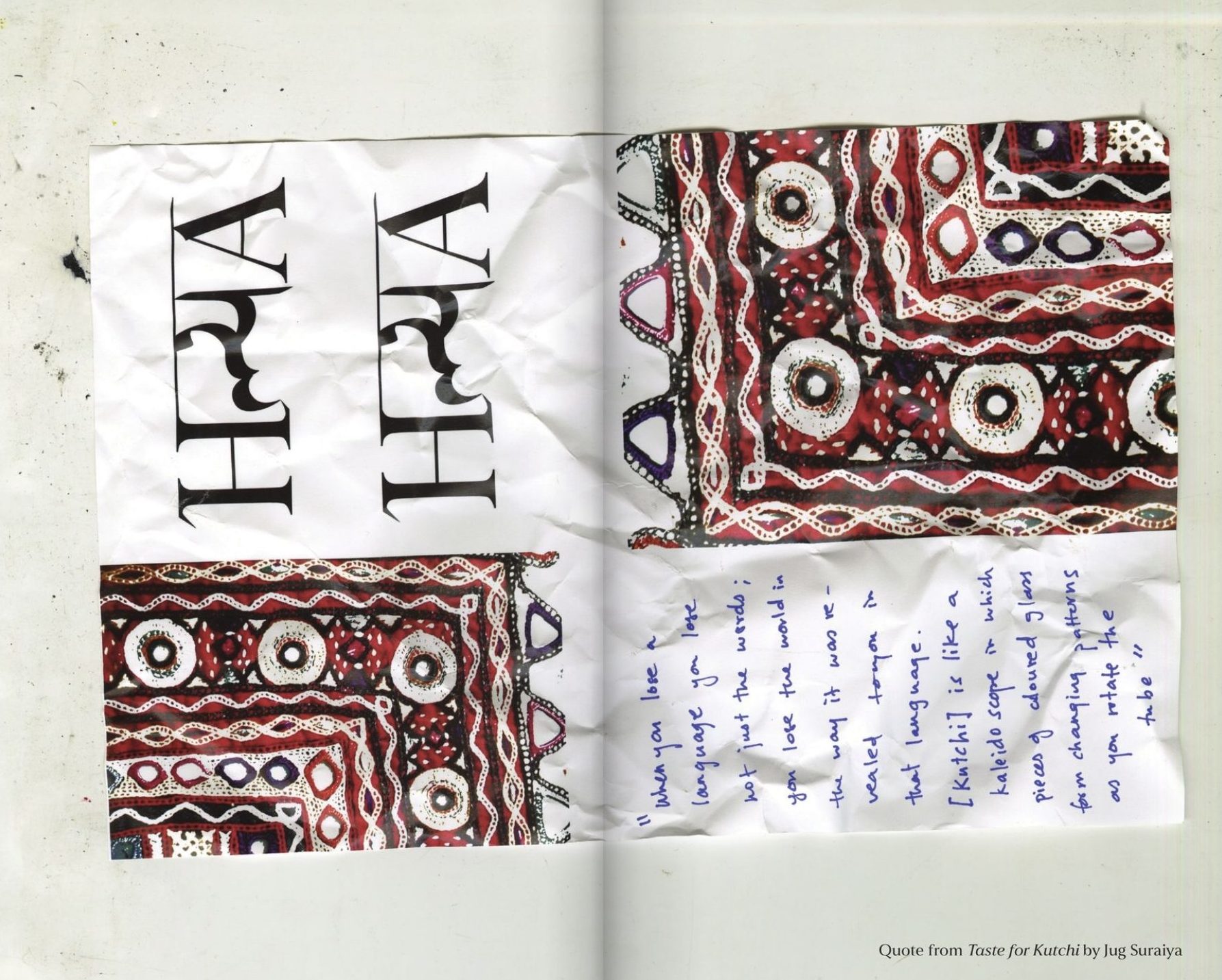
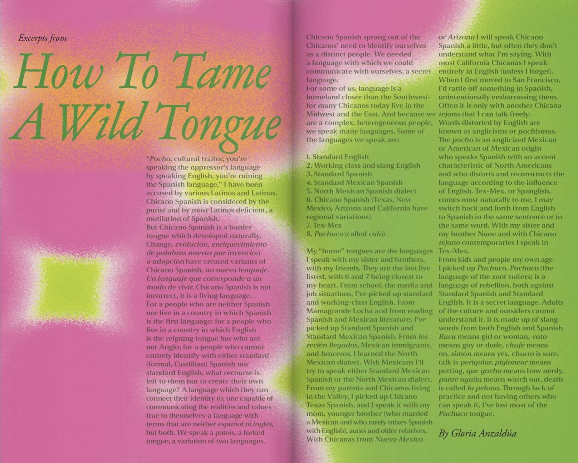
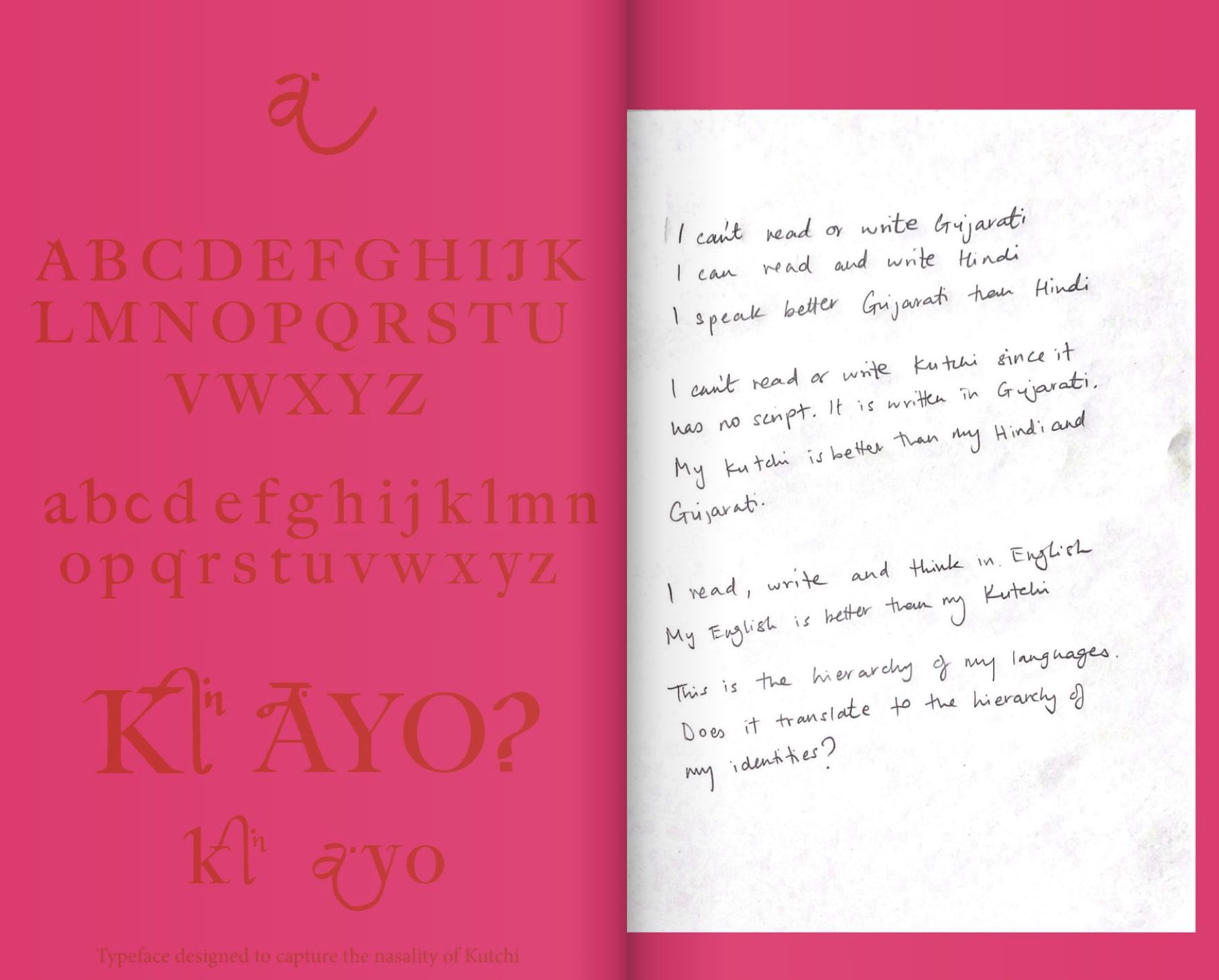
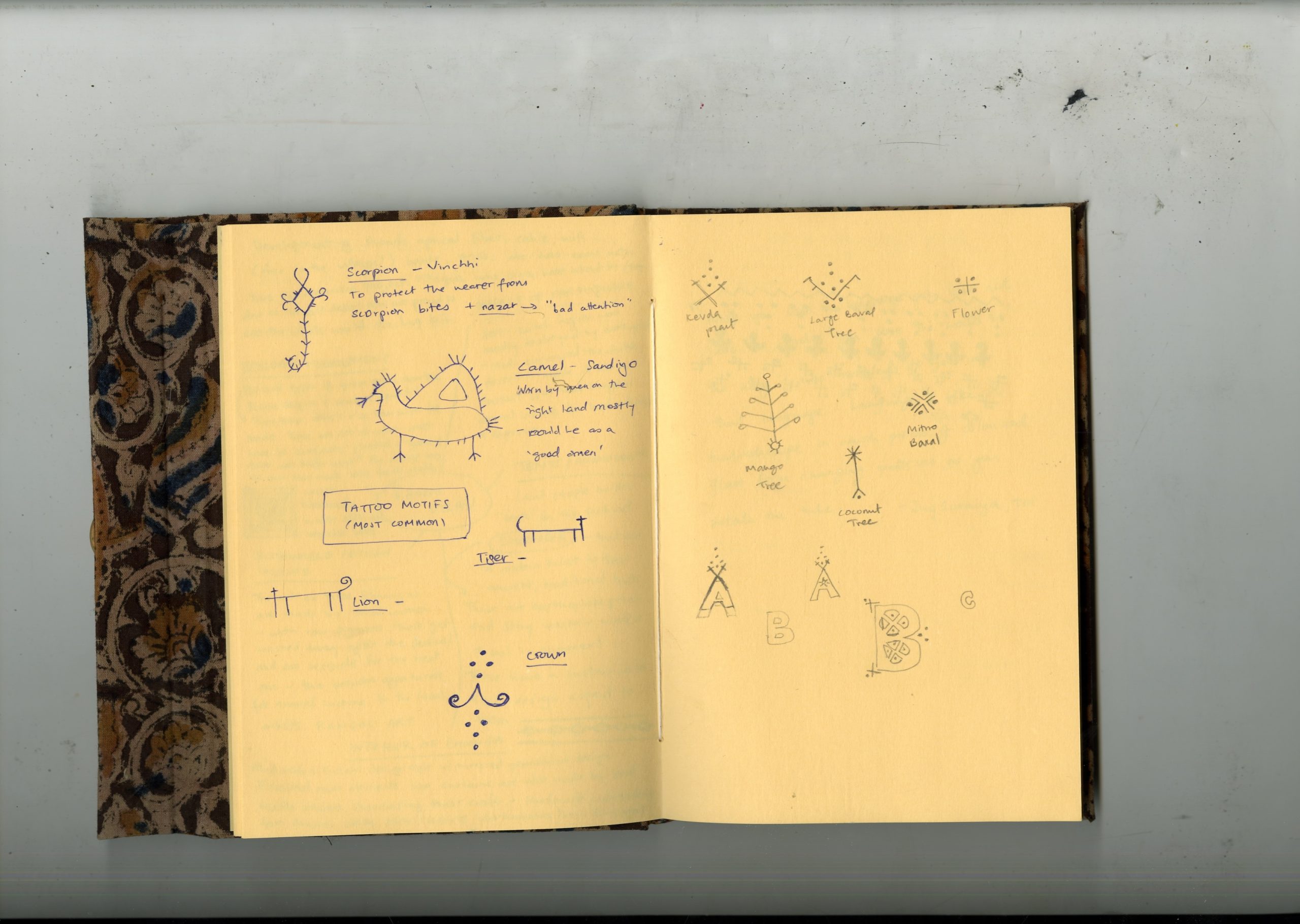
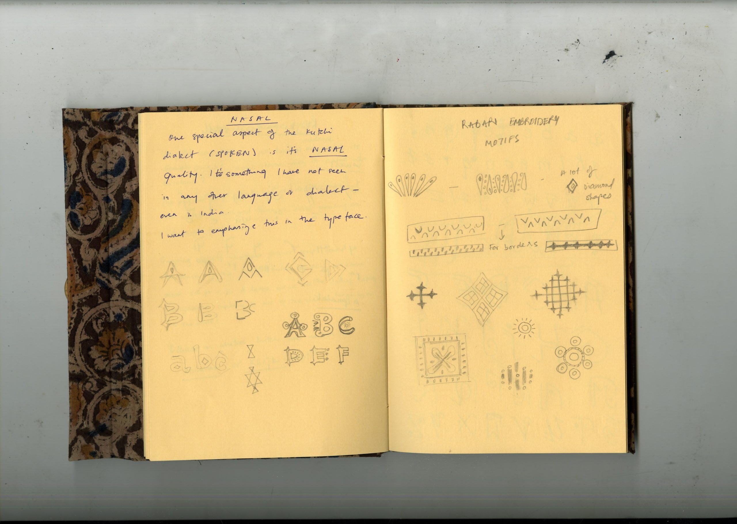
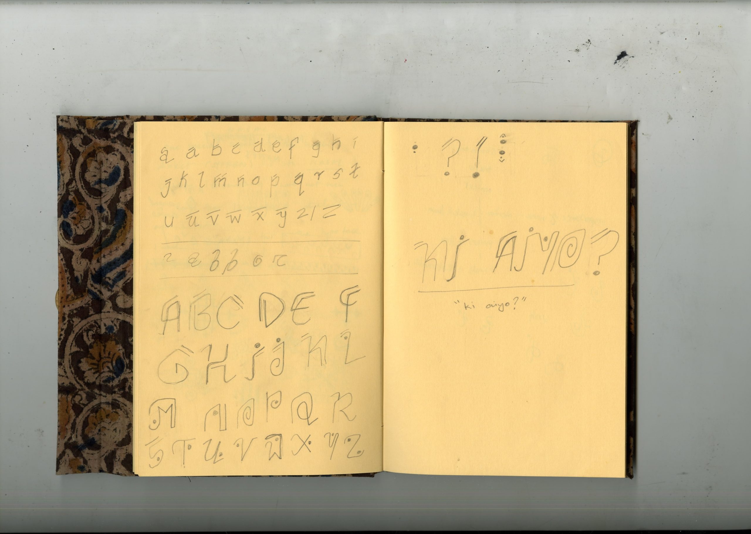
Intrigued by the heavy nasality of Kutchi, I created a typeface to represent the way Kutchi is spoken in my family. To visualise the phonetics of my ‘language of intimacy’, as Amy Tan describes language variations created within families.
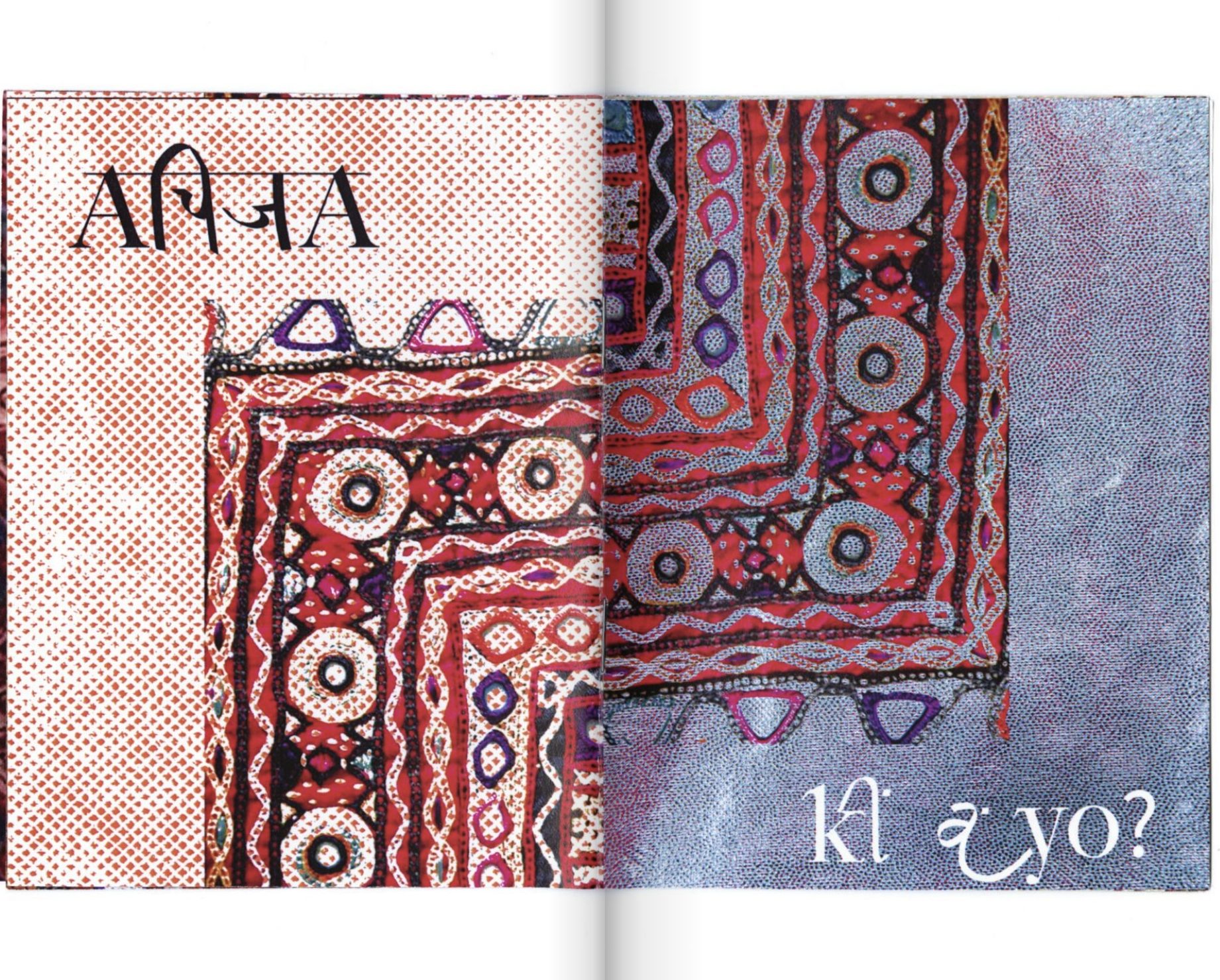
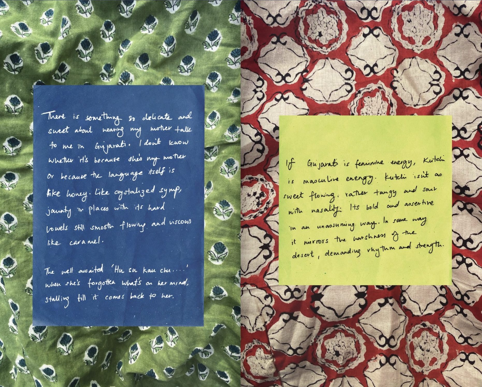
I focused on quintessential phrases such as ‘Ki Ayo’ and ‘Achija’ (come again) to capture the dialect through my experiences. I used the Latin (English) and Devanagari (Hindi) scripts to show the power of these two over regional languages such as Kutchi and Gujarati.
EXPLORATION OF IDENTITY
My name has always perplexed me. I never felt like it belonged to me. Or rather I didn’t belong to it.
This reflection prompted an exploration of ethnic identity, and the contradictory feelings of fear and pride that come with being part of any diaspora. I aim to visualize this juxtaposition of emotions and create space for the dichotomies of identity.
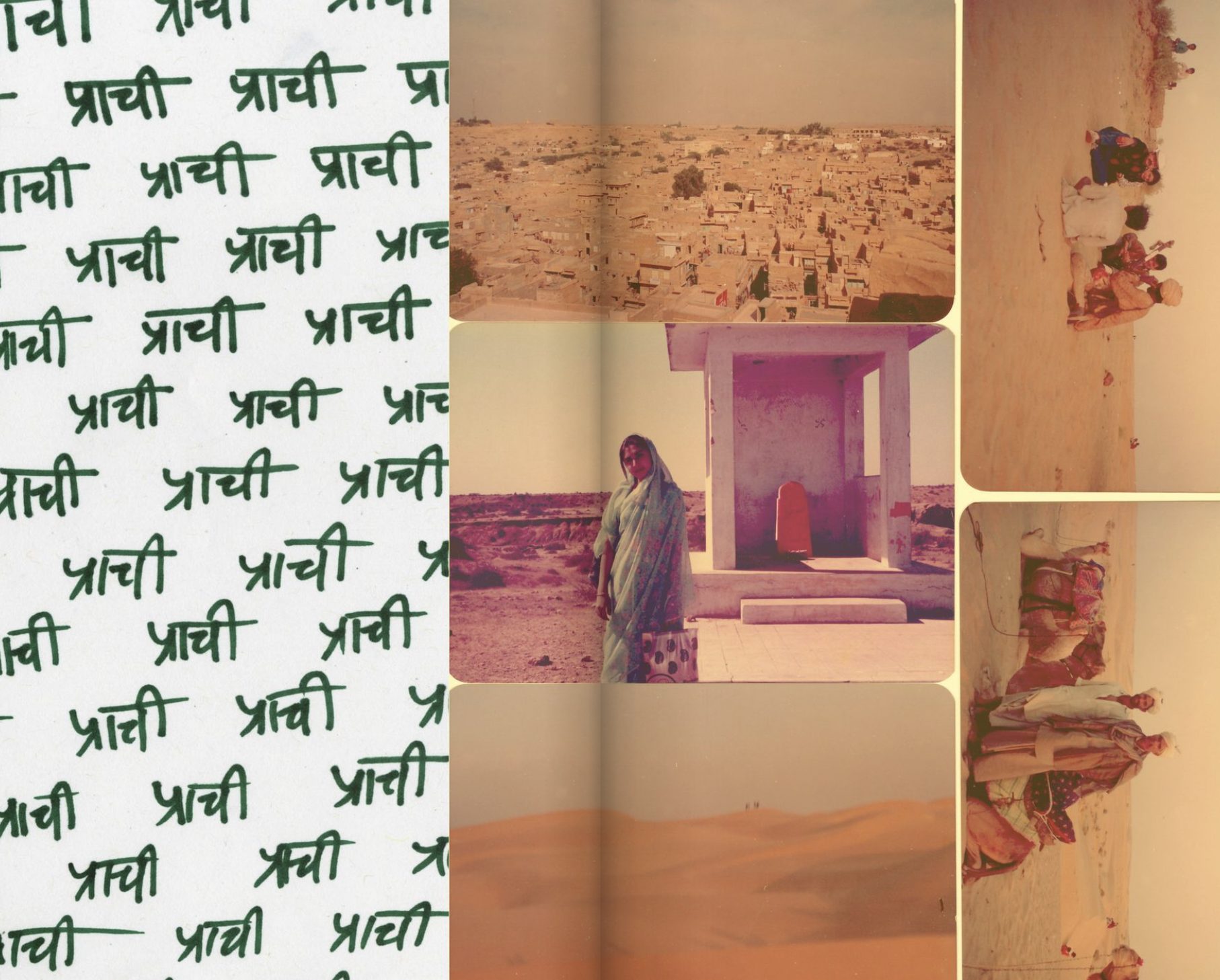
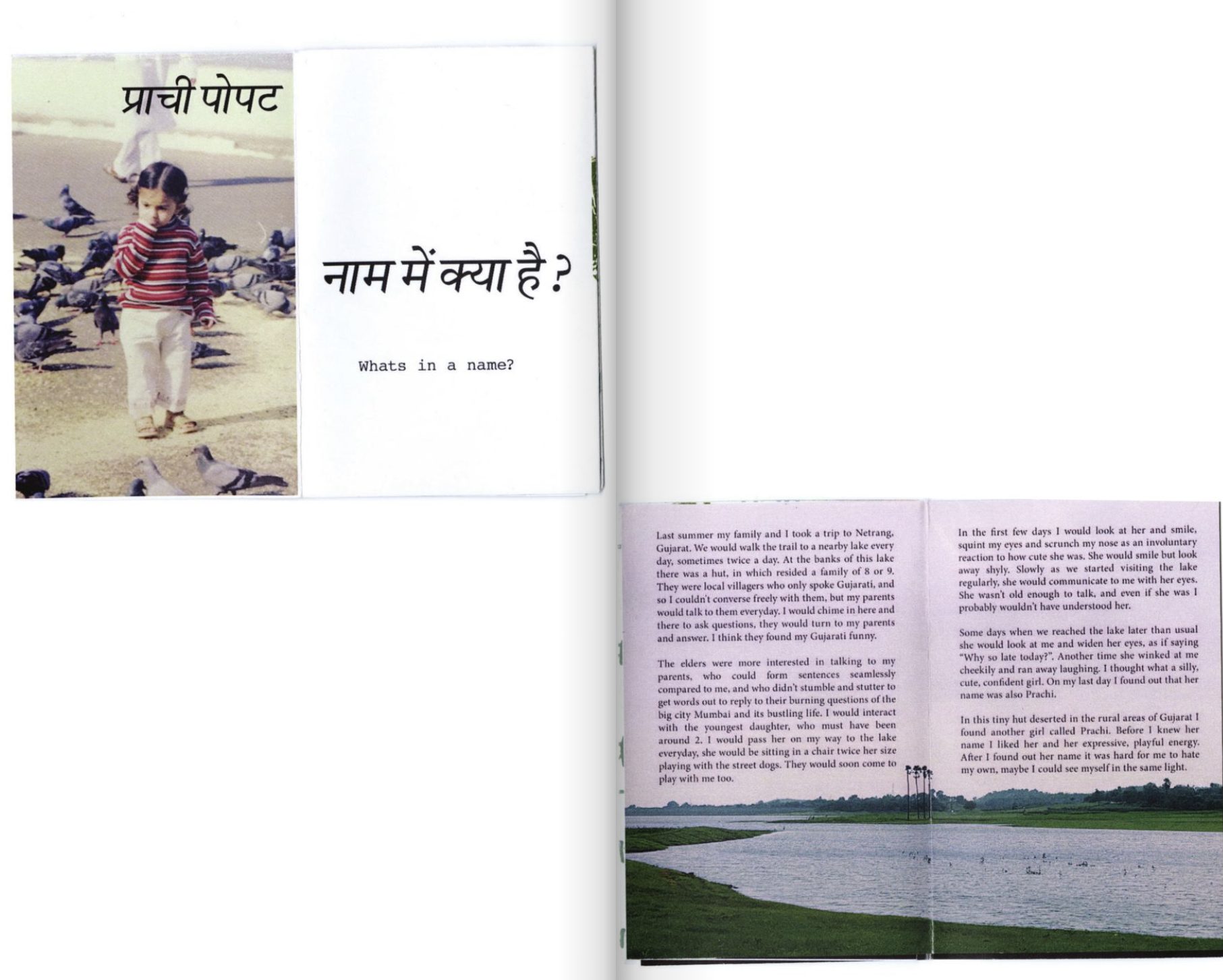
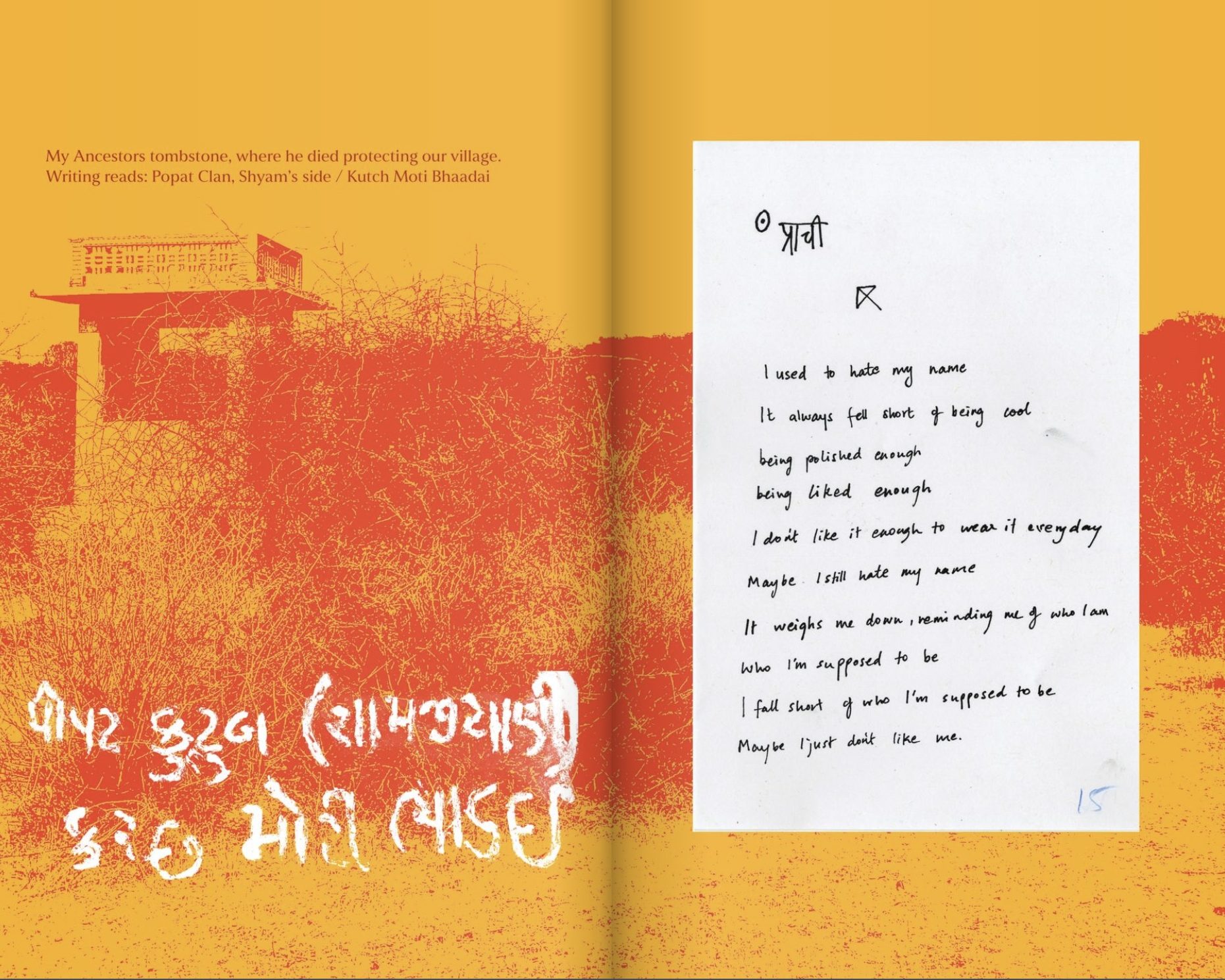
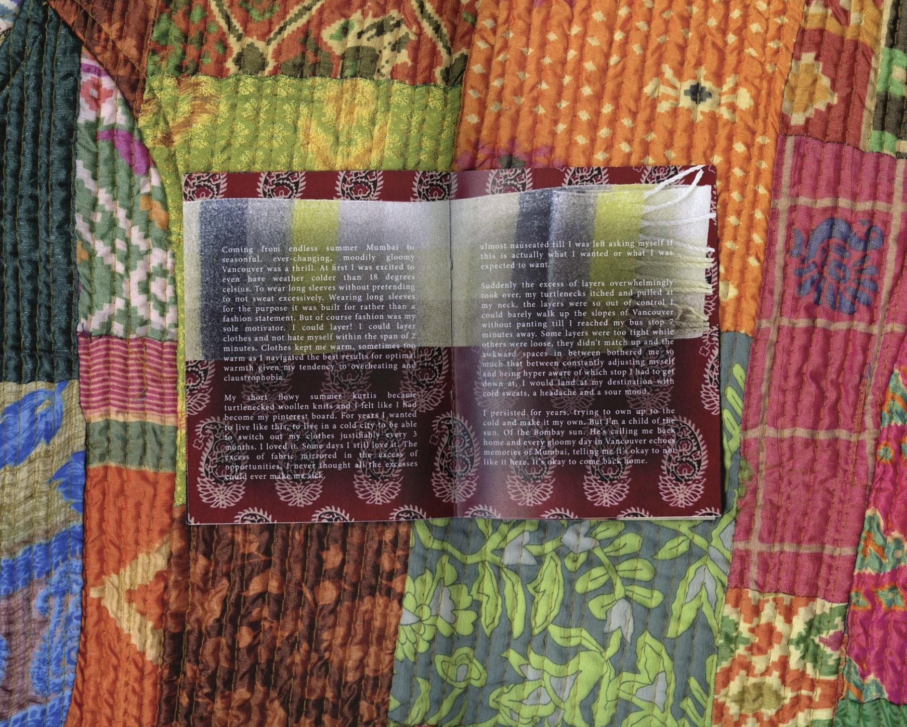
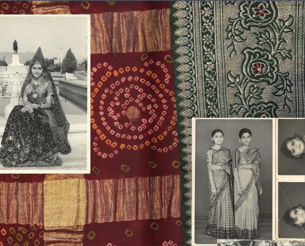
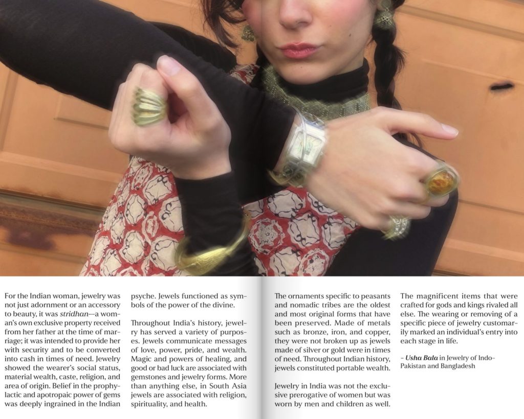
I explore Indian traditions of passing down clothing and jewellery as a form of history and record keeping. This is a more experiential form of recounting history than written documentation, as it allows individuals to engage with their heritage on a visceral level that transcends the written word.
TEXTILE AS ALLEGORY
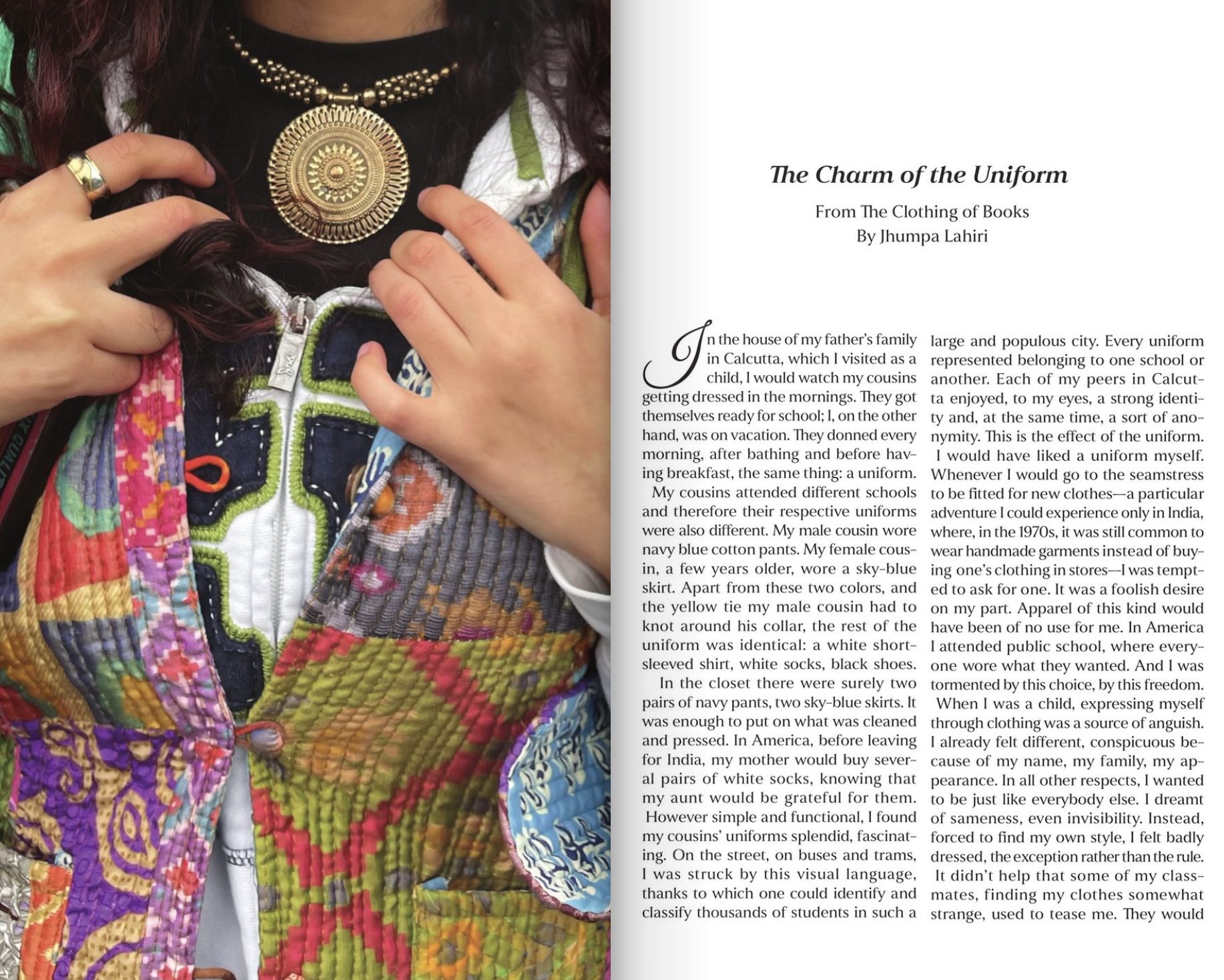
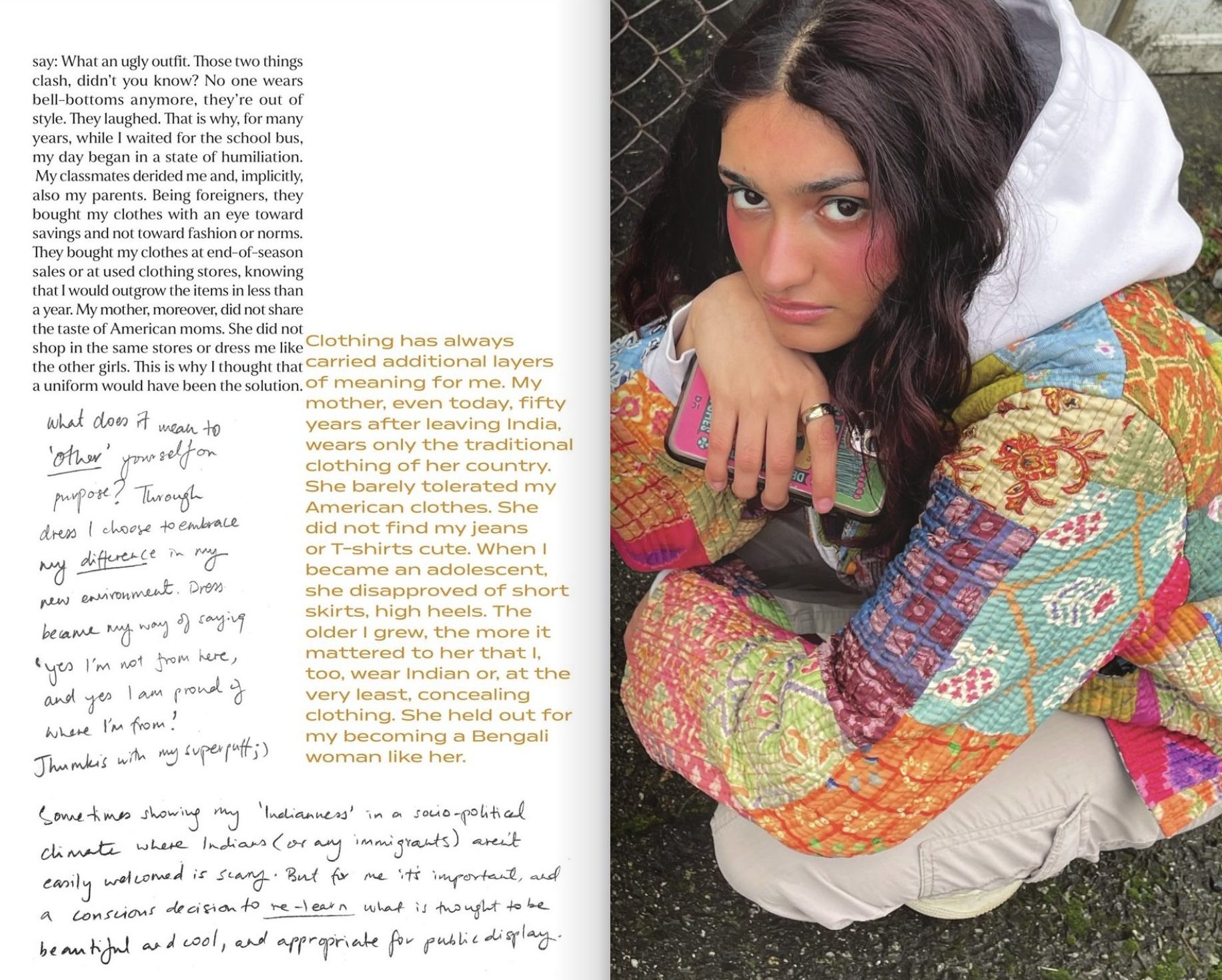
Throughout this practice space I use Indian textiles as a metaphor for larger themes of identity, belonging, difference, and the politics of being considered ‘ethnic’ in a predominantly white environment. I’m interested in investigating the role of fashion as an identity marker and a form of ethnic expression. As a tool to ‘other’ yourself on purpose.
BELONGING
Being away from home was hard on me emotionally. I never felt grounded enough, and the constant change of moving every 3 months took a toll on my confidence.
Moving to the West for any purpose comes with the expectation of a better life. This was not the case for me. I wanted to visualize my reality of loneliness and isolation, and the sense of disillusionment that came with my new life.
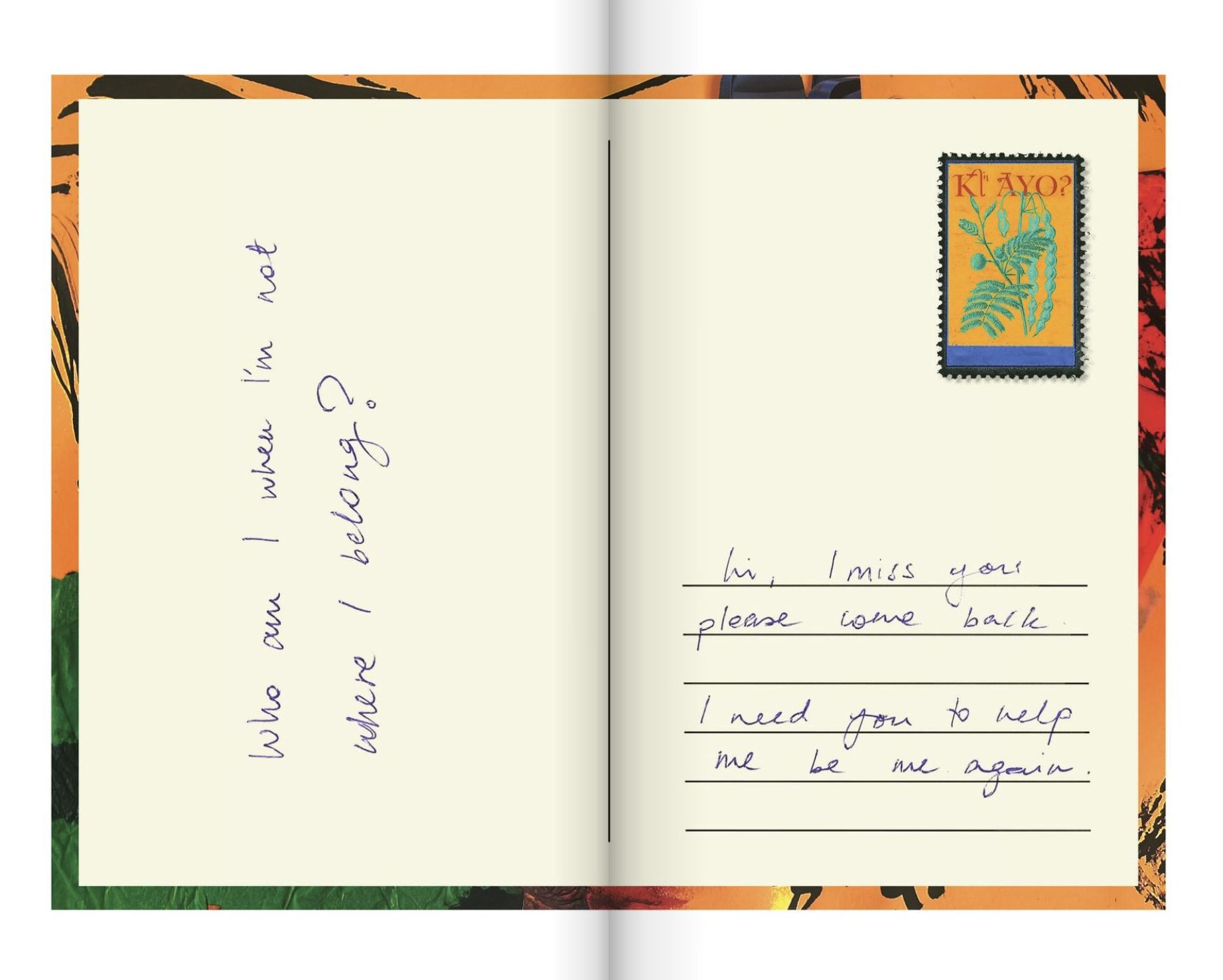
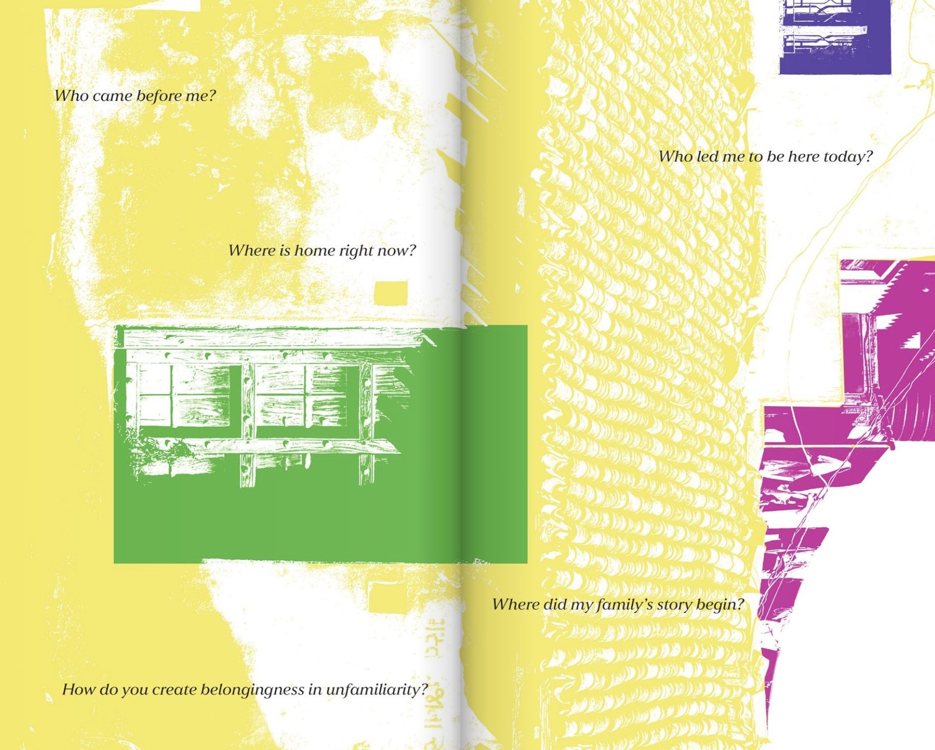
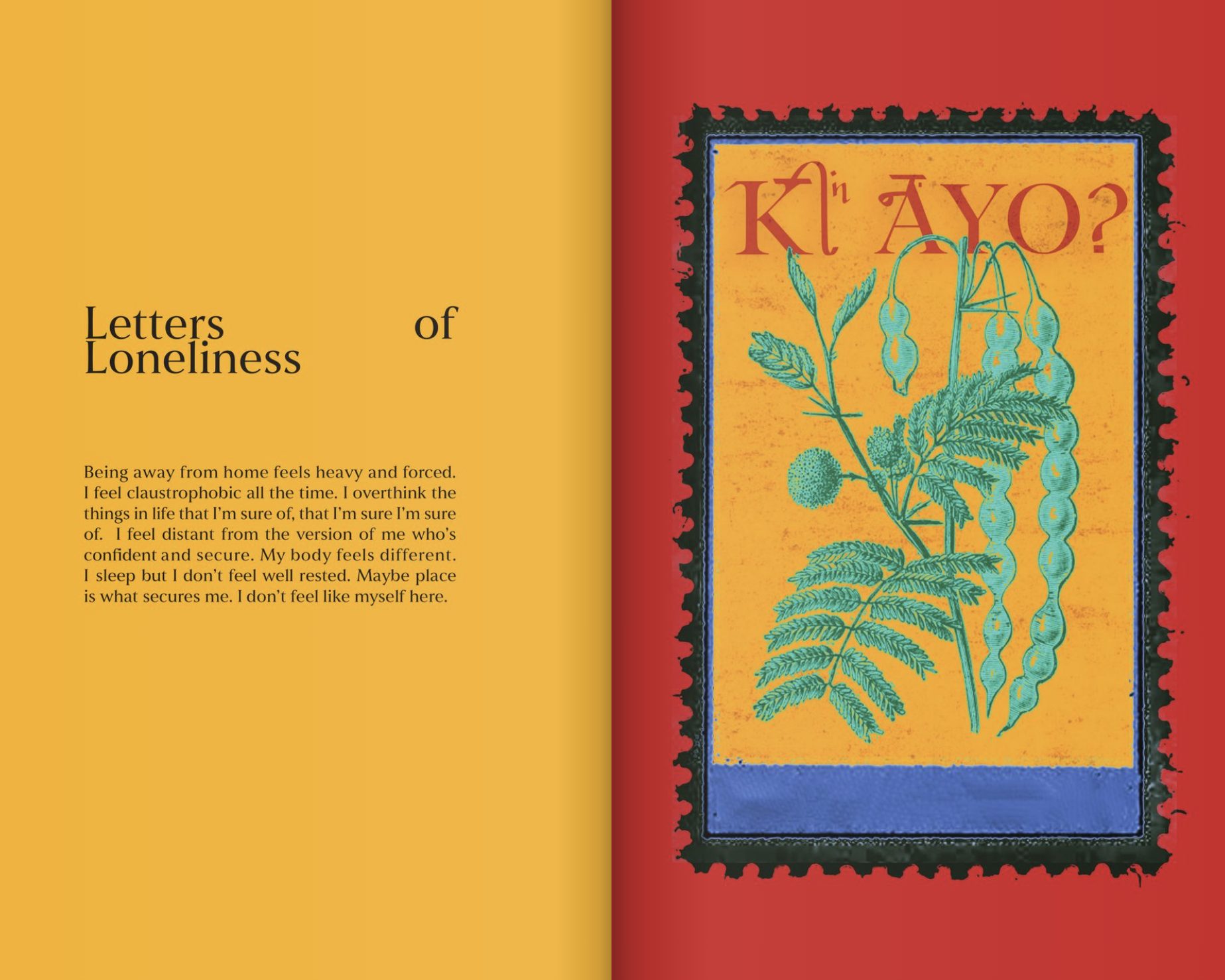
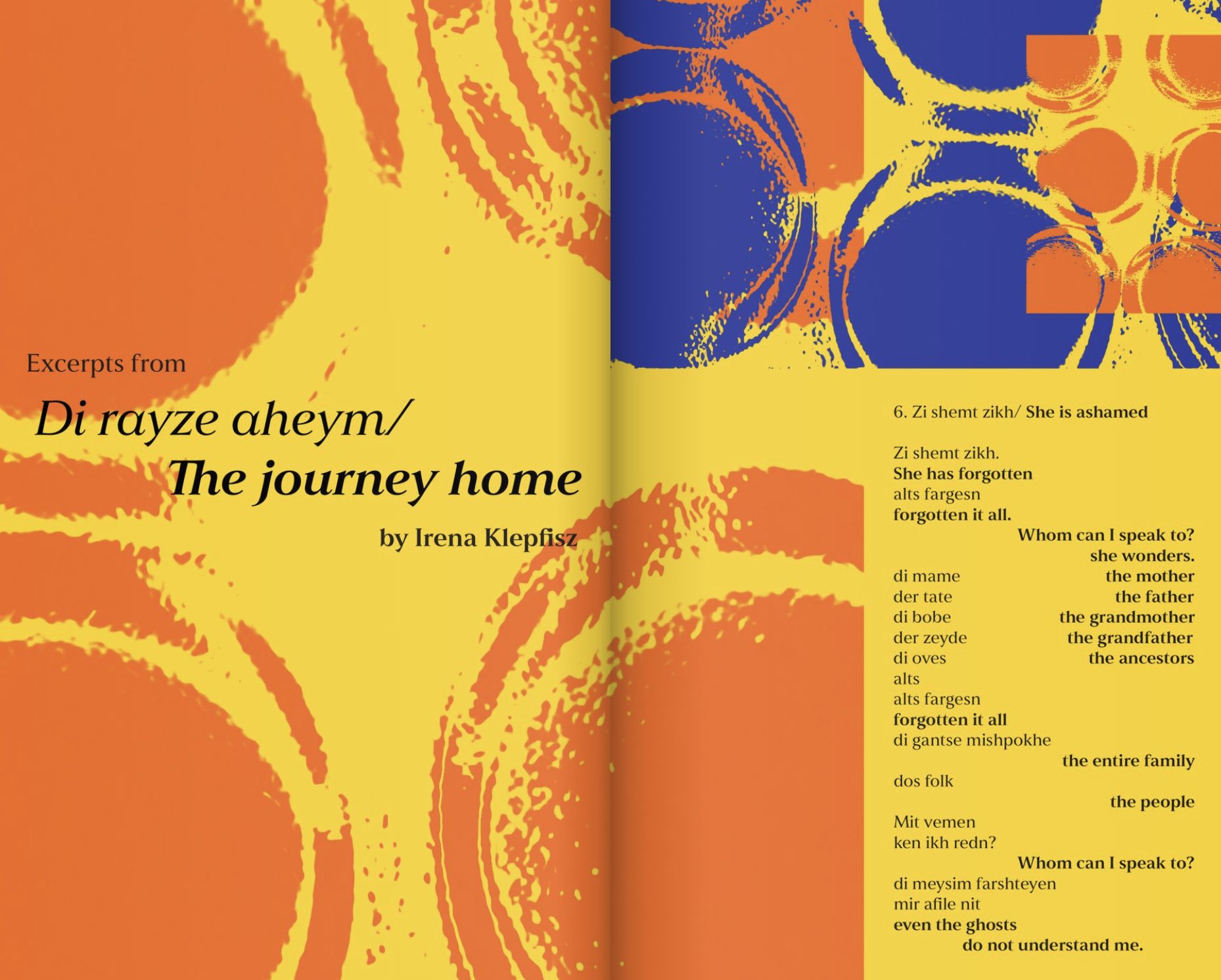
My practice is guided by a range of open ended questions regarding belonging, heritage and place.
DESIGN PEDAGOGY AND PRACTICE
I aim to represent age-old Indian crafts and traditions in my design practice. Having studied Roland Barthes’ work on semiology and its manifestation in the Bauhaus movement, I explore mehendi (henna) design and its ability to narrate a story.
My intention is to show that these traditional practices, when viewed critically, also exhibit semiotic techniques of symbolism and iconography.
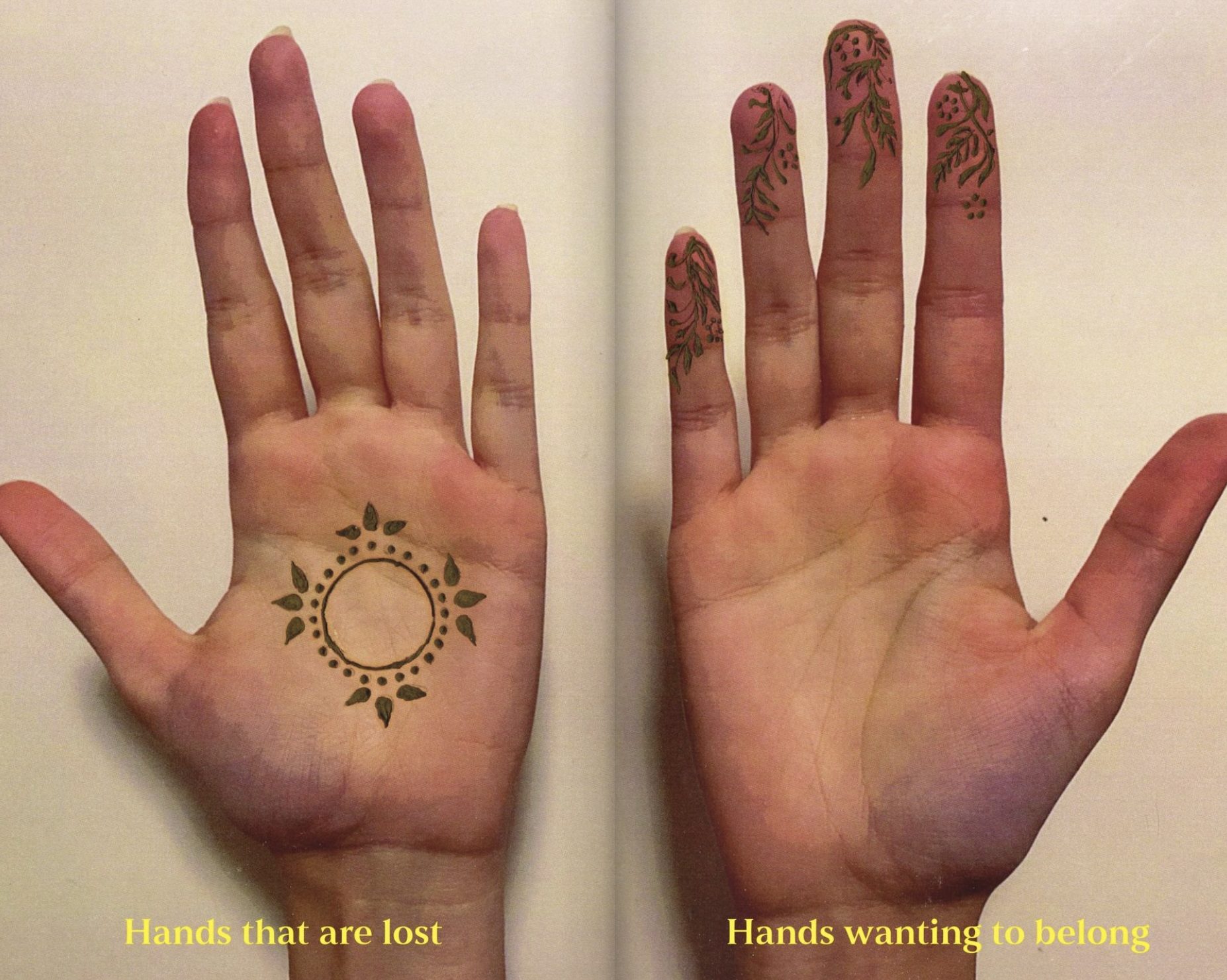
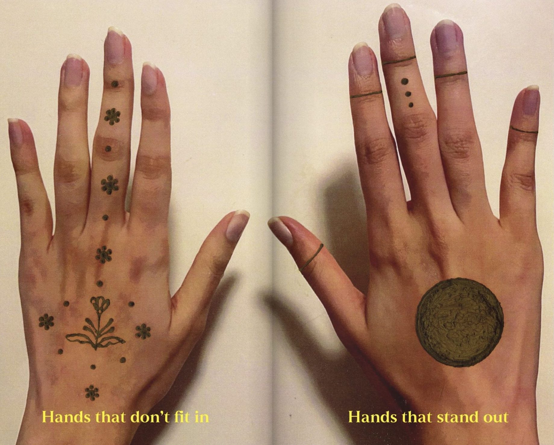
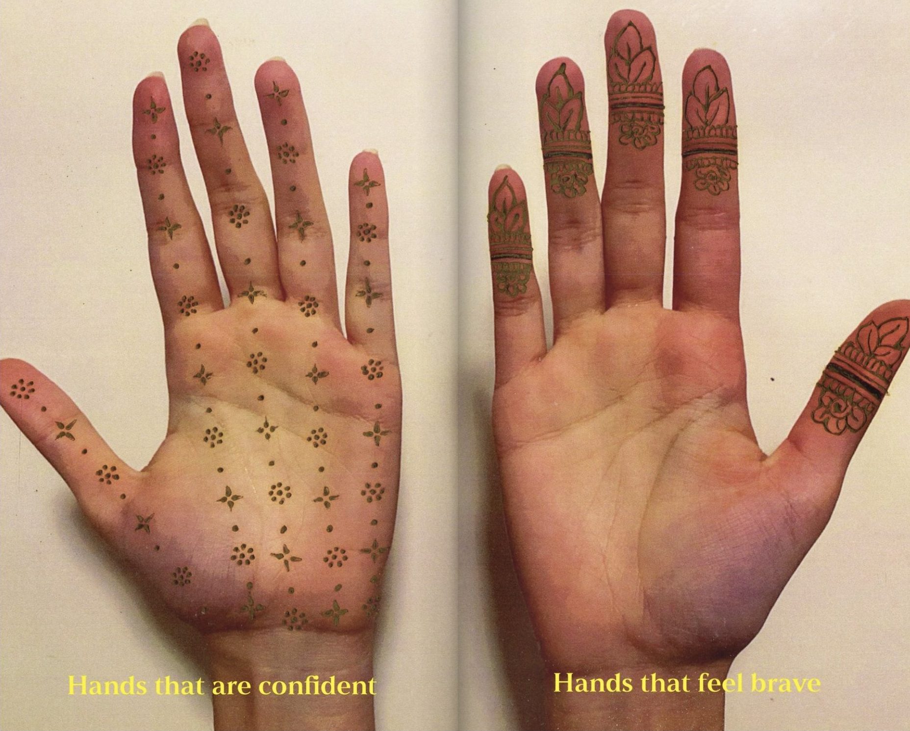
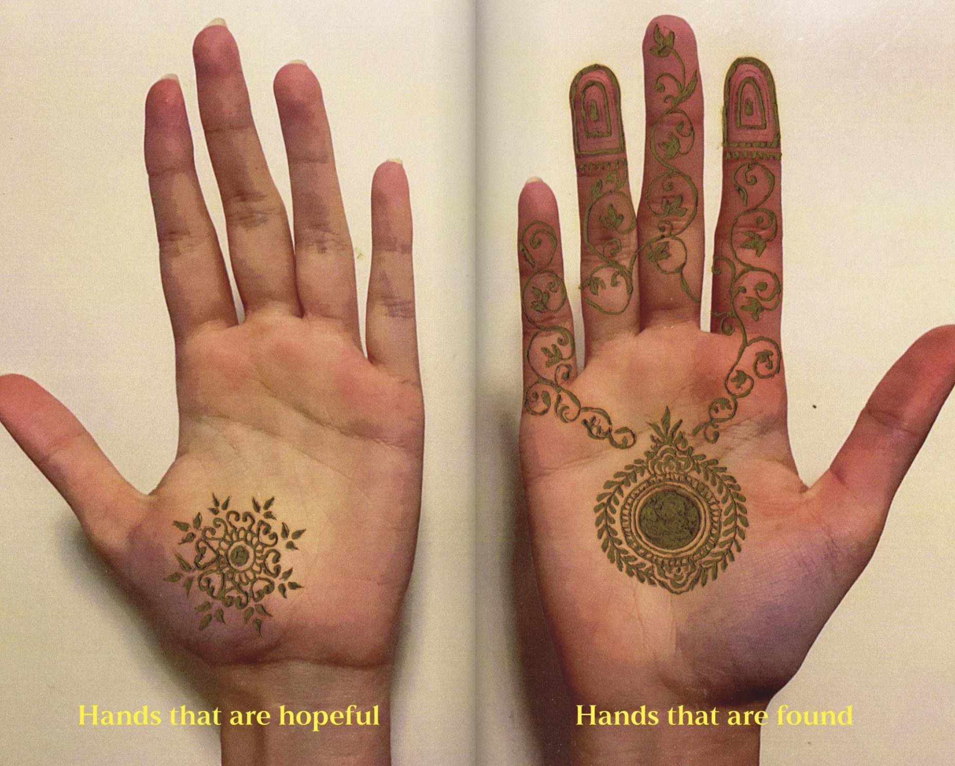
Whereas the above example introduces Indian practices to a western framework, I am also interested in re-imagining this framework, as one that prioritizes designing for an Indian context and audience.
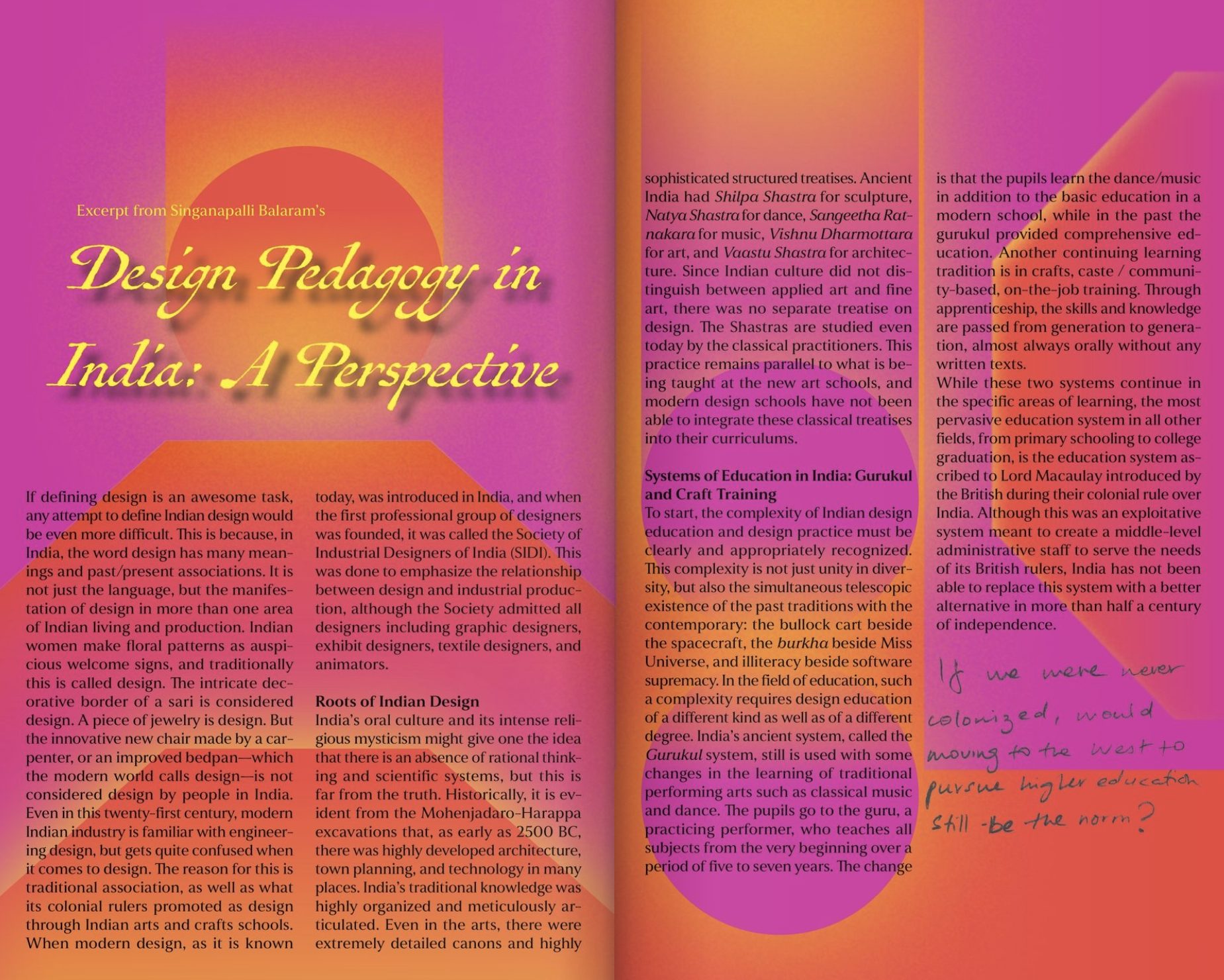
Essays that explore design through a non-western lens have been excerpted and supplemented with notes and reflections from my practice.
EPHEMERA
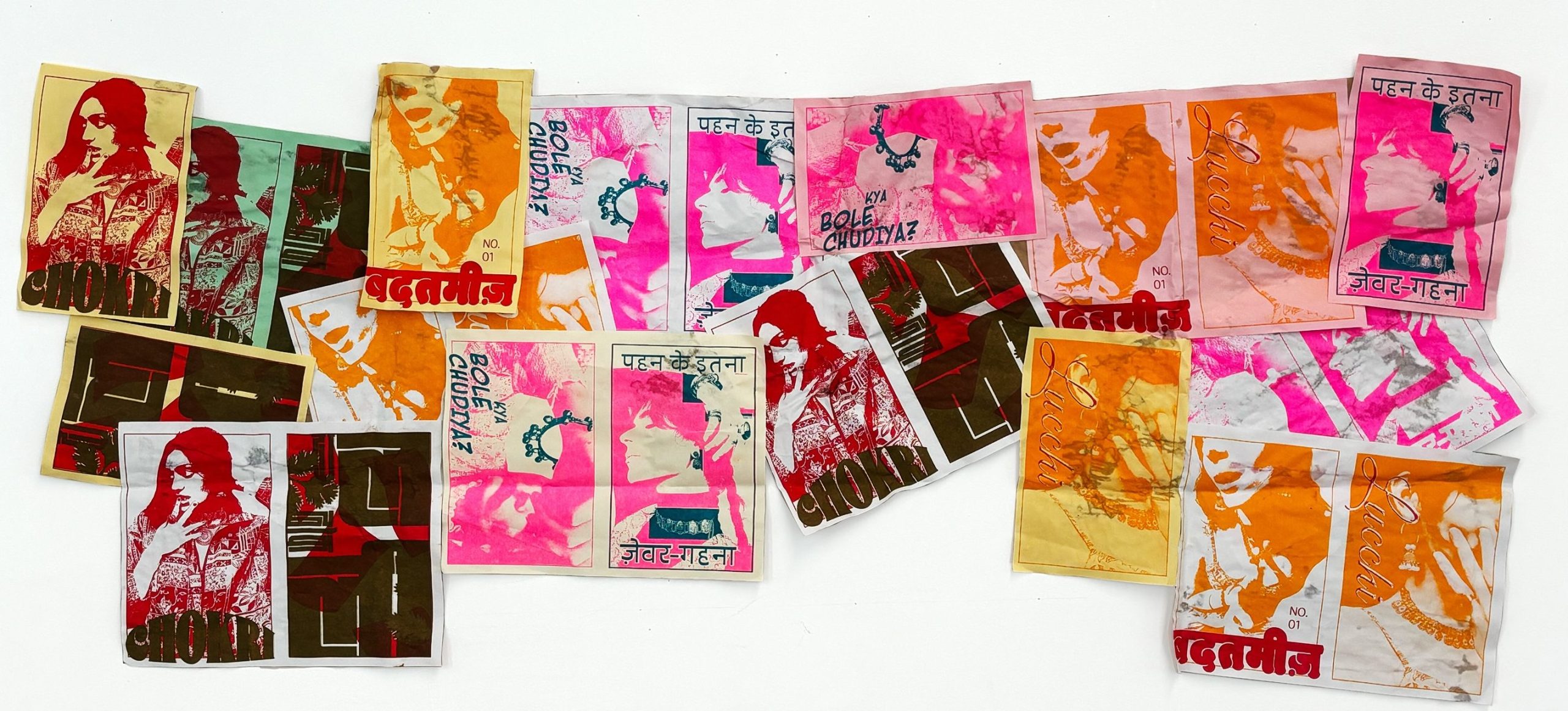
The book is accompanied by ephemera establishing a strong Indian visual identity. Umbrella themes of language and dress take on playful forms in risoprinted postcards, holographic stickers and stamps!
The postcards have different Kutchi and Gujarati words / phrases relating to girlhood and femininity. The focus on Indian textiles continues throughout all the design assets of this kit.
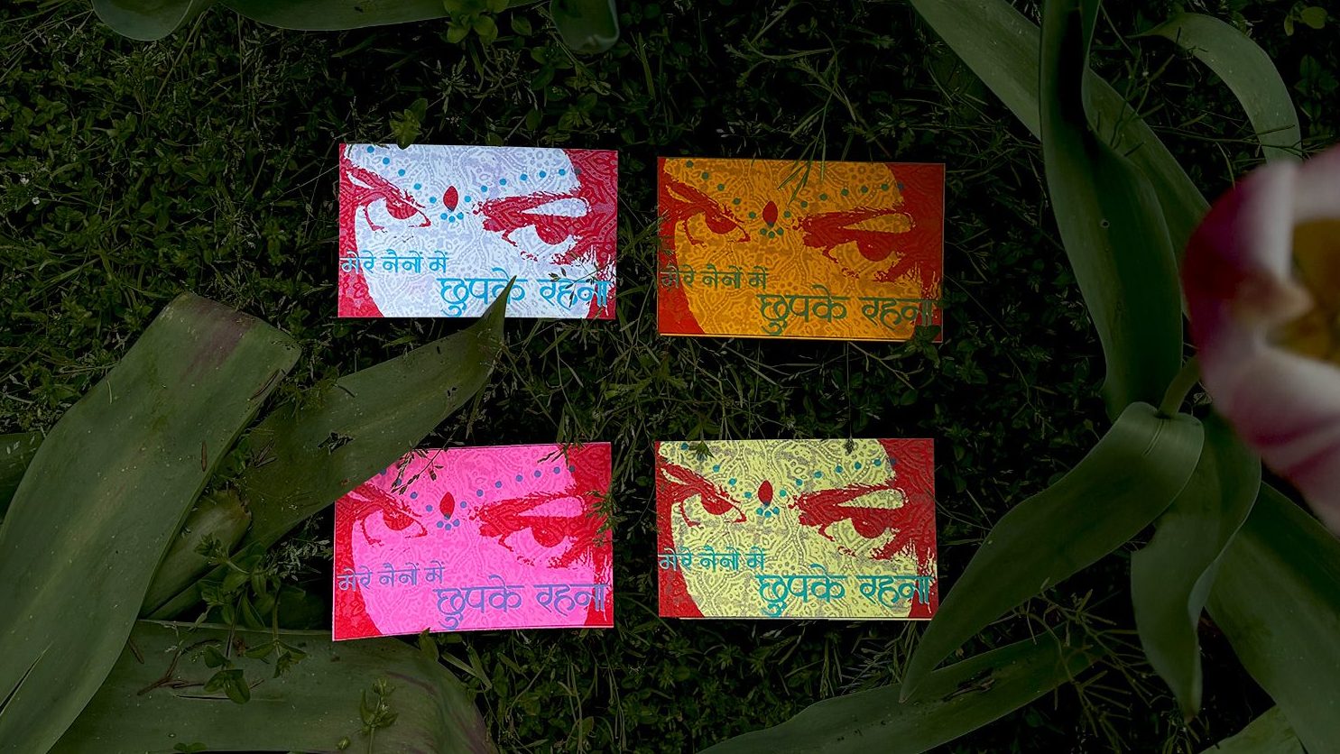
Mere Naino Mein Chupake Rehna (Stay hidden in my eyes)
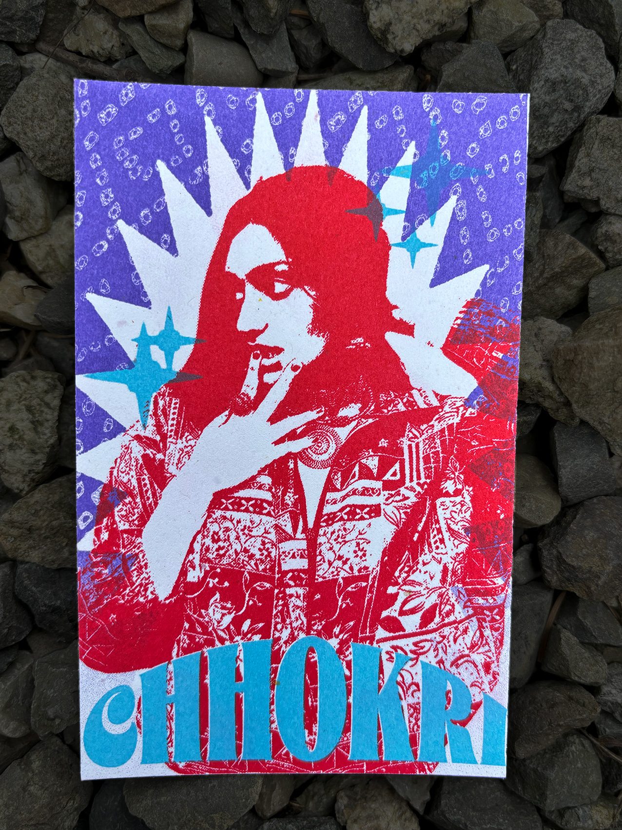
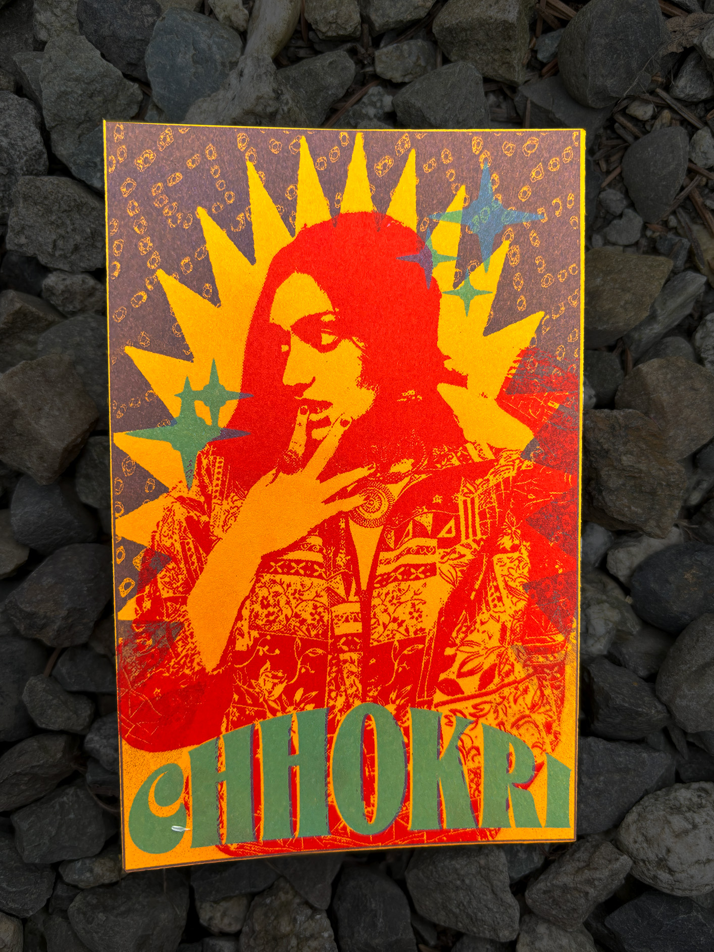
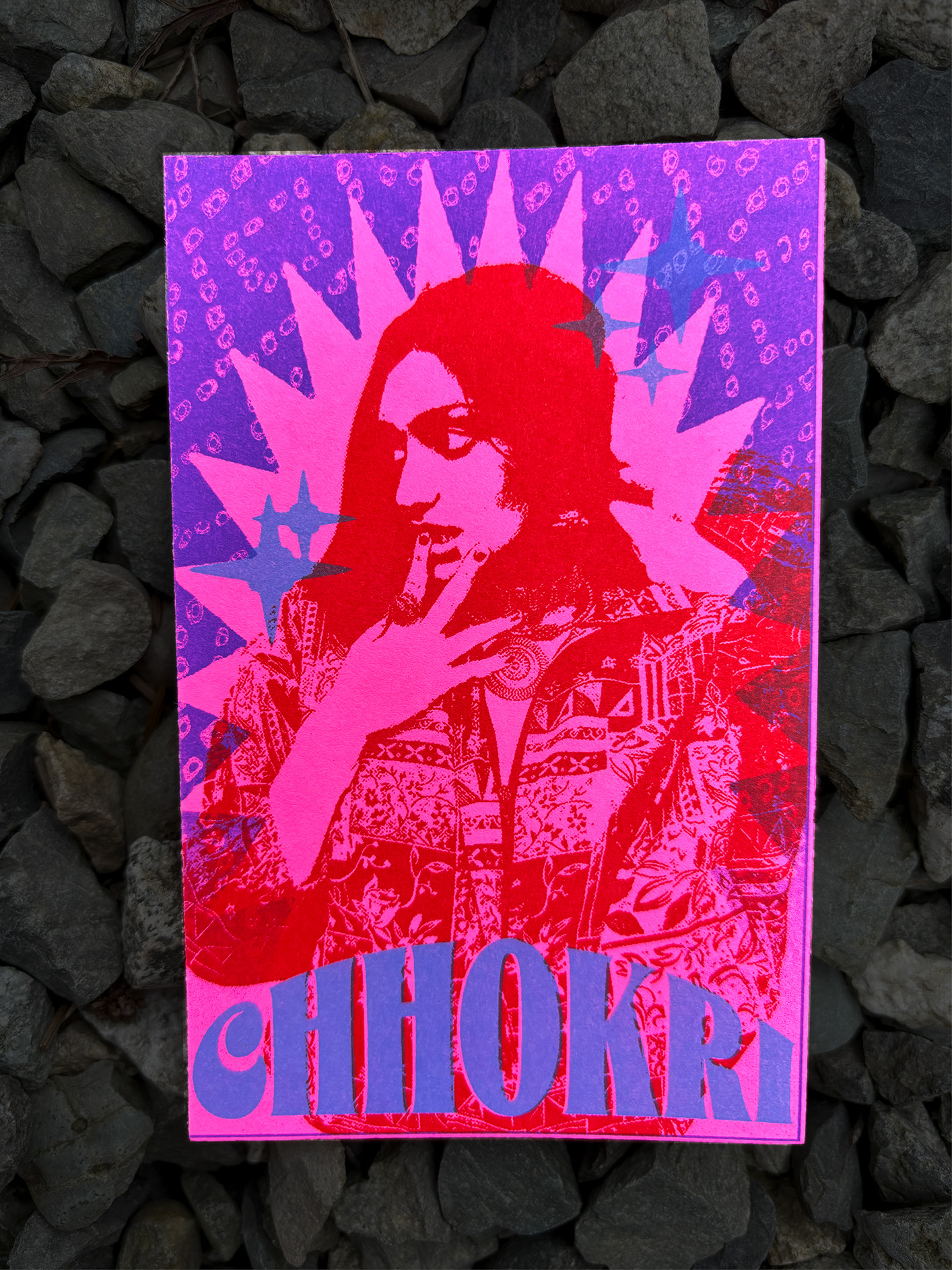
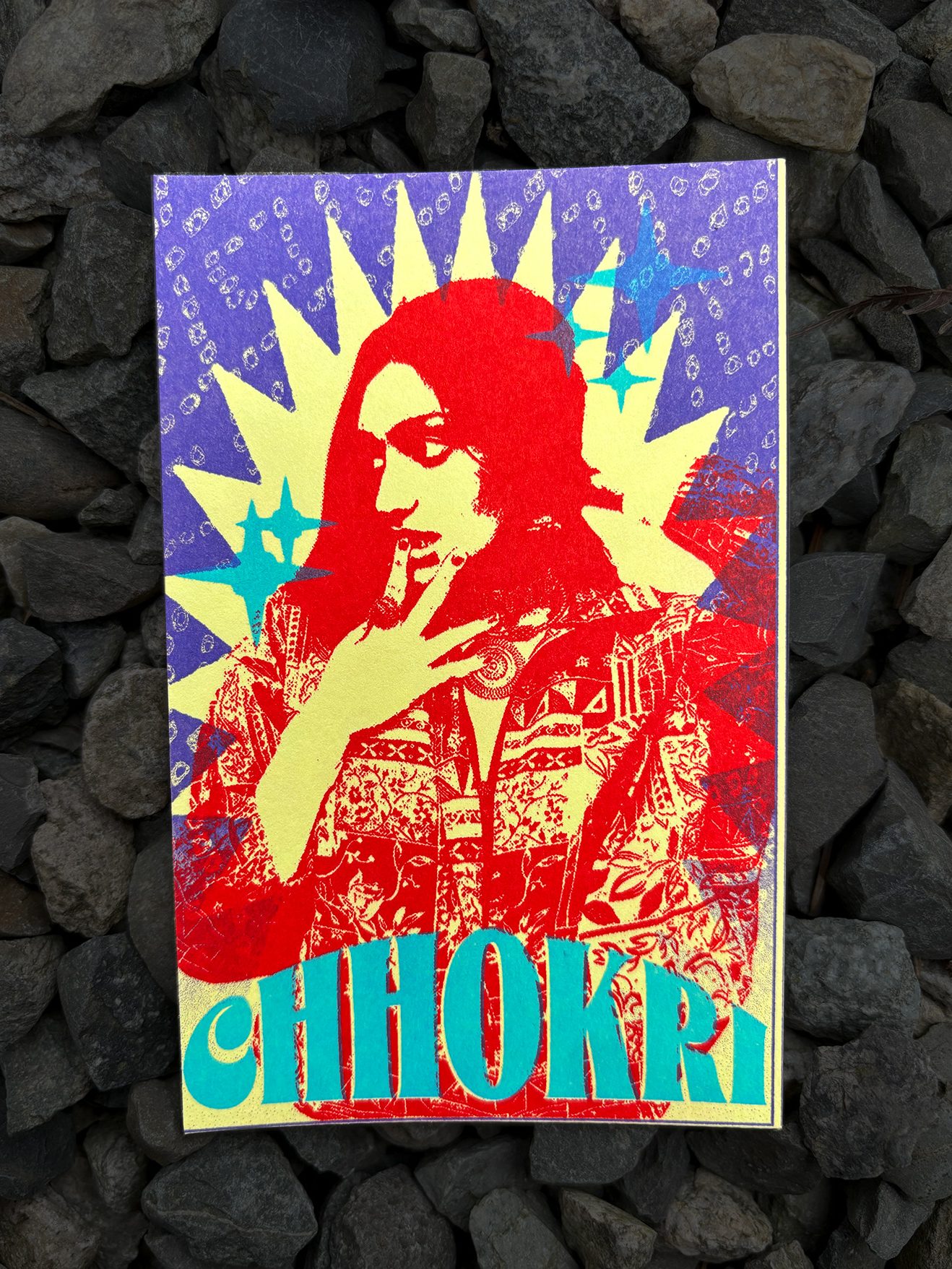
Chhokri (Girl)
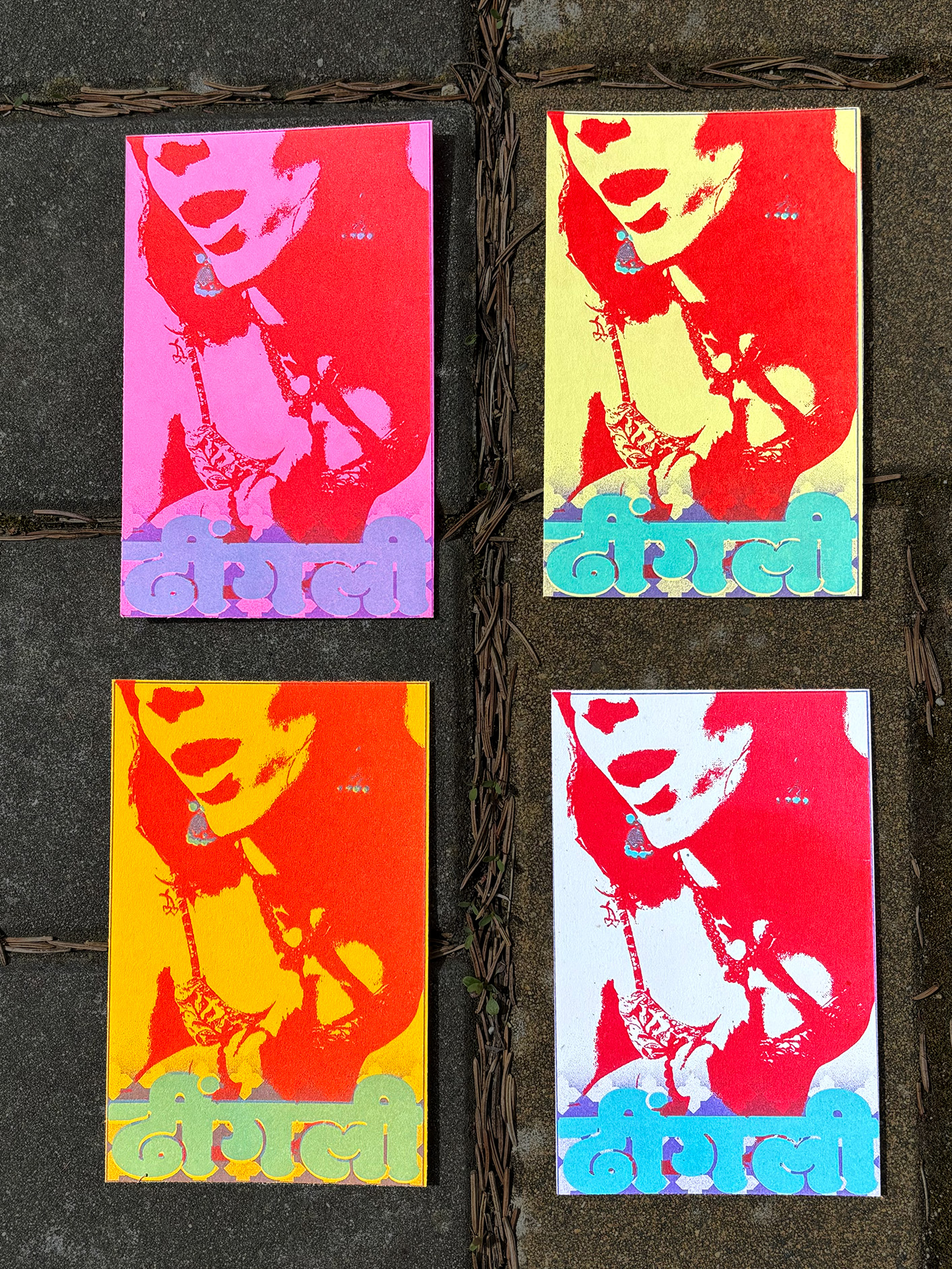
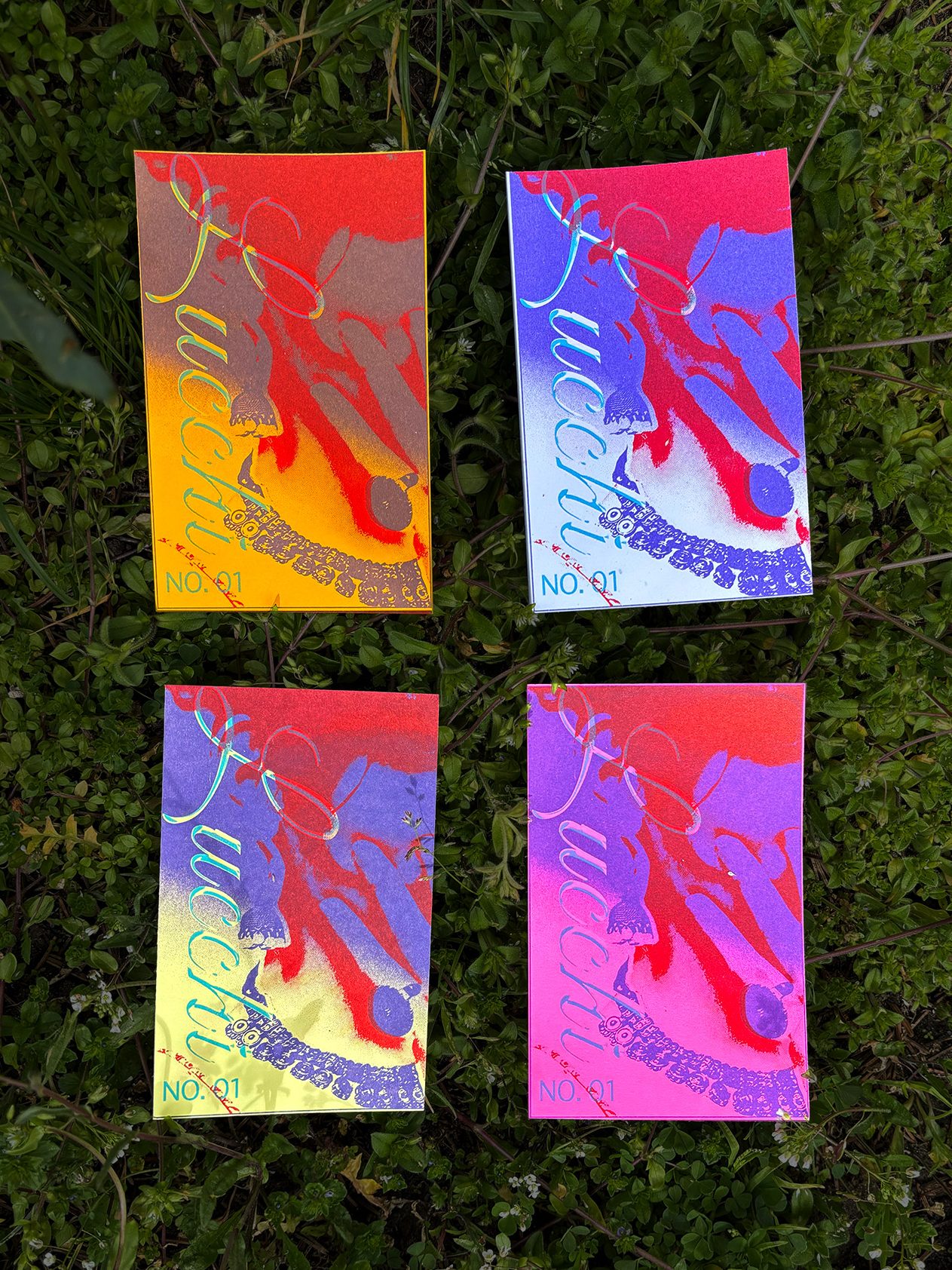
Dhingli (Doll)
Lucchi (Sly / naughty girl)
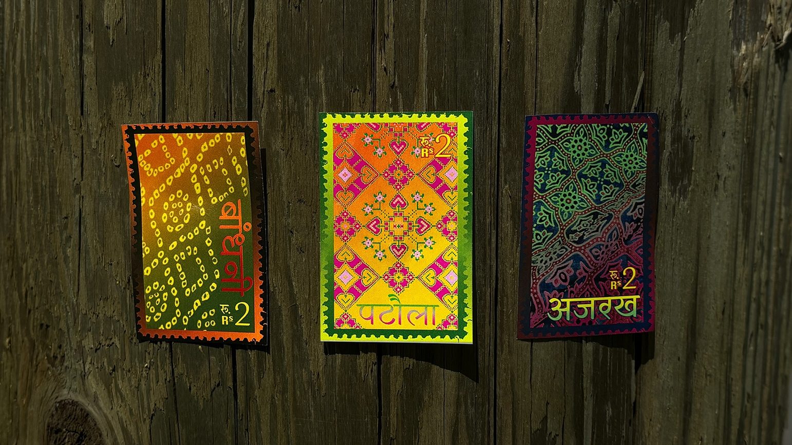
Stamp design showing 3 popular Indian prints—Bandhani, Patola and Ajrakh.
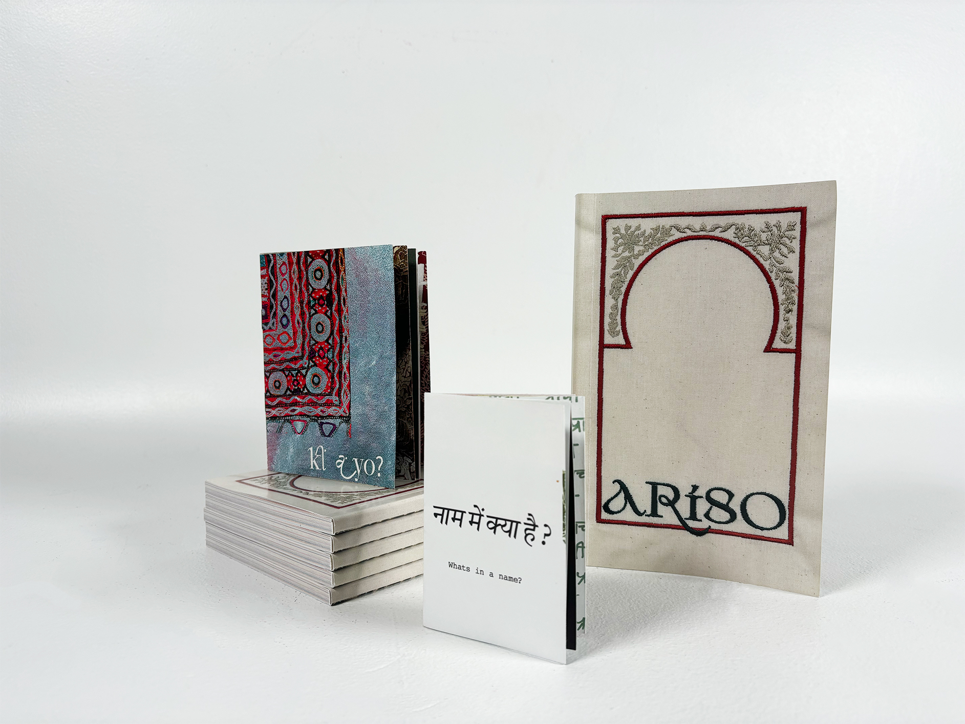
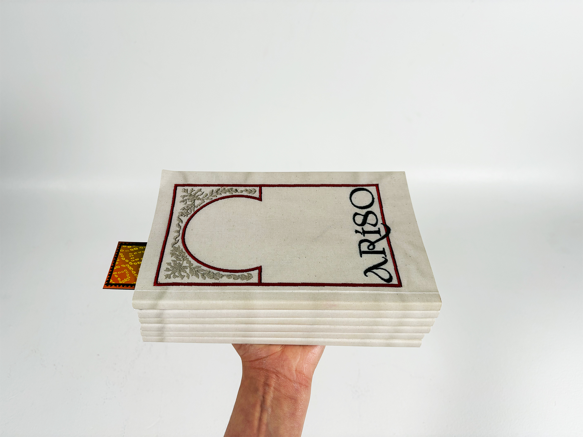
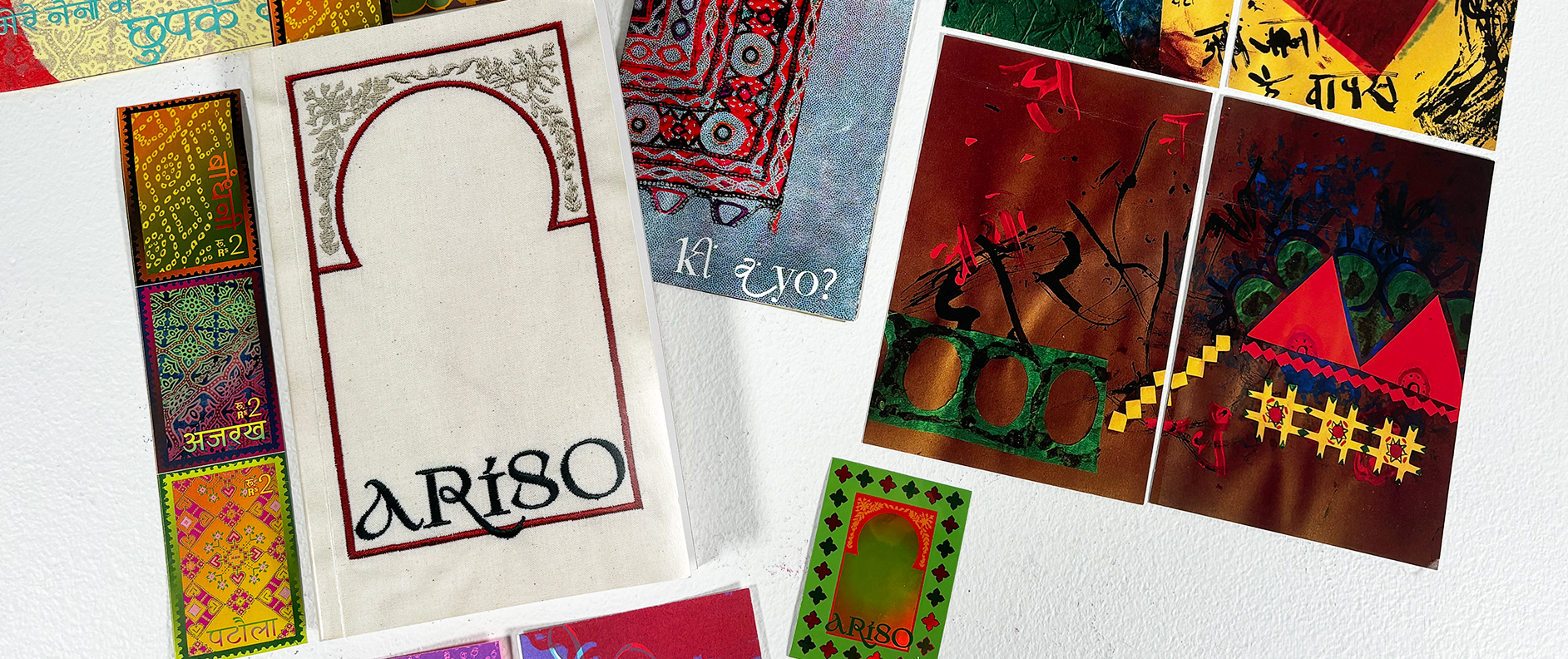
Ephemera galore: bookmark, sticker, zines, and postcards
PROCESS + REFLECTIONS
TYPEFACE
Through this project, I have learnt that my work is heavily process oriented. Research and exploration are the pillars of this process. I enjoy making in all forms, be it through words, shapes or textures.
Initial sketches for typeface

FASHION
While introspecting on what brings me comfort and confidence in an unknown environment, I found that fashion and the agency of dress is a liberating element of presenting yourself to the outside world. Fashion plays an important role in allowing me to engage with my culture in new and fun ways. I informally interviewed my friends and family to understand how incorporating ethnic wear into our daily lives makes a difference when away from home.
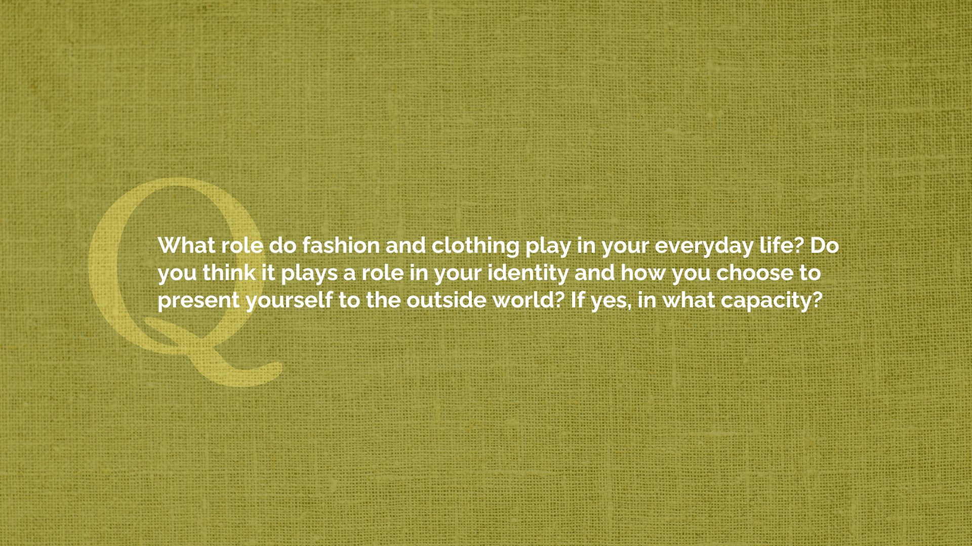
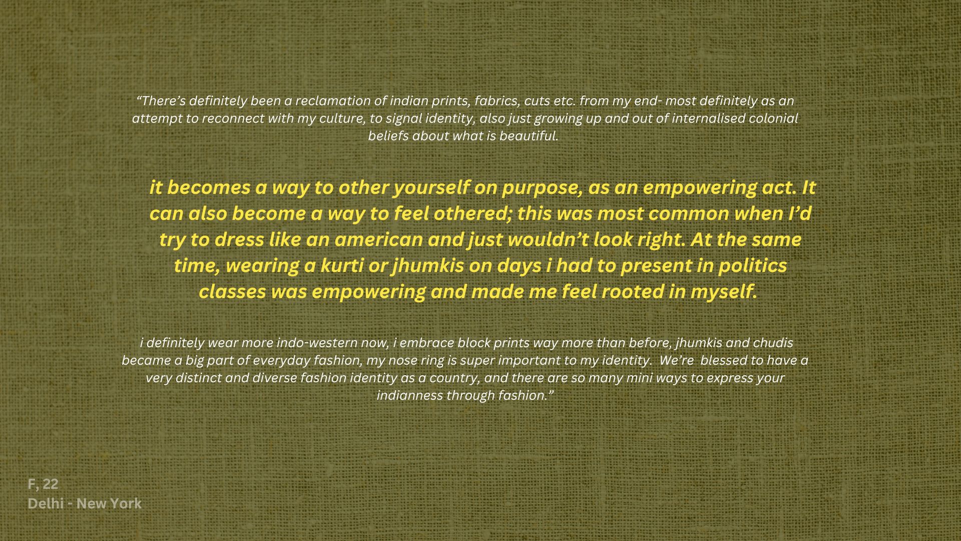

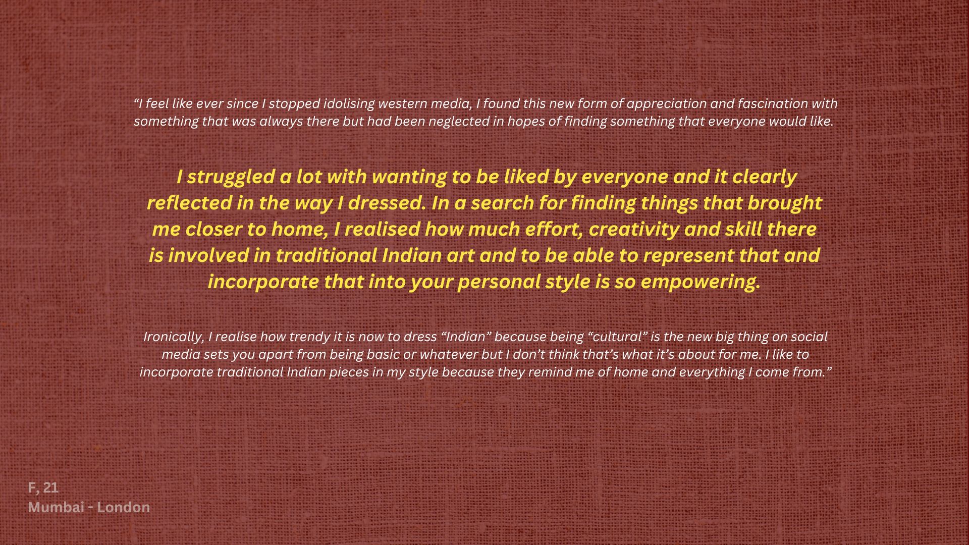
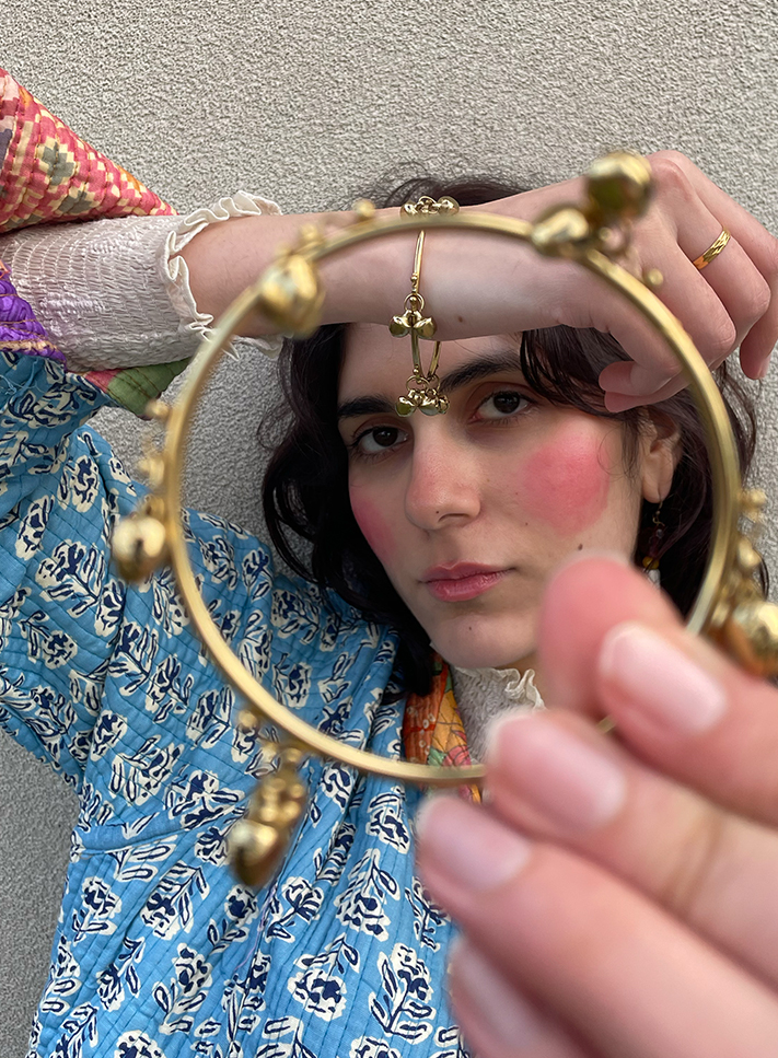
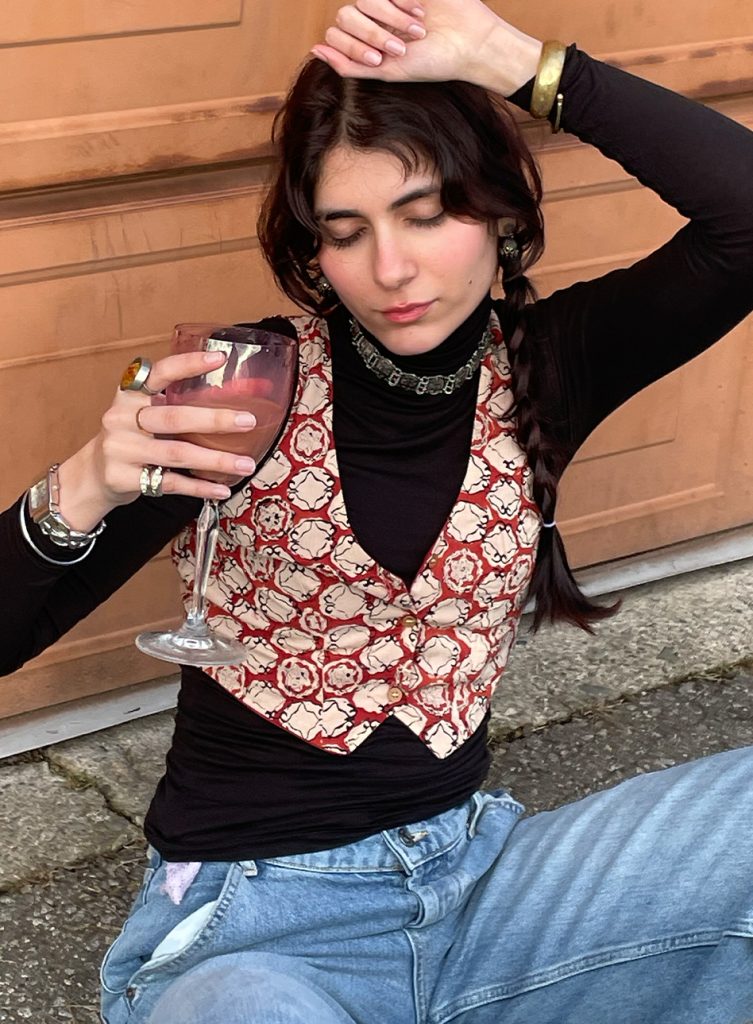
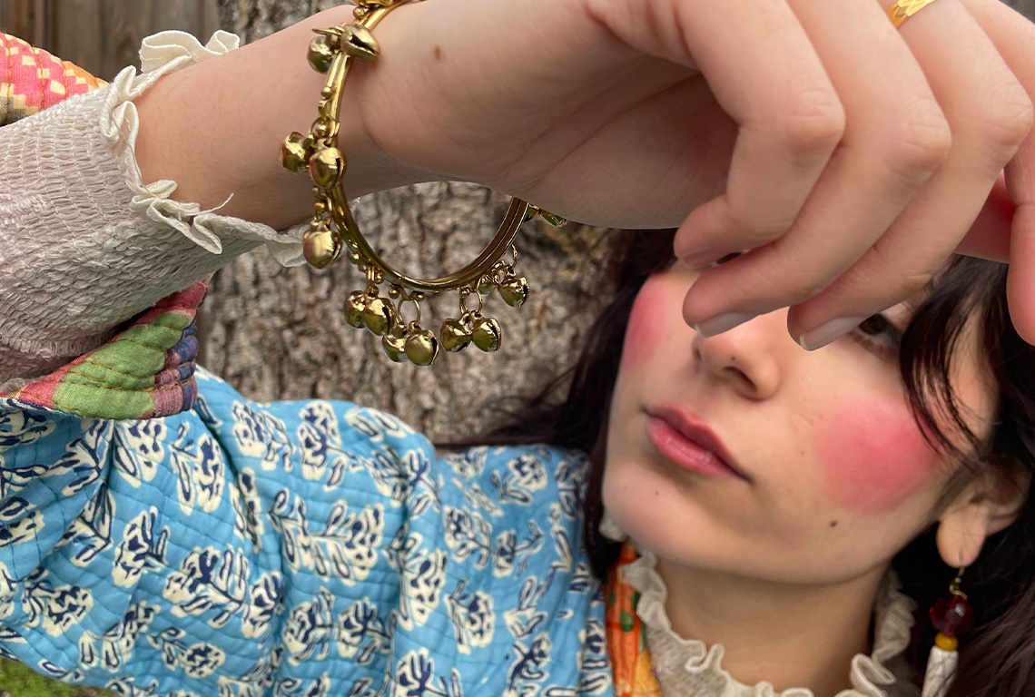
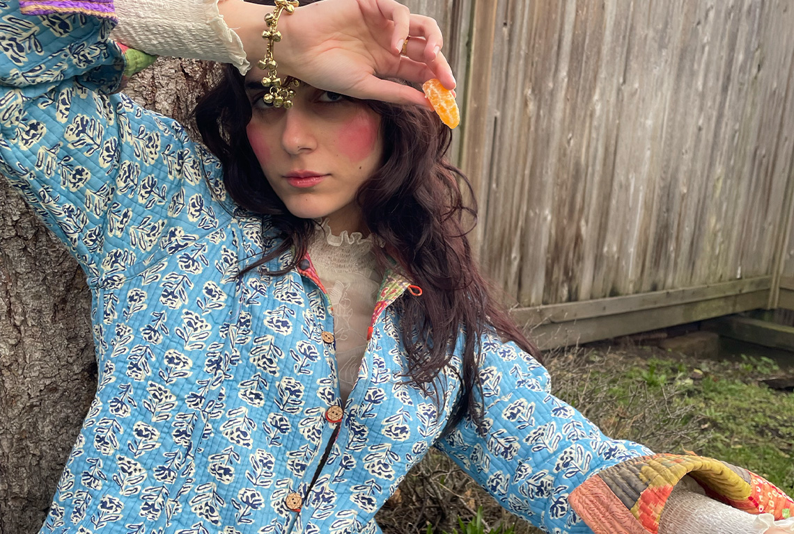
Following up on this, I styled my beautiful roommate in a few of my favourite go-to outfits that incorporate Indian ethnic wear. I had no idea what I would do with these, but I was enjoying the process of making without an end goal. Eventually these ended up making it in the final copy of my book, alongside research essays on fashion and identity. This experimentation led to more photoshoots for my risporinted postcards.
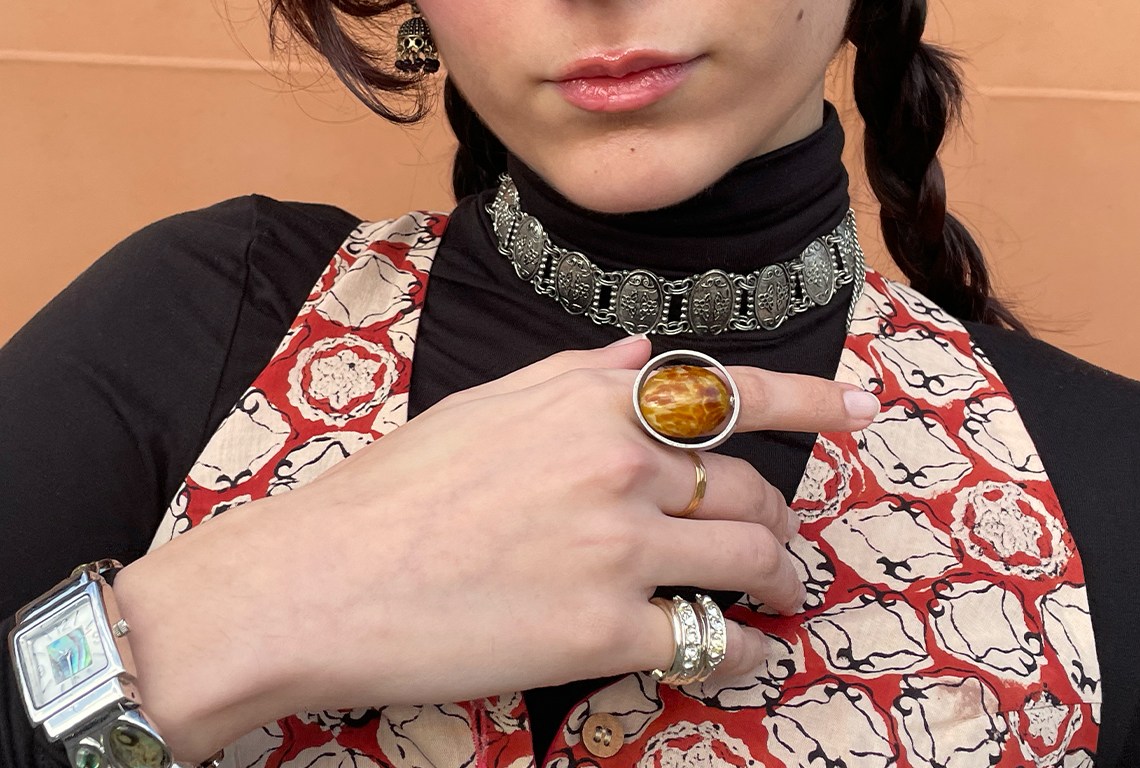
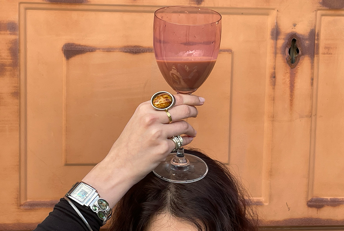
After this shoot I found myself intentionally tapping more into Indo-western fashion for my daily outfits. Throughout the timeline of this project I have become more confident in how I choose to present myself. Often times I find that fashion isn’t taken seriously, and seen as separate from design. But for me, fashion and design are two fingers of the same hand. I get most of my inspiration for my designs from my outfits. From colour palettes to the use of prints and accessories, fashion is my gateway into making. Most of the backgrounds in the compositions of my book are scans of my clothes or my mother’s sarees.
VISUAL CULTURE

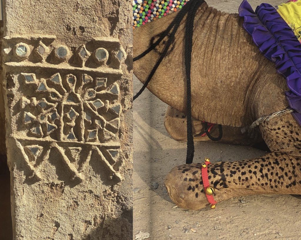
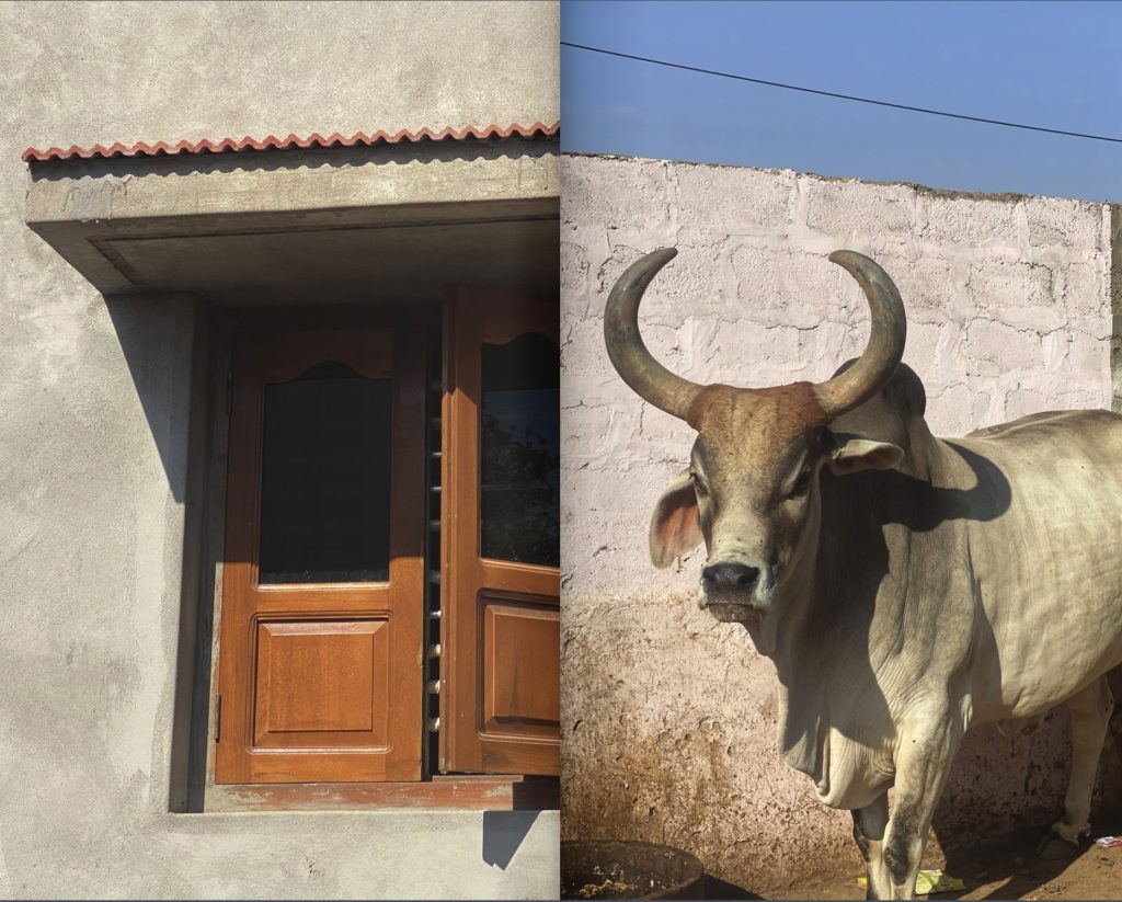
Growing up we never saw visually captivating ads for things like Kanthil. This lack of visual representation of a common household item has led for it to be viewed differently than something like chewing gum.
I want to the include visual culture from my everyday life and from the scenes of India in my work, as an attempt to challenge my own idea of aesthetics, whilst being mindful about the power of representation.
CREATIVE WRITING
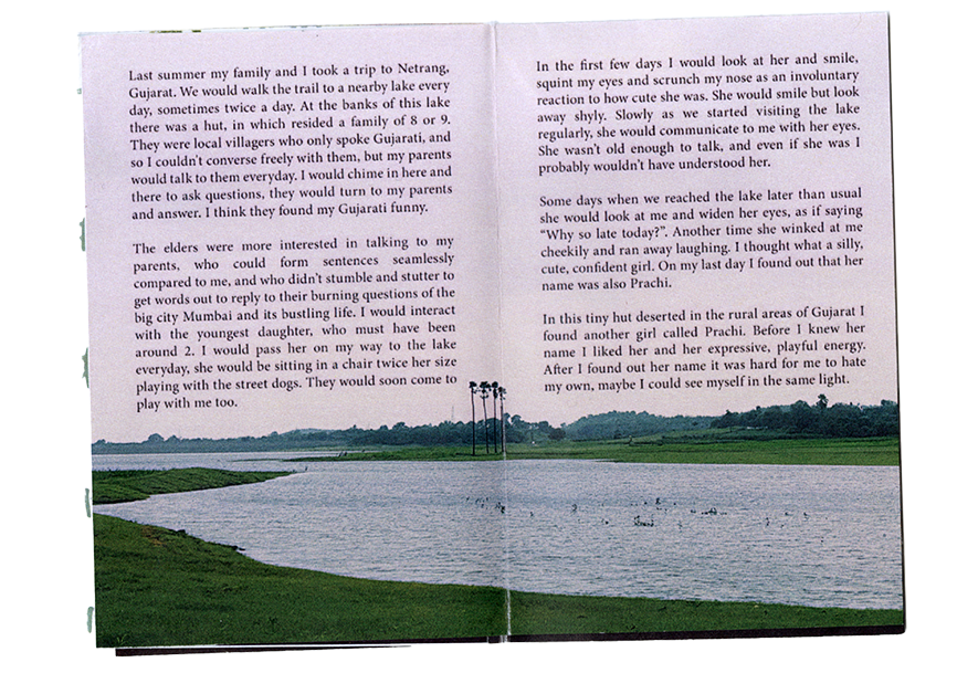
One of my goals with this project was to revive my creative writing practice. With the help of my professors Gabe Wong and Dr. Sue Shon, I regained confidence in my creative writing and feel courageous enough to share a small glimpse of it with the world through my book.
I look forward to learning and growing, both as a human and as an artist. I hope this space has given you something to relate to, or think about. I would love to hear your thoughts on my work. Please feel free to reach out via email at prachipop8@gmail.com.


