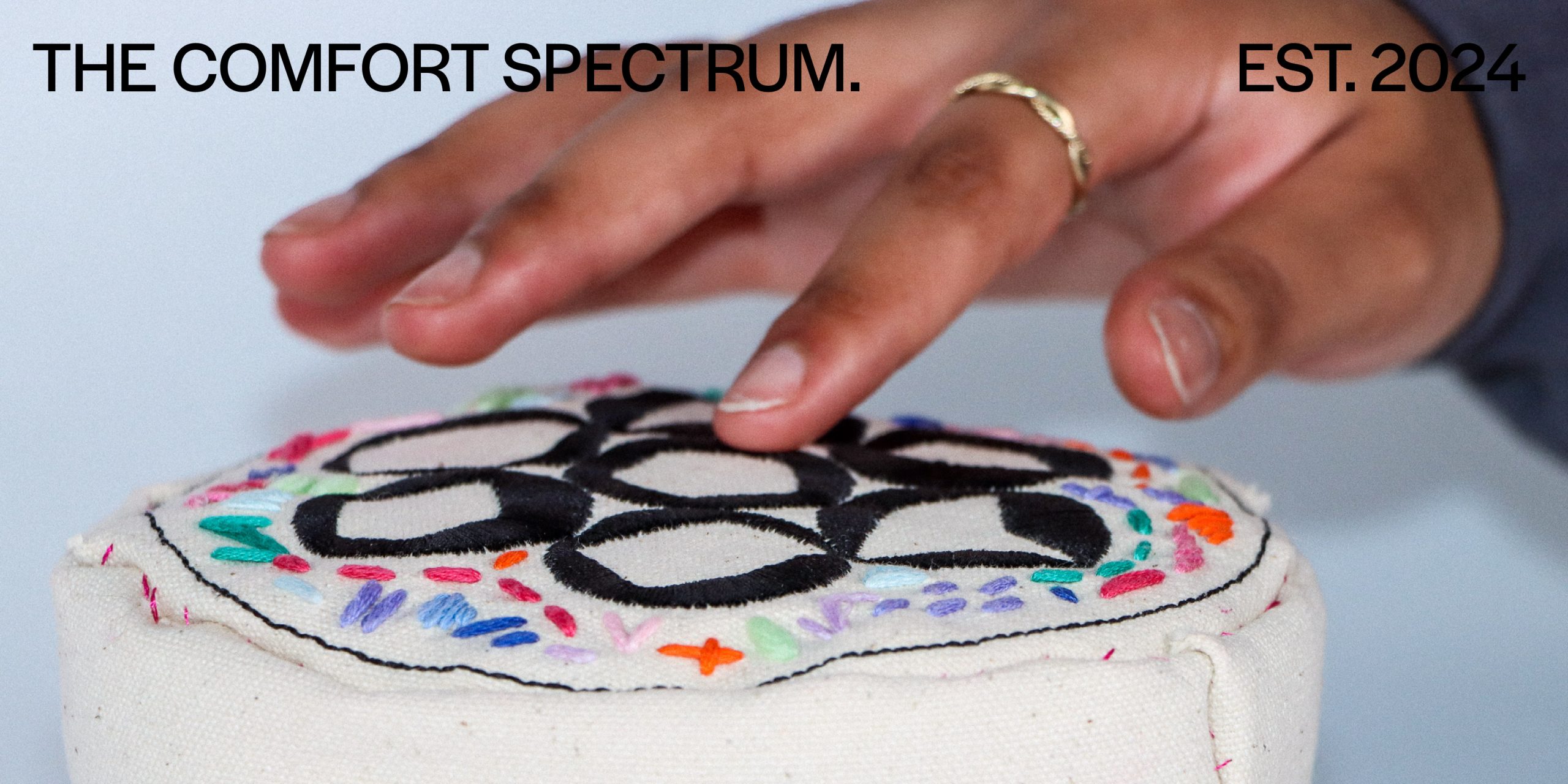
The Comfort Spectrum
Jasmine Wong
See it On Campus: Level 2
Visitor InfoECU Award Recipient
Glenmore Custom Print + Packaging Award – Winner
PROJECT OVERVIEW
The Comfort Spectrum explores and visualizes how people with autism navigate the boundaries of comfort in social spaces.
Autism (noun)
A developmental disability caused by differences in the brain. People with ASD often have difficulties with social communication and interaction, and restricted or repetitive behaviors or interests. They may also have different ways of learning, moving, or paying attention.
Numerous designs for autism are created by neurotypical people for autism, rather than the person with autism themselves. Sometimes, this approach might do more harm than good because they fail to address autistic experiences accurately as they are not autistic. Instead of supporting autistic experiences, some of them are focused on helping people with autism conform to neurotypical standards, assuming it would “fix the problem”.
This action causes a huge amount of physical and emotional stress on people with autism, as it takes up a lot of effort and energy to mask and appear as a neurotypical person; inflicting severe consequences on mental health. Those issues include burnout, meltdowns, and loss of self identity. The general population is unaware of the detrimental repercussions it perpetuates due to previous biased autism research, and the lack of empathetic understanding as evidenced in the Double Empathy Problem (Milton et al., 2012).
This project is the antithesis to biased design for autism, informed by my own experiences being on the autism spectrum. It is an in-depth study into un-masking autism and fostering self acceptance, while de-stigmatizing and educating about it. At its core, The Comfort Spectrum invites the audience to rethink about designs for autism, and puts emphasis on the necessity to design from an autistic point of view for it to be effective.
The Comfort Spectrum is a brand that explores effective design for people with autism in three parts: The Burnout Toolkit, The Comfort Packet, and The United Comfort Workshop.
BRANDING GUIDELINES
The visual identity system of The Comfort Spectrum aims to challenge the perception of a spectrum.
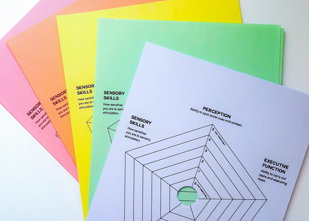
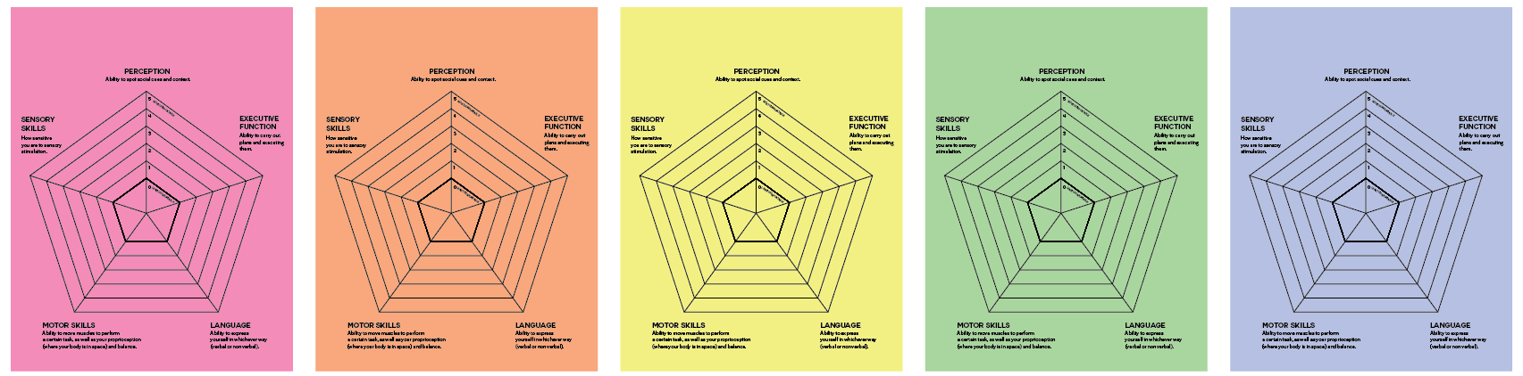
When people think of a spectrum, they usually think of a linear line with drastic difference on both ends, and you can sit anywhere on that line. However, I believe that the autism spectrum is more multifaceted than that. The autism spectrum is more like a five-point radar graph, with each point representing a domain of autism. For me, it represents perception, executive function, motor skills, language, and sensory skills.
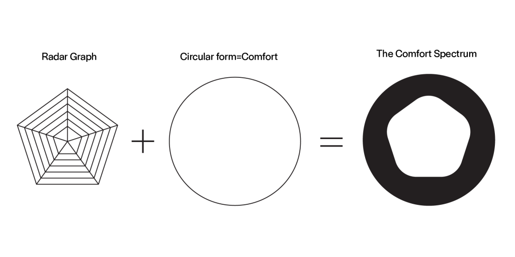
Primary Logo
From the original pentagon, it could expand into various different five-pointed forms, representing how autism could be experienced in various different ways and our experiences cannot fit into one stereotype.

Secondary Logo

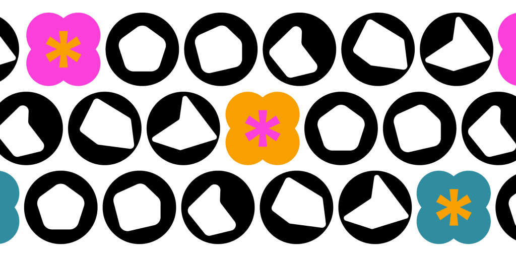
Additional Design Elements
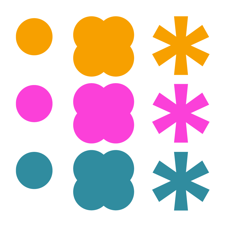
I’m utilizing recurring circular forms to form a pattern and play into that notion of comfort. I also added an extra design element, the asterisk, because its form indicates the motion of expanding.
Combination Variations
There is a system I had used to categorize items in The Comfort Spectrum: primary logos are used for everything under The Comfort Spectrum, secondary logos are used for sub categories in topics, and the asterisk is used in anything that has relation to The Burnout Toolkit.
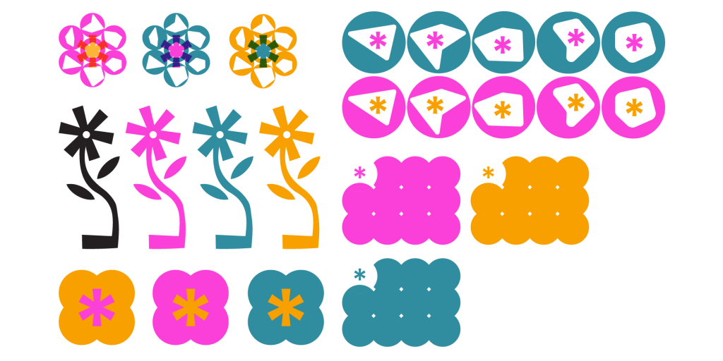
Color Palette & Typography

PART I: THE BURNOUT TOOLKIT
The functionality of The Burnout Toolkit
MASKING (verb)
Masking is a strategy used by some people with autism, consciously or unconsciously, to appear non-autistic. While this strategy can help them get by at school, work and in social situations, it can have a devastating impact on mental health, sense of self and access to an
autism diagnosis.
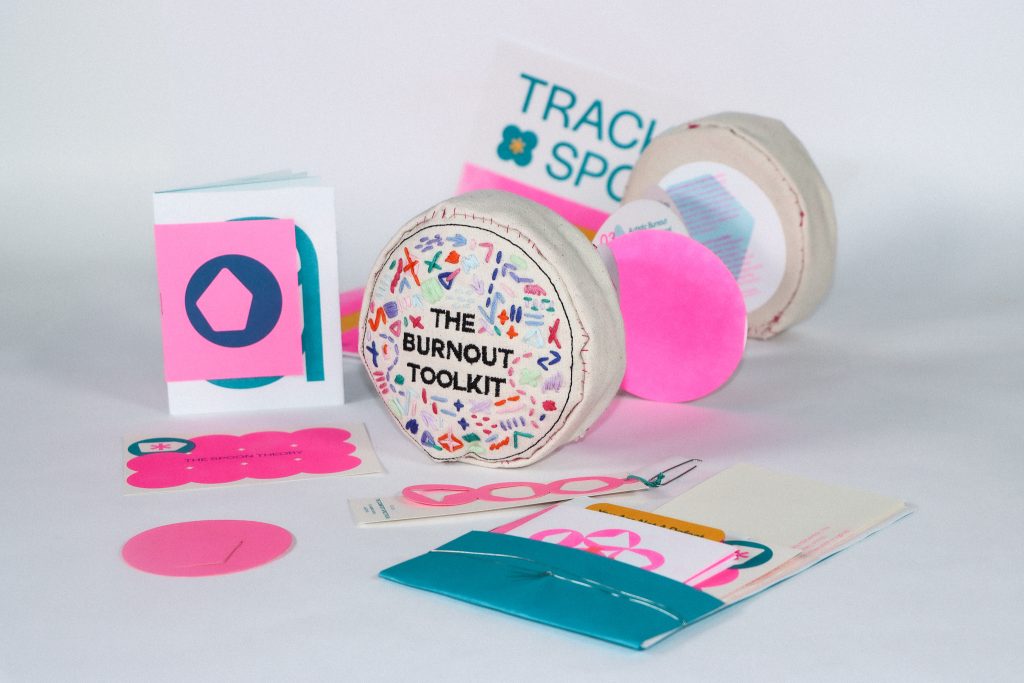
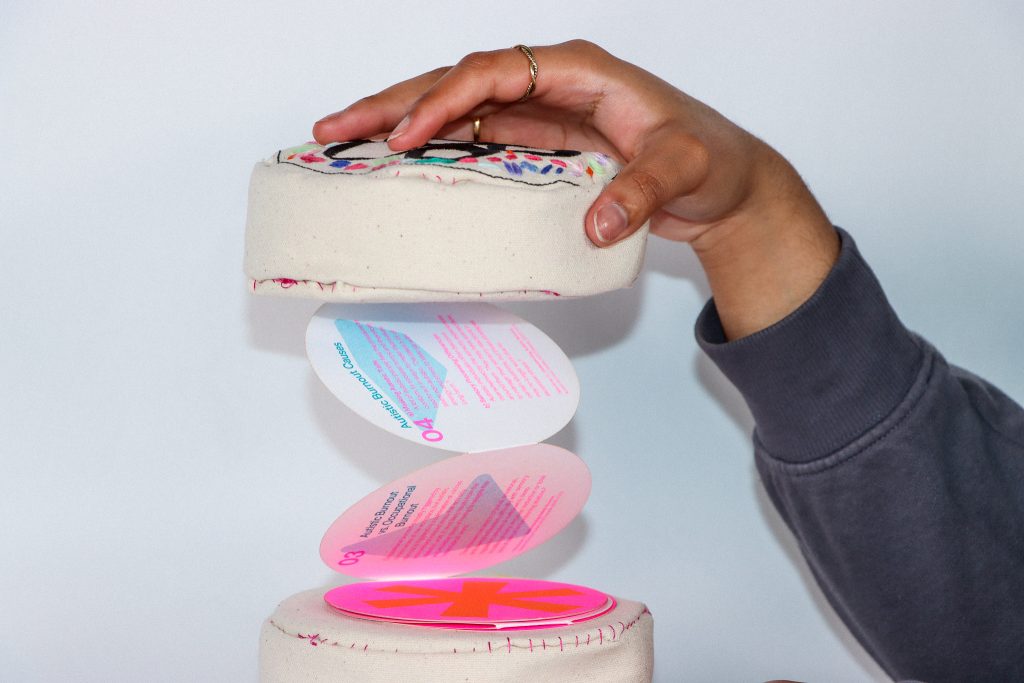
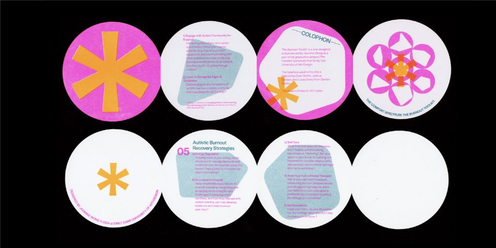
The Burnout Toolkit stemmed from the idea that instead of a comfort zone, comfort could be portable. It is designed to sit in a space of a waiting room of a psychiatry healthcare office. The Toolkit contains a collection of information that speaks on autistic burnouts, what they are and how to recover from them. All information is referenced from research curated by AIDE Canada: ‘Understanding Autistic Burnout’ by Sylvere Moulanier and ‘Emerging Ideas in Understanding and Addressing Autistic Burnout’ by Connie Wong and David Nicholas.
The object is made of canvas and stuffed cotton, with hand-sewn embroidery designs on the cover. The aim of this design is to stimulate tactile senses with the soft exterior of the cover plus the raised texture and pattern of embroidery, to soothe and ground someone who is overstimulated and going through an autistic burnout.
The Toolkit is inspired by my own experience with autistic burnouts. I went through a bad episode of it last year, and I didn’t realize how much it would impact me. So, I wanted to make something that is functional and contains all the information I wished I had known at that time, and assembled them into one item for accessibility.
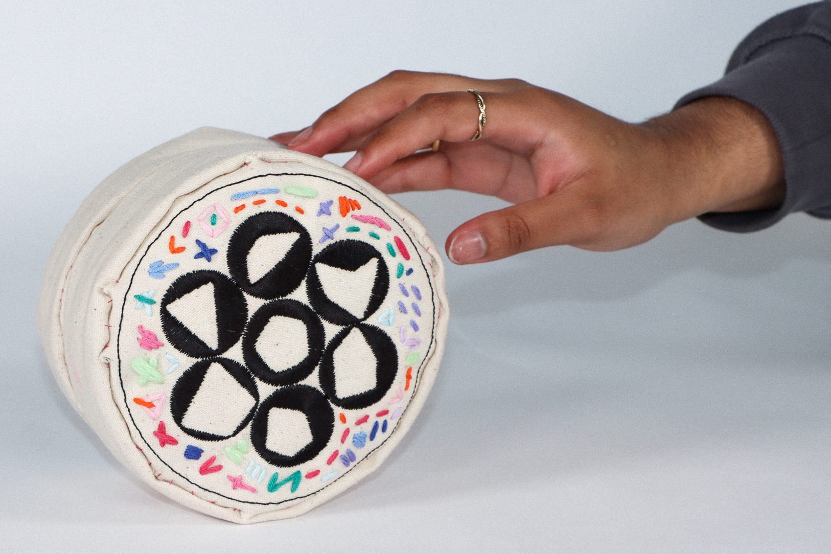
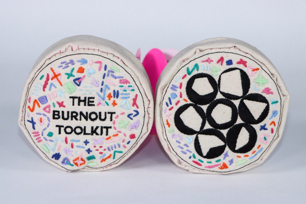

Frontside of the Burnout Toolkit.
Backside of the Burnout Toolkit.
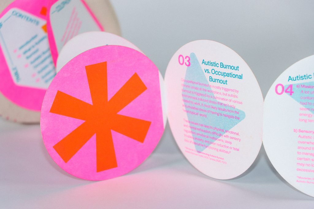
PART II: THE COMFORT PACKET
Visualizing information with The Comfort Packet
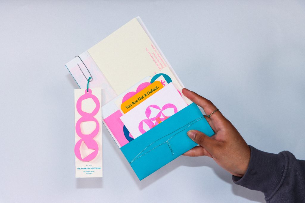
The Comfort Packet is a collection of information curated with the intention of addressing issues caused by long term masking in a social space. The purpose of this packet is to inform and share resources, and these takeaways will be distributed at the Pacific Autism Family Network Centre (PAFN). The contents include:
1x The Burnout Toolkit Zine
1x The Spoon Theory Postcard
1x The Spoon Theory Poster
1x Autistic Perspective Zine
1x Brand Bookmark
1x Encouragement Card
1x Foreword
1x Tag
I found that information on the web regarding strategies managing burnouts and masking are in pages upon pages of text in pdfs. While detailed explanations and resources are useful and help a lot, I find it hard to comprehend at times due to its lack of visual stimulation. Majority of people with autism are visual learners, therefore I re-structured information that I found helpful into a simple and pragmatic way for easier understanding. I also made sure to choose different textures of paper for the extra layer of tactility.
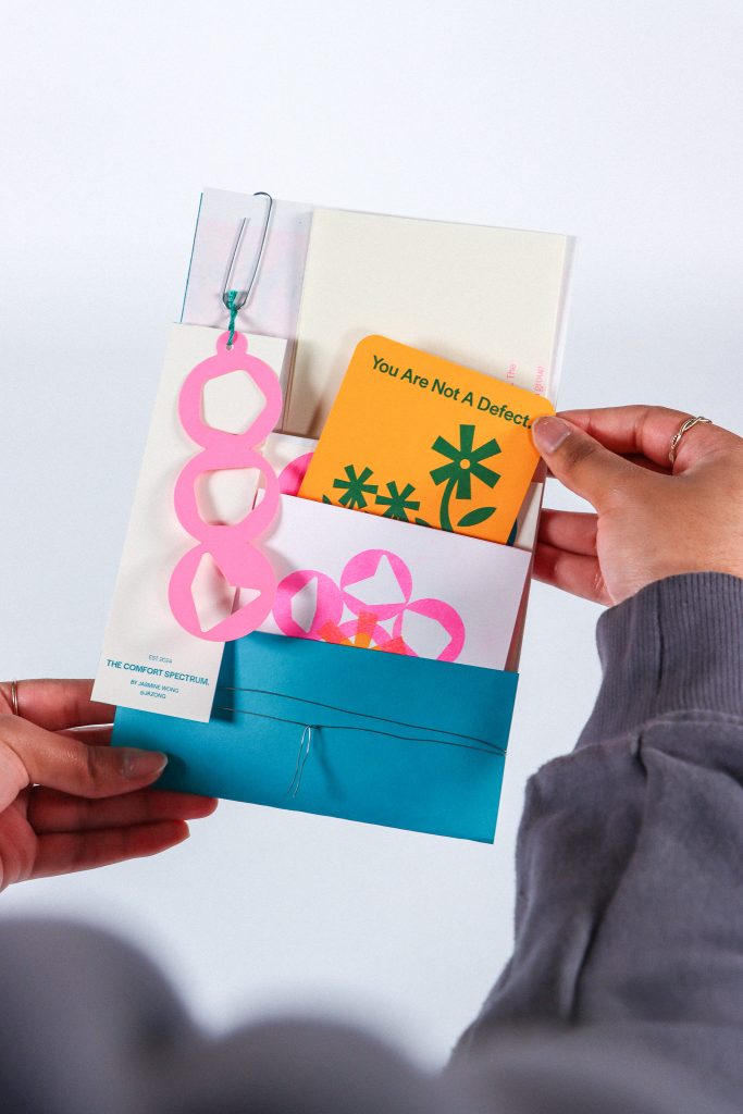
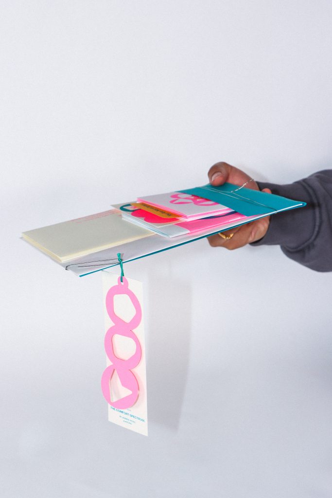
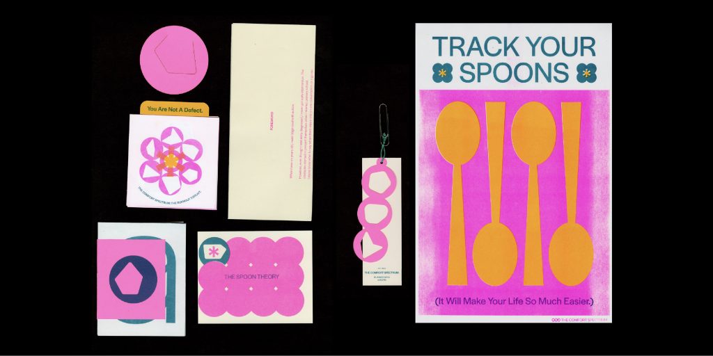
Full spread of inclusions in The Comfort Packet.
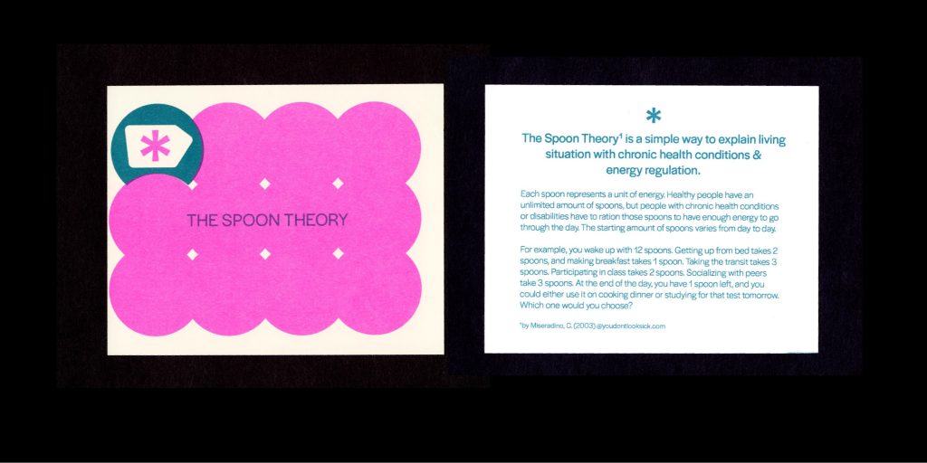
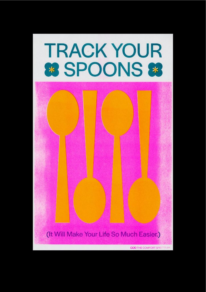
The postcard, along with the accompanying poster that talks about The Spoon Theory which is a good analogy when explaining energy regulation and living with chronic health conditions.
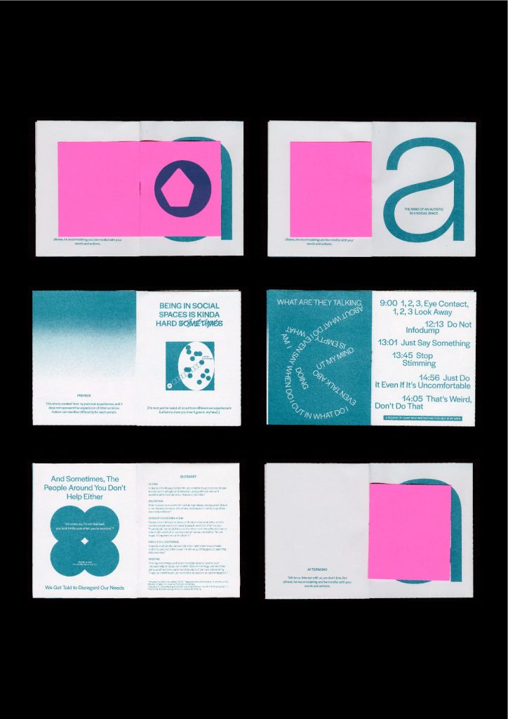
The autism perspectives zine illustrates what goes on in my head when I have to interact with social spaces.
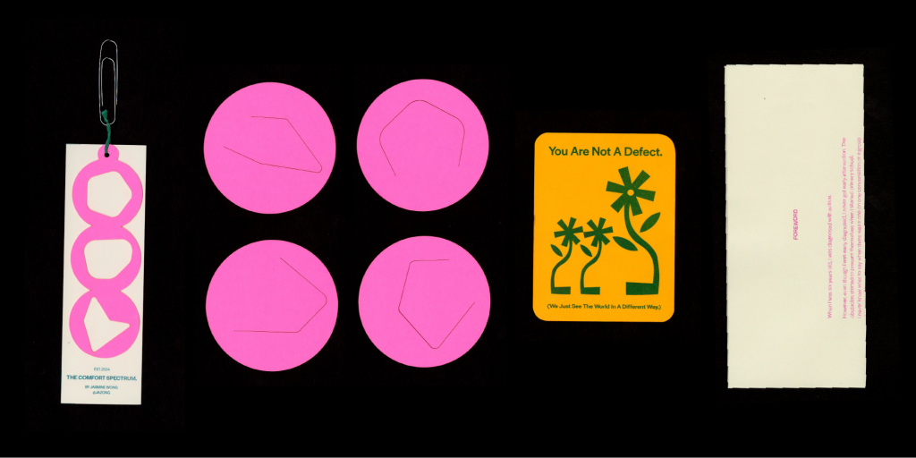
Bookmarks and the tag are created by lasercut, the encouragement card comes in the Burnout Toolkit zine and the foreword is just an introduction letter to this project.

An additional inclusion that is available on-site for takeaway during the grad show. It is advice taken from The Burnout Toolkit.
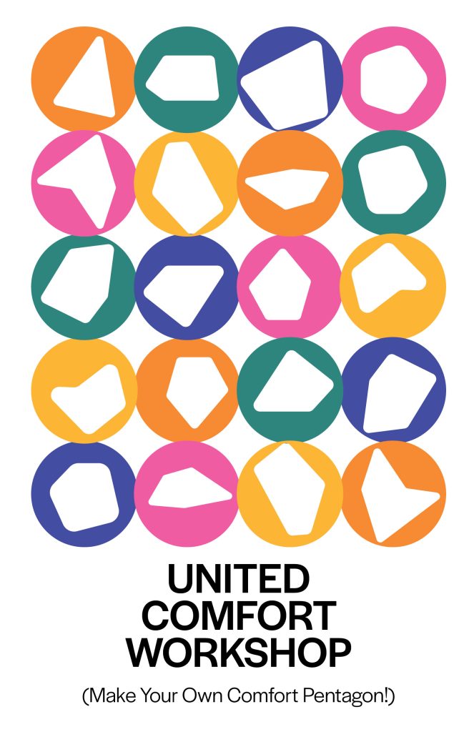
PART III: THE UNITED COMFORT WORKSHOP
Community engagement with The United Comfort Workshop
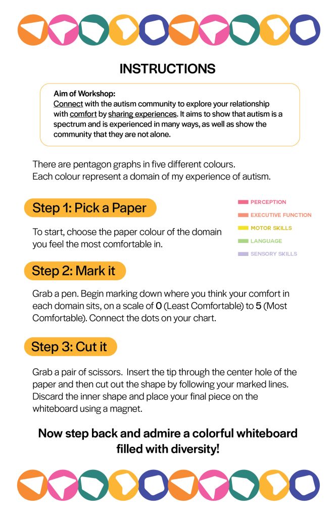
The United Comfort Workshop is a workshop that aims to connect with the autism community to explore your relationship with comfort by sharing experiences. It aims to show that autism is a spectrum and is experienced in many ways, as well as show the community that they are not alone.
I was lucky to be able to connect with Pacific Autism Family Network (PAFN) and AIDE Canada to run the workshop in their centre. The workshop is both synchronous and asynchronous, situated at the lobby of PAFN Centre and would run for a month from April to May 2024. Participants could go up to the installation and display their own outcomes.
To kickstart the workshop, the first run was held with a group of five individuals with autism so they could set an example with what the activity looks like to other participants who are doing it asynchronously. The first run was a success, and I had been invited to do a second run of the workshop with another group of participants that is scheduled in May.
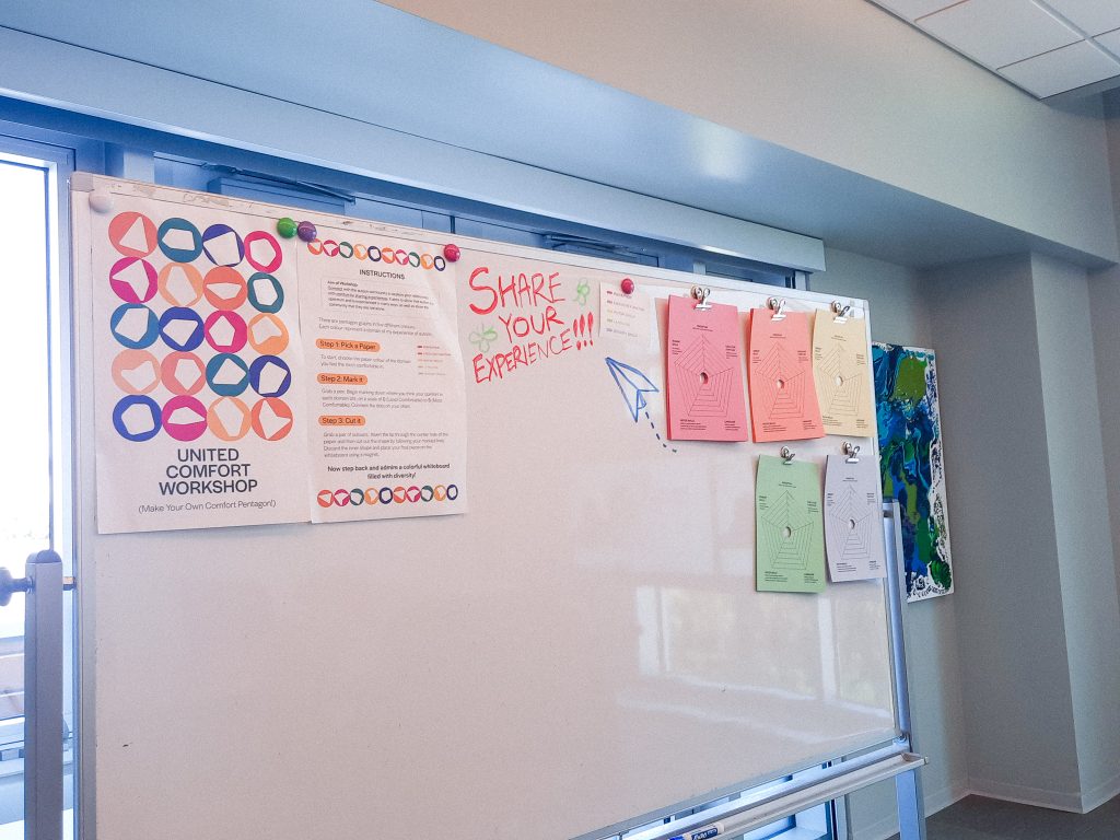
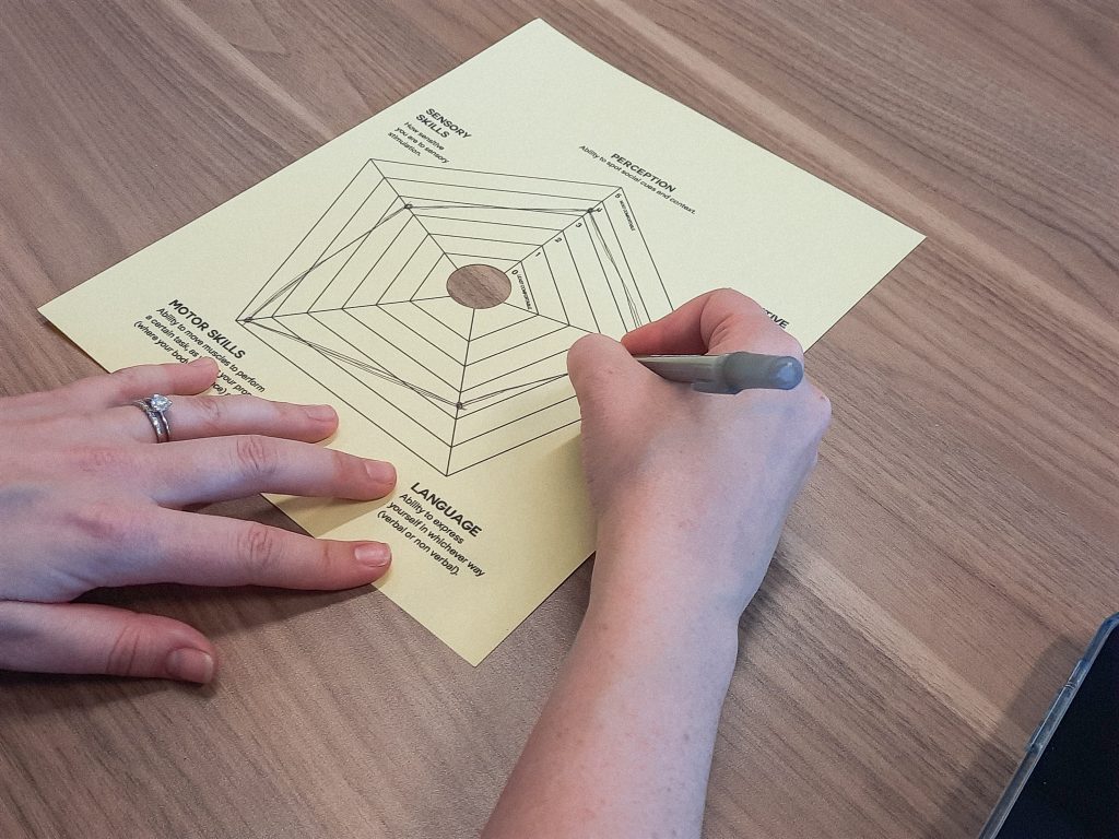
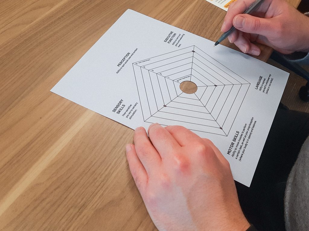
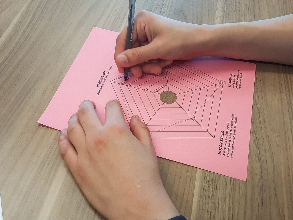
Examples of participants’ outcomes

SPECIAL THANKS
To my instructors Jon Hannan and Marcia Higuchi, and Nadia Beyzaei from the Health Design Lab for helping and guiding me during the process of this project. To PAFN, for giving me the precious opportunity to work with them and the lovely people I had met that day. To family and friends, who fostered an inclusive and inspiring environment that made the art university experience
more enjoyable.