Outside Elements
Isabelle Alicia Hawkings
See it On Campus: Level 1
Visitor InfoNear the entrance on the side of the shorter wall.
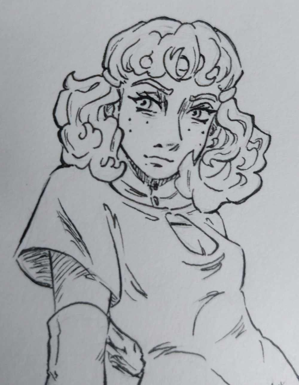
Each piece here is a snapshot from what will become one shot graphic novel. In which a young girl named Morgan discovers her magical abilities don’t quite fit in with that of her peers. A sign she is meant for greater things and taking her far beyond the mountainous borders of her secluded home, the forest kingdom of Forble.
It’s a story intended to explore themes of change and pursuing goals outside of one’s comfort zone. Through not only a chaotic and magical world but the art that depicts it as well. Morgan and I are on a grand journey of self discovery and personal growth together. Struggling to adapt to the challenges life brings and finding a clever way to connect with the world around us.
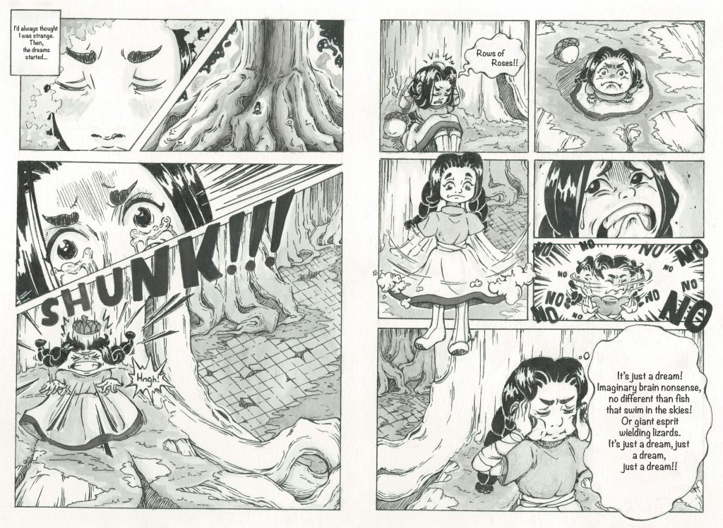
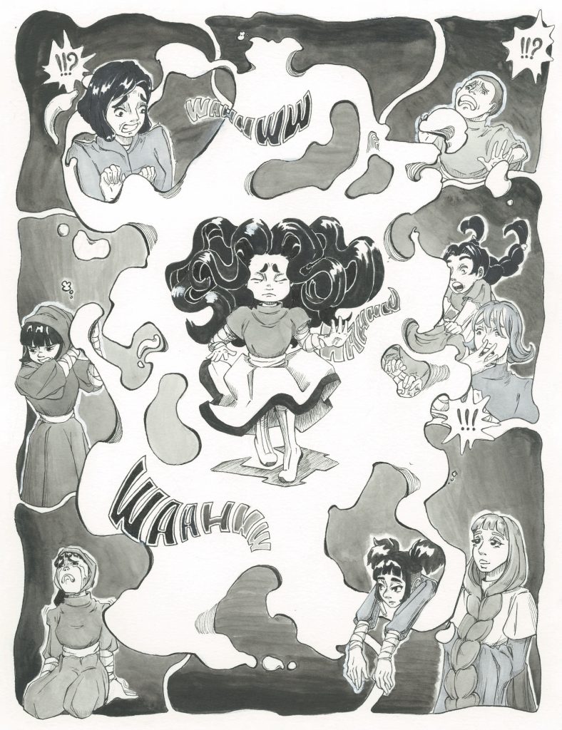
Morgan’s Dilemma, 7″x 10″, Ink and Watercolour on Paper. 2022
These were the first pages I worked on and while I’m still rather proud of them, it shows how far I’ve come. It’s a very quick paced page spanning a wide range of facial expressions. It is meant to capture a sense of anxiety around an uncertain future (in this case a magical one). The panels here are rather standard and only subtly guide the eye through the page. The real heavy lifting is done by the panel breaks, my favourite of which is a nod to Eiichiro Oda (creator of One Piece) and how all major characters in his story are introduced through dramatic panel breaks.

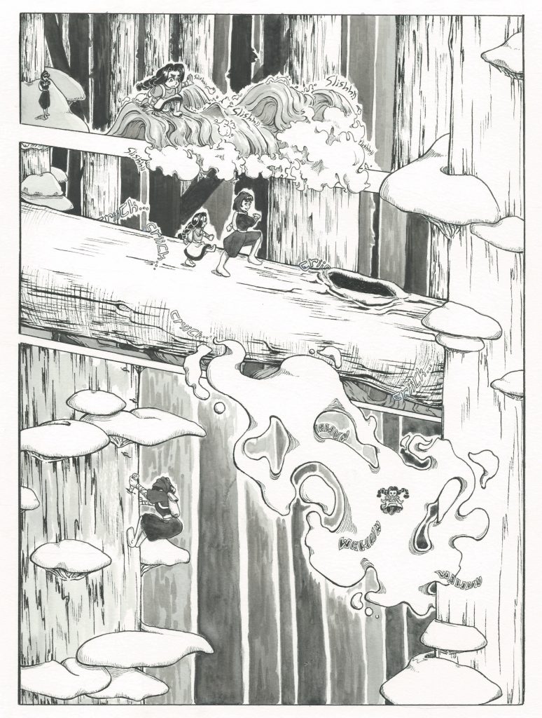
Each page here is a look at my experimentation with the classic elements of a comic page. Seeing what can be done with panels and sound effects, and tailoring those aspects to one’s own artistic sensibilities.
In the world of comics your panels act as separation of moments in time. They are most commonly used to break moments apart and simply show the art in sequence.
Panels in these pieces move closer and closer to becoming a part of the piece rather than simply acting as a frame. They are obscured, wiggle with the characters, and even become part of the scenery. Treating them as such allows for the energy in each moment to really flow as they would in any other artistic medium.
Sound effects are much the same, they serve to embody how the space in time shown would sound. Large warping sounds to indicate the air resisting fluctuations in gravity, tiny skinny words that float through natural settings, and rapid zooming text that works as an indication of motion just as much as it does of sound.
The two work together to guide the audience’s attention around the page while also providing them with one whole piece of art to enjoy.
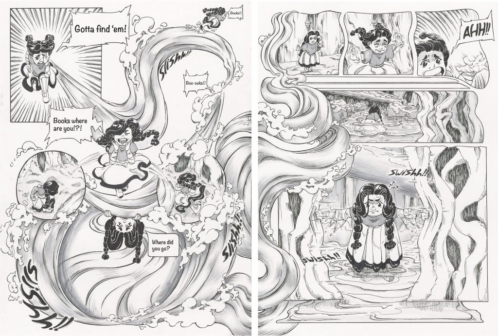
Book Search, 12″x 16″, Ink and Mixed Media on Paper. 2024
Why Traditional? and Why Black/White?
My work is done almost completely traditionally with pens, watercolour ink, and alcohol markers. I prefer to work this way as I enjoy the tactile aspects of the art making process. The scratching of pens against paper, the sensation of a smooth brush stroke, and all the textured bits that come with the process.
Despite my love of bright colours, I’ve chosen to work in black and white for two reasons:
- I am a huge fan of manga and am endlessly fascinated by how the restrictive format of black and white can be used to create such expressive and innovative page designs.
- I also find that black and white art lends itself to making your marks the star of your piece. Lighting through tons of tiny scratches, blobs of ink becoming a landscape, and scribbles making up a stylish shirt.
While I always strive to have clear and readable pieces, it’s not necessarily my priority. My art will always prioritise looking like it was made by hand because it’s made with the intention of celebrating what I enjoy about creating.
