The Exploration of Graphic Design in Chile / El Salvador
Alessandra Martinez
See it On Campus: Level 1
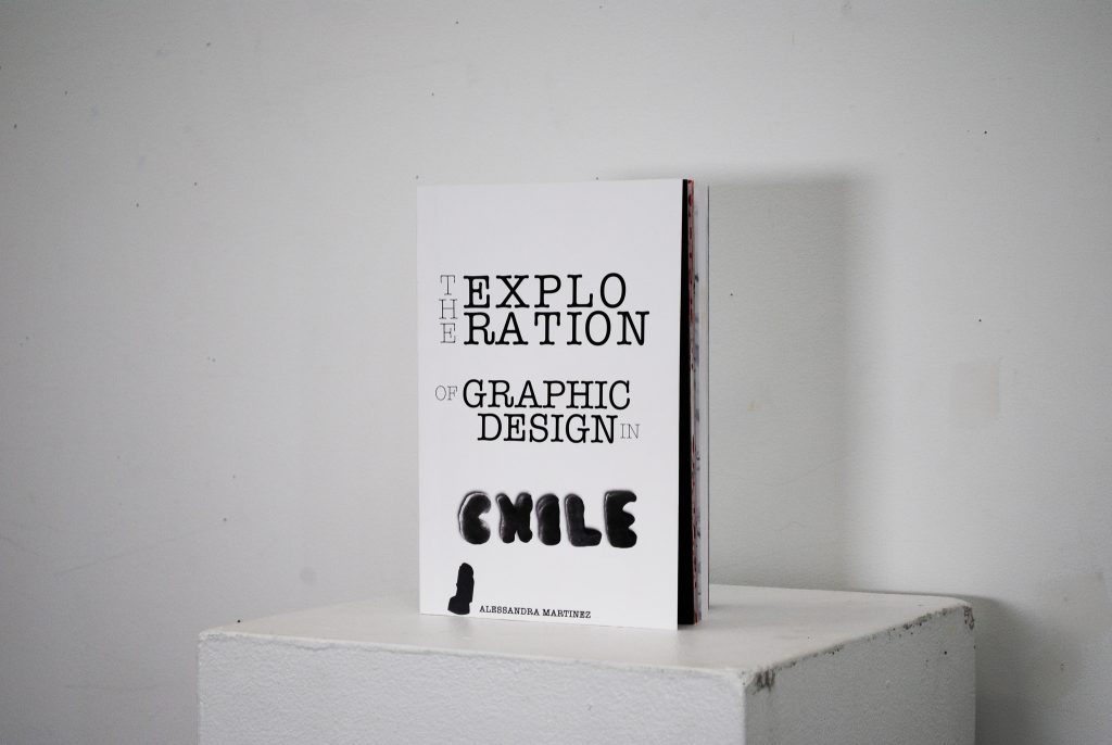
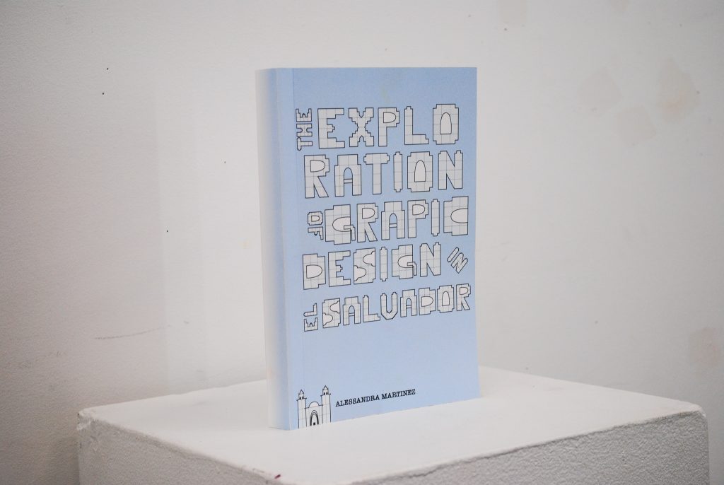
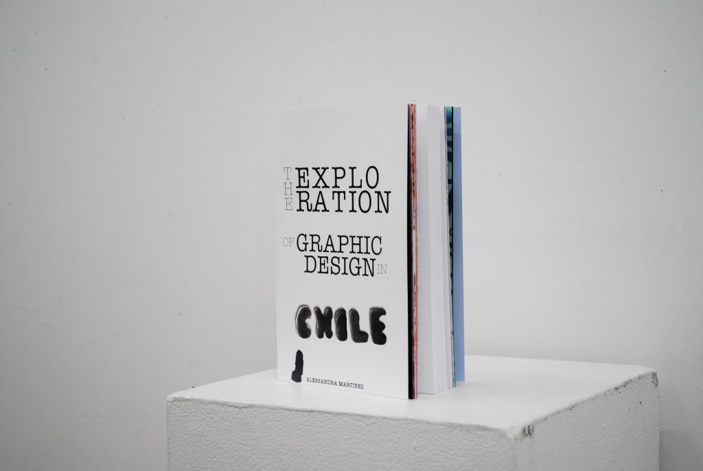
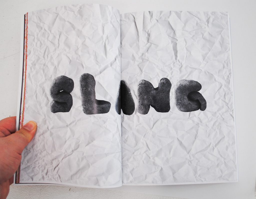
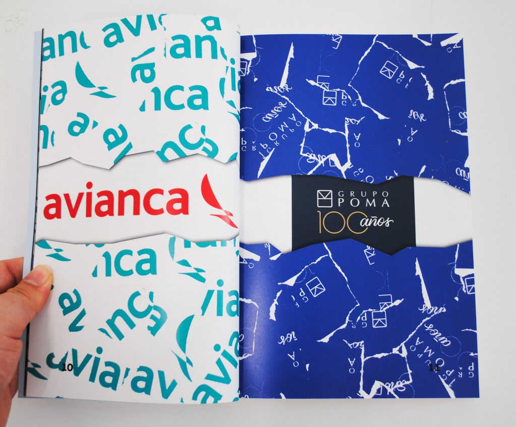
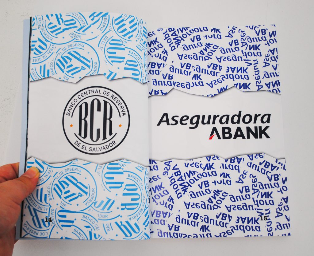
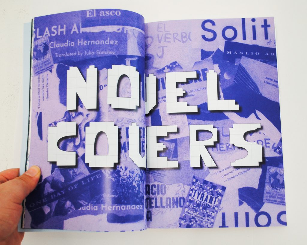
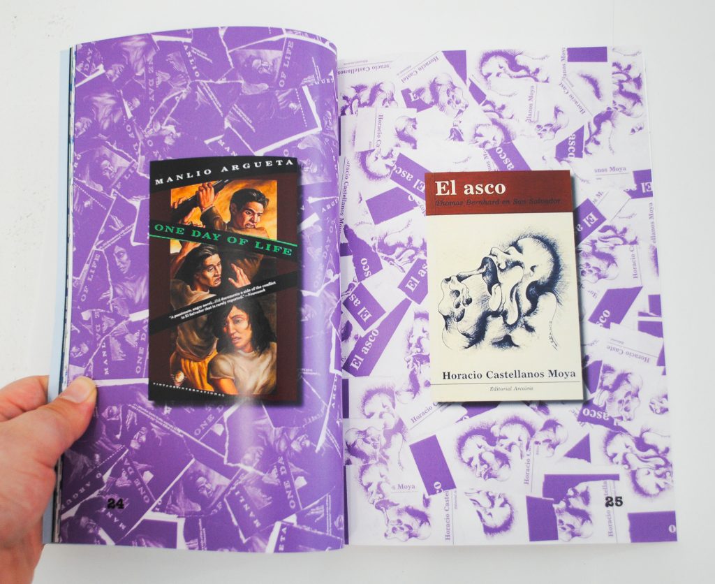
Visitor InfoThis project is a dual-function book exploring graphic design and culture in Chile and El Salvador. Each chapter features an example of graphic design, since I was on a time limit I only included novel covers, logos and slang. The main goal of my project is to show examples of graphic design in both Chile and El Salvador and to show that there is a difference between these two Latin American countries.
Growing up as a Chilean Salvadorean Canadian mix I had a lot of people assume that I was fresh off the boat from Mexico because I’m Hispanic. It was important to me that I use my heritage as the base of my project since I love to add personal aspects to my projects, because of this, which was why I added a chapter to feature the slang and terms used by each side of my family that I heard growing up.
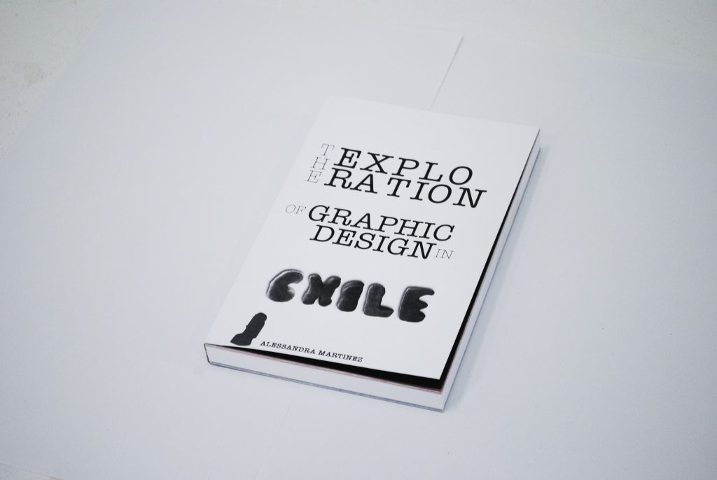
Here are a few examples from the Chilean side:
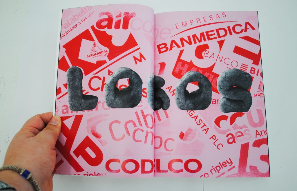
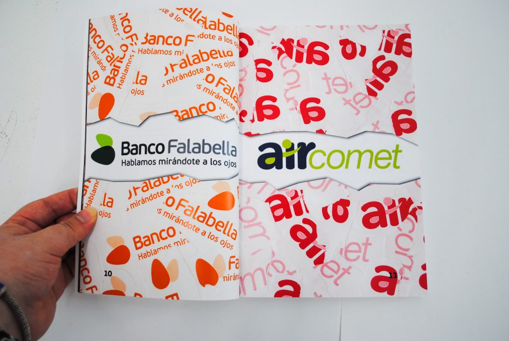
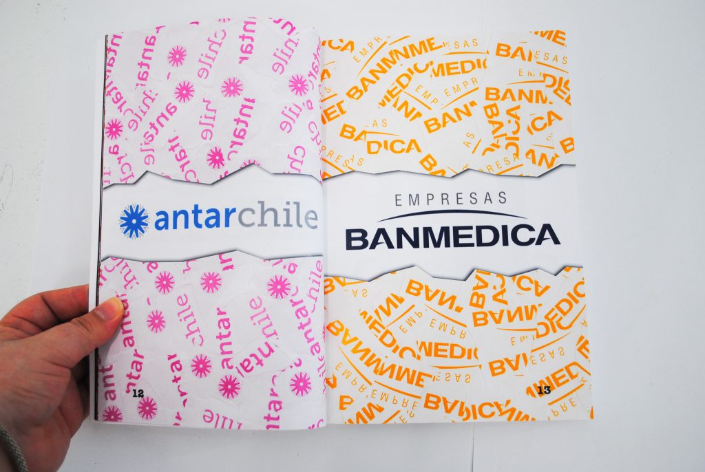
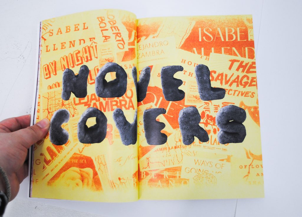
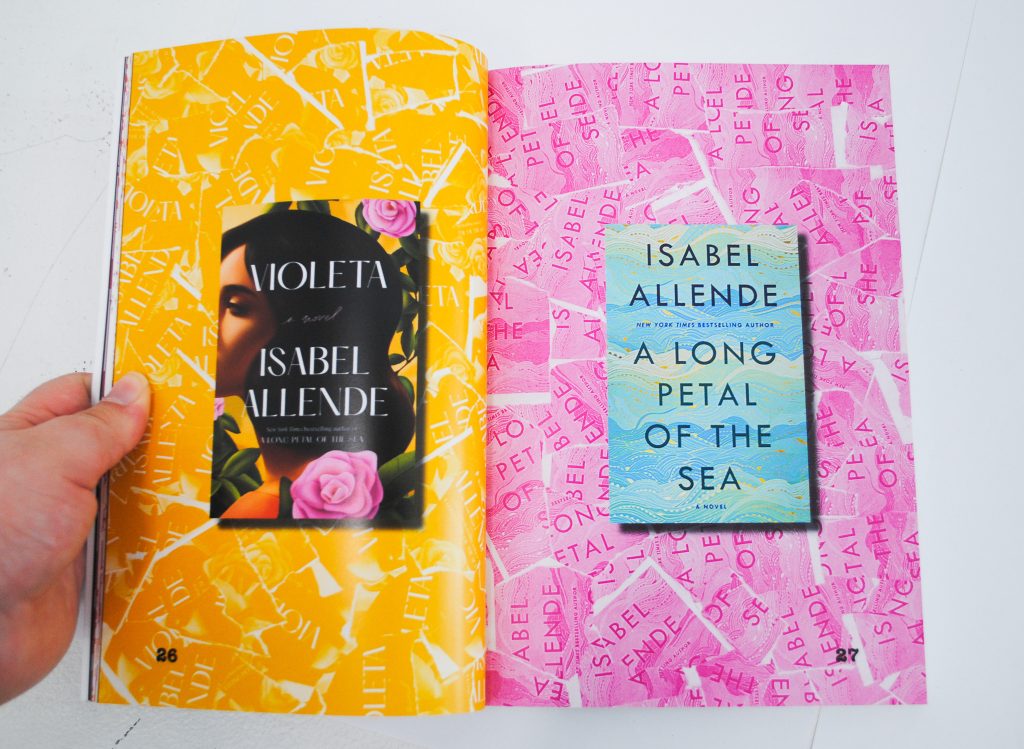
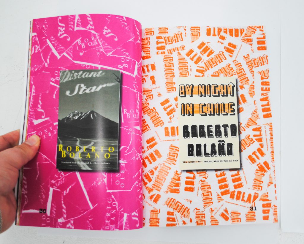
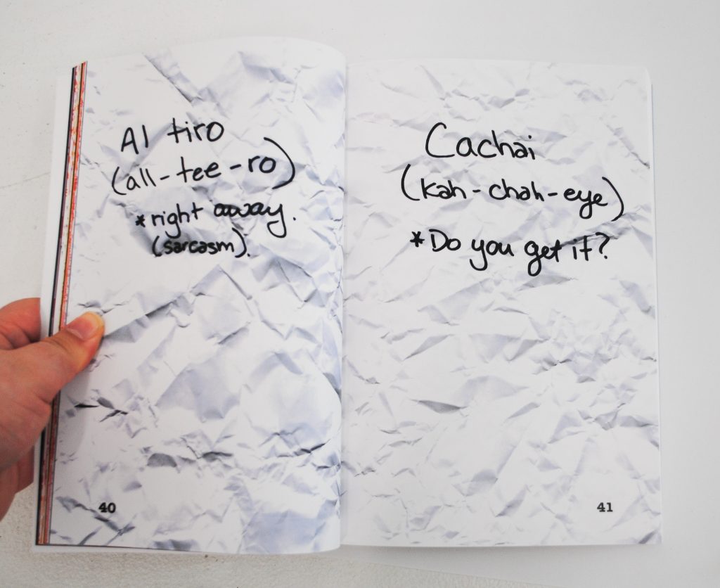
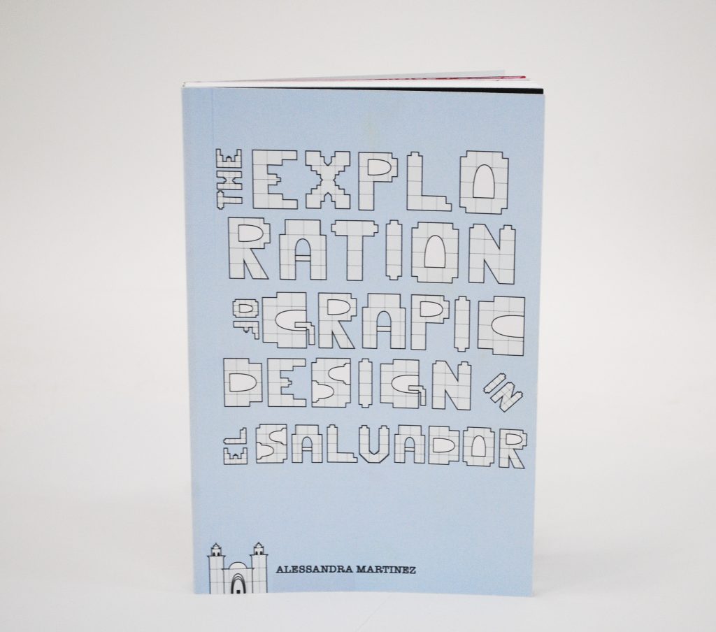
Here are some examples from the Salvadorean side:

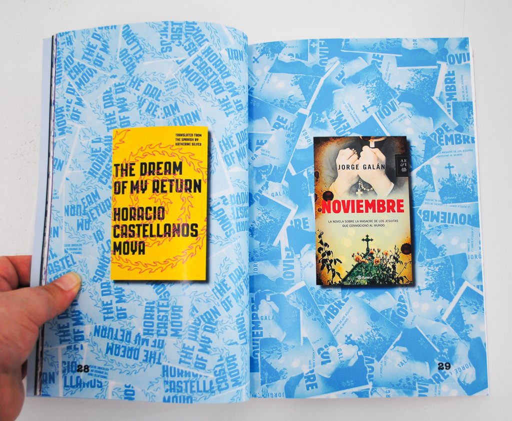
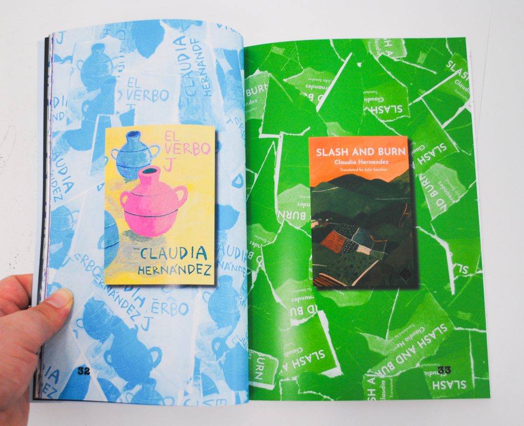

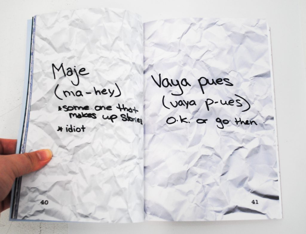
Takeaway Items
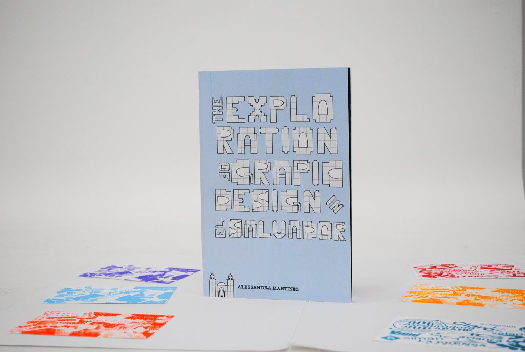
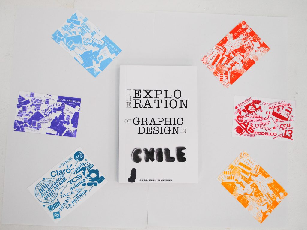
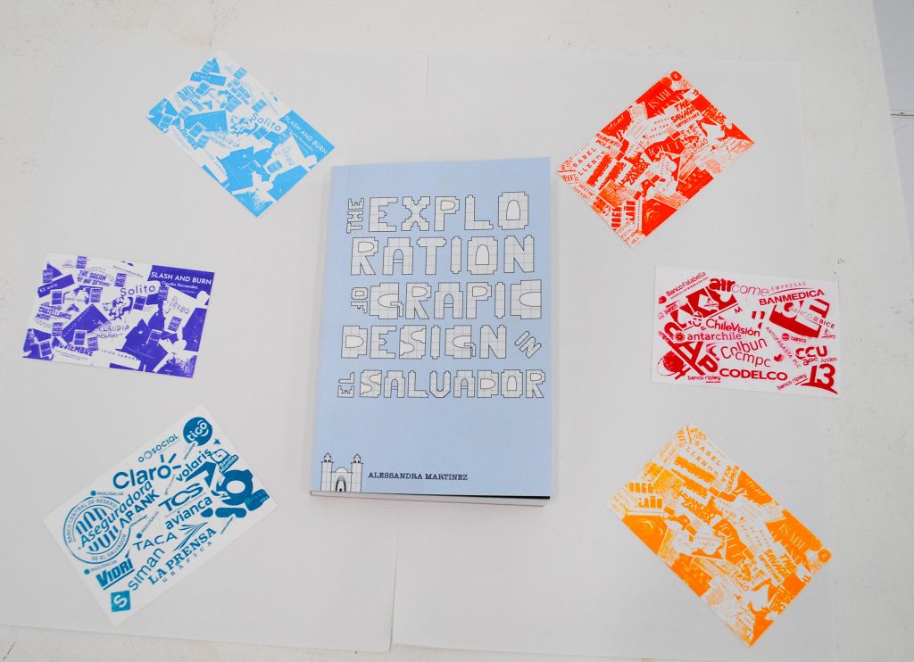
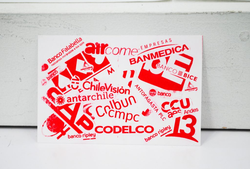
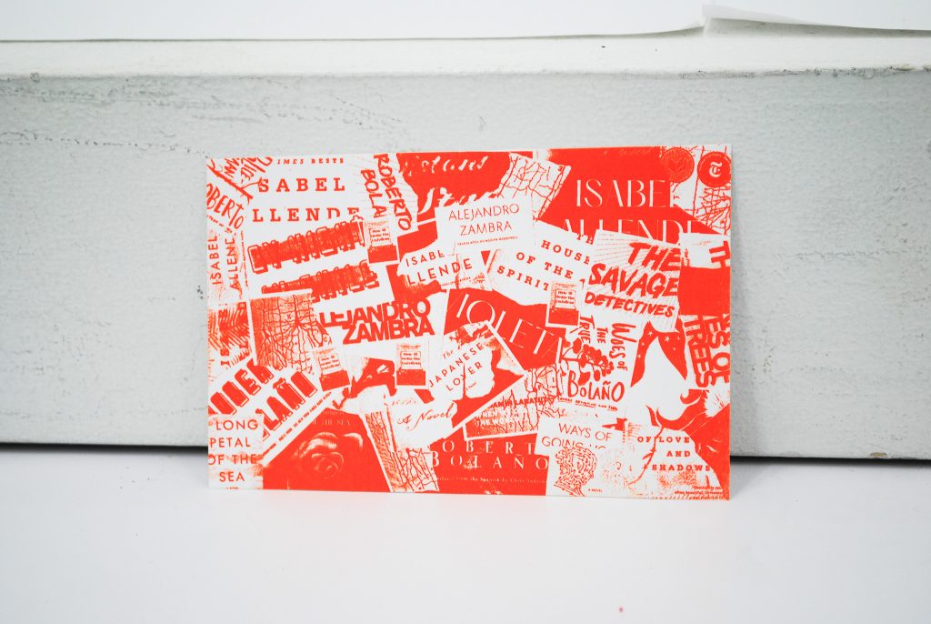
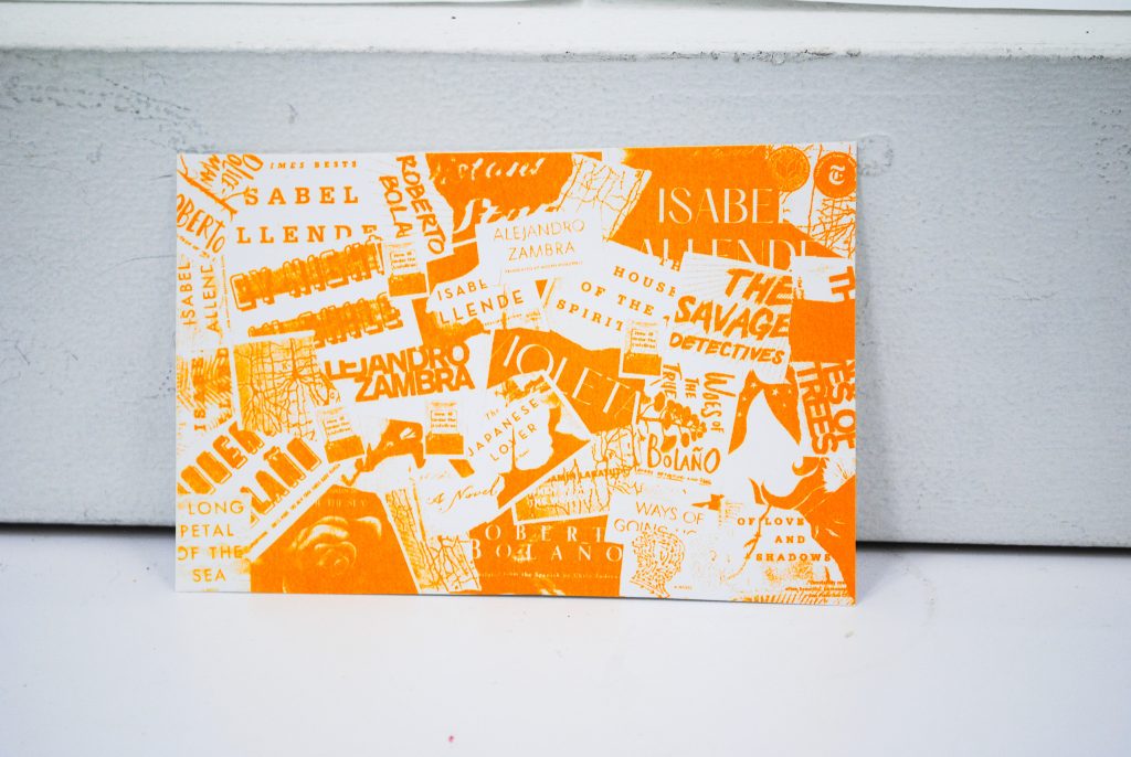
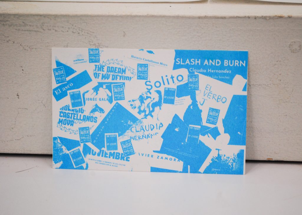
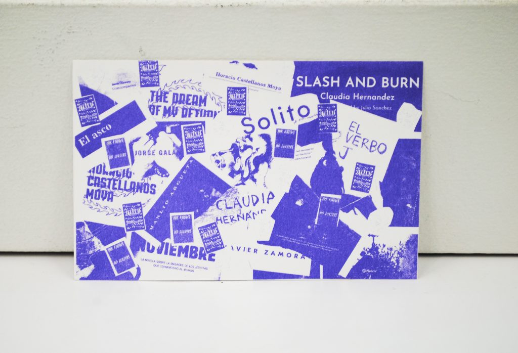
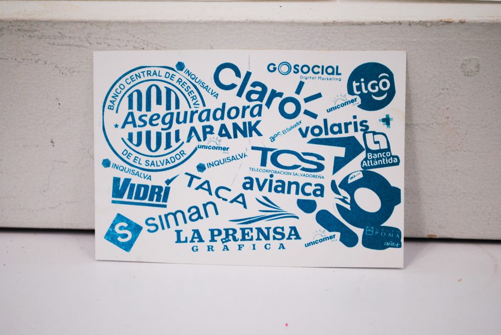
I also made some takeaway items. These mini posters have the same design as the background image in the spreads with the chapter titles. They were made with the riso machine with card stock paper. I used bright red, orange and sunflower for Chilean designs and teal, violet and aqua for the Salvadorean designs.
My Typefaces
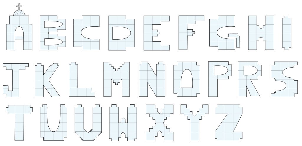
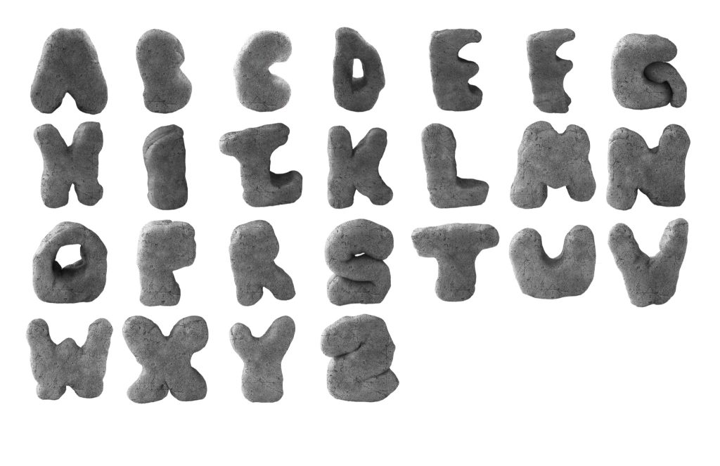
For this project, I also designed two typefaces, one for Chile and one for El Salvador. I used an important or iconic landscape or building as a node or homage to each country. For Chile, I based their typeface on the Moai stone statues on Easter Island and for El Salvador I based their typeface on the metropolitan cathedral in San Salvador. I picked the Moai since it is a very iconic landmark in Chile but I picked the metropolitan cathedral because a priest during the civil war died trying to negotiate peace between the gangs and the people, as a result, many families fled the country including my mom and her family.
Chilean typeface:
Salvadorean typeface:
