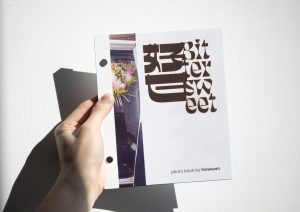
A quick approach to improve typographic equity (picked out from a complex design framework)
Liyang Zha
See it On Campus: Level 2
Visitor InfoExperience the environmental graphic installation section of this research, Thoughts On Design, in Michael O’Brian Exhibition Commons (MOEC), outside of Aboriginal Gathering Place (AGP).
Government postcards having 8 minority languages show the good intention of inclusivity but probably going to fail to persuade the audience because of some design choices made in typography. This may further cause isolationism and distrust in design. Oftentimes, these problems can be addressed by reducing the level of scriptural contrast. By examining the postcard from the city of Vancouver, we can point out the typographic flaws and what a better design may look like. (image 1).
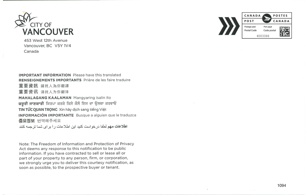

The city of Vancouver’s visual identity designated Gotham as the organizational typeface for the Roman script. There are traces in this particular design that the designer tried to unify the visual across different languages, which deserves recognition for the effort. Although the multilingual design in this postcard is far from horrible, several flaws can be better addressed (image 2).
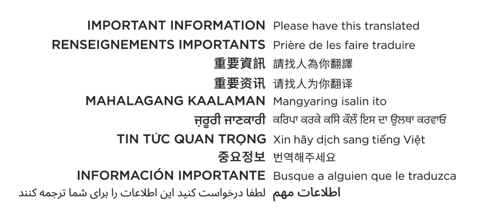
The visual equity in this existing design can be improved, and the most approachable improvement can be done by emphasizing transferable scriptural features and deemphasizing on visual shibboleth element, which can be archived by reducing the unnecessary spatial and typographical difference while keeping the legibility of each language. These differences can often be dealt with through universally recognized typeface features, like the style of the typeface (serif vs sans serif), breathing room between glyphs (leading and tracking), and more. Here (image 3) is a possible design approach to better address language equity.
An extremely important point for communication designers when working on a language they do not speak is that there should always be consultation involved with the community of the particular language. With adequate information from the consultation, and only then, designers can then start to work on the analysis and deemphasizing shibboleth elements.
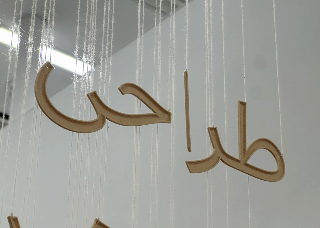
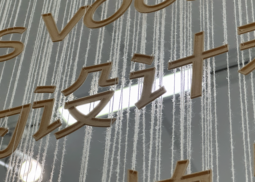
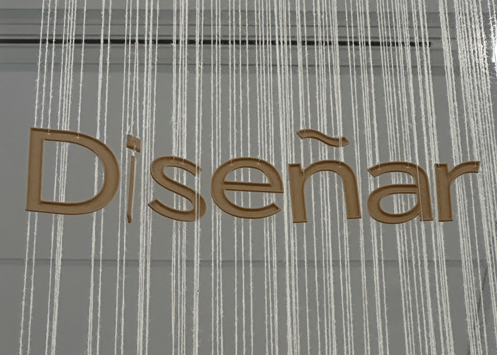
Additionally, when designers are working with a customized typeface, some typographic and scriptural characters are translatable and transferable to different scripts. For example, an environmental graphics project, Thought On Design(image 4), connects 5 drastically different languages across four scripts through the material, light & shade, and spatial composition.
This project is a reflection of contemporary multilingual and multiscriptural designs. By suspending each 3D-printed letter and character with fragile cotton threads, this project creates a delicate yet grand viewing experience.
The purposeful misspelling in English is a sarcastic take on multilingual and multiscriptural designs, which in the case of Canada, often contain suboptimal elements in languages other than English.