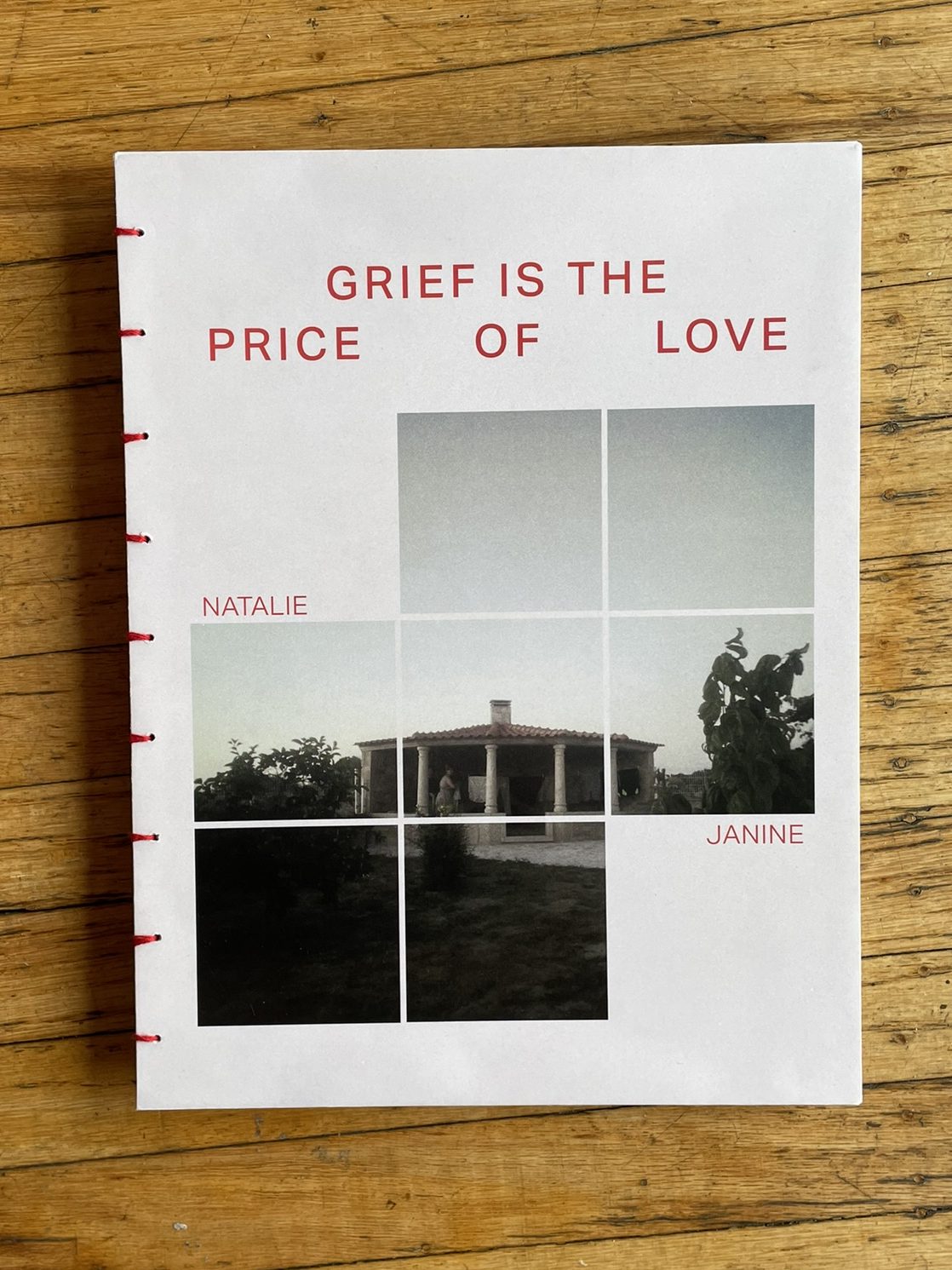
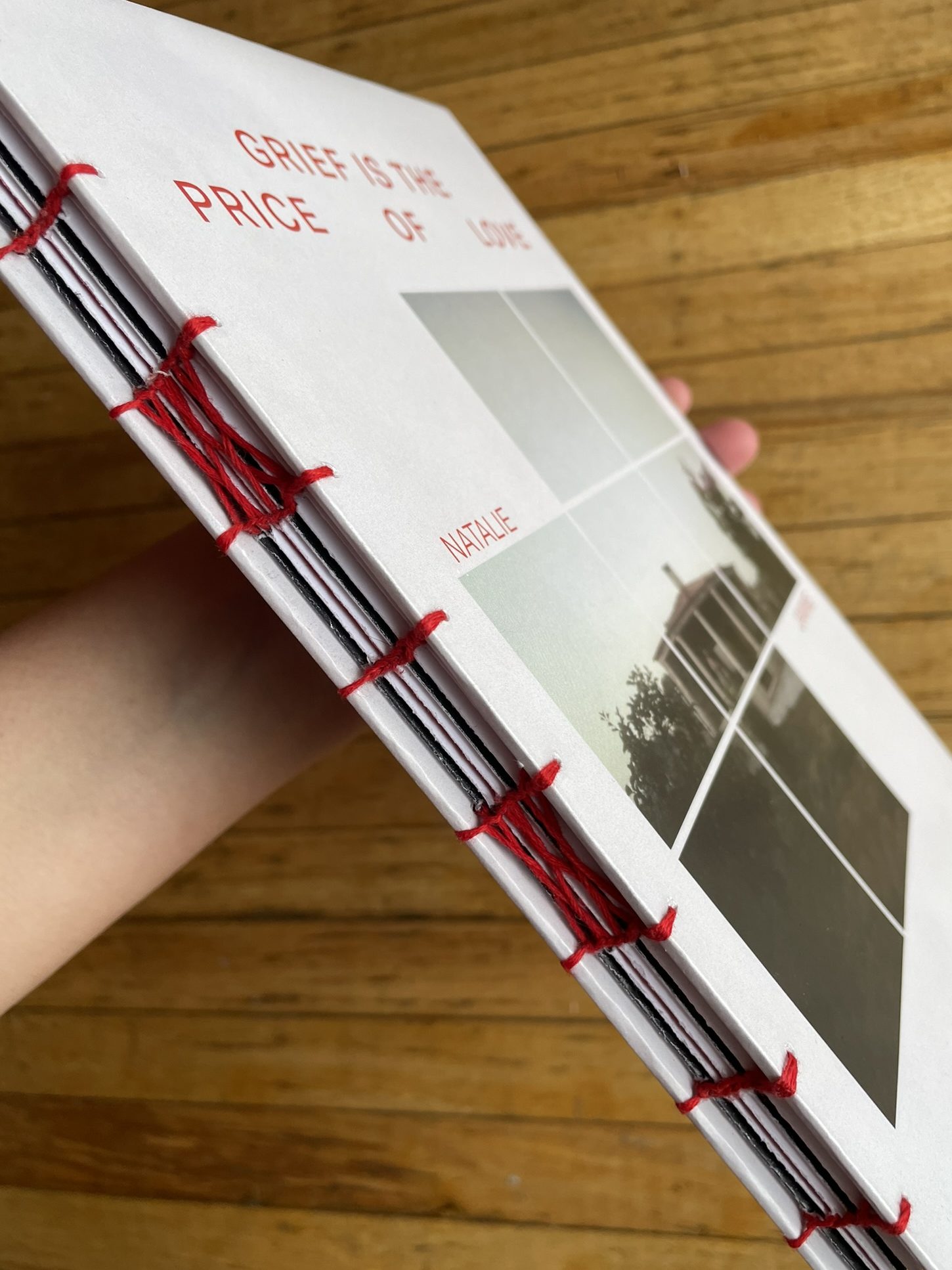
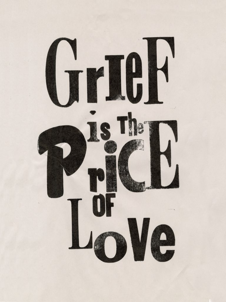
Grief is The Price of Love
Natalie Janine Gonçalves Farahani
See it On Campus: Level 2
Visitor Info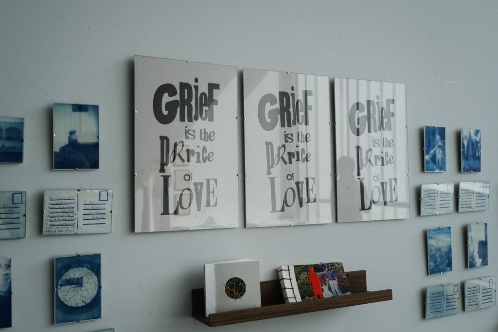
A tribute to the deep pain of losing a loved one, Grief is The Price of Love captures the reflective moments that arise in the aftermath of loss and the difficulty of grappling with it while the world around us continues to turn. Through a combination of traditional art and design practices and alternative visual storytelling, this book covers the journey of reconciling with death and confronting the loss of a loved one head-on. With a stripped-back, intentional, making-based approach, every step of the journey towards acceptance is documented, as well as the equal parts sorrow and calmness that come with it. This work is a reminder of the price we pay for loving deeply and that, nevertheless, our grief, as well as our joy, should hold the same reverence as one another.
Combining photography, printmaking, cyanotype printing, and alternative visual storytelling, this project is an exploration of loss and memory through meditation and repetitive making processes, compiled in one final publication with explanations of each process in a prose reflective of the lengthy and arduous nature of the creation of each element, and written reflections on various texts and the process of healing from the loss of a loved one.
This publication was assembled by hand, bound in signatures using a classic kettle stitch and decorative French link binding, making it an involved and intentional process from generating the content, to the very last knot of thread on the spine of the book.
While I invite you to take a look at the full publication linked at the end of this page, see an overview of the project below.

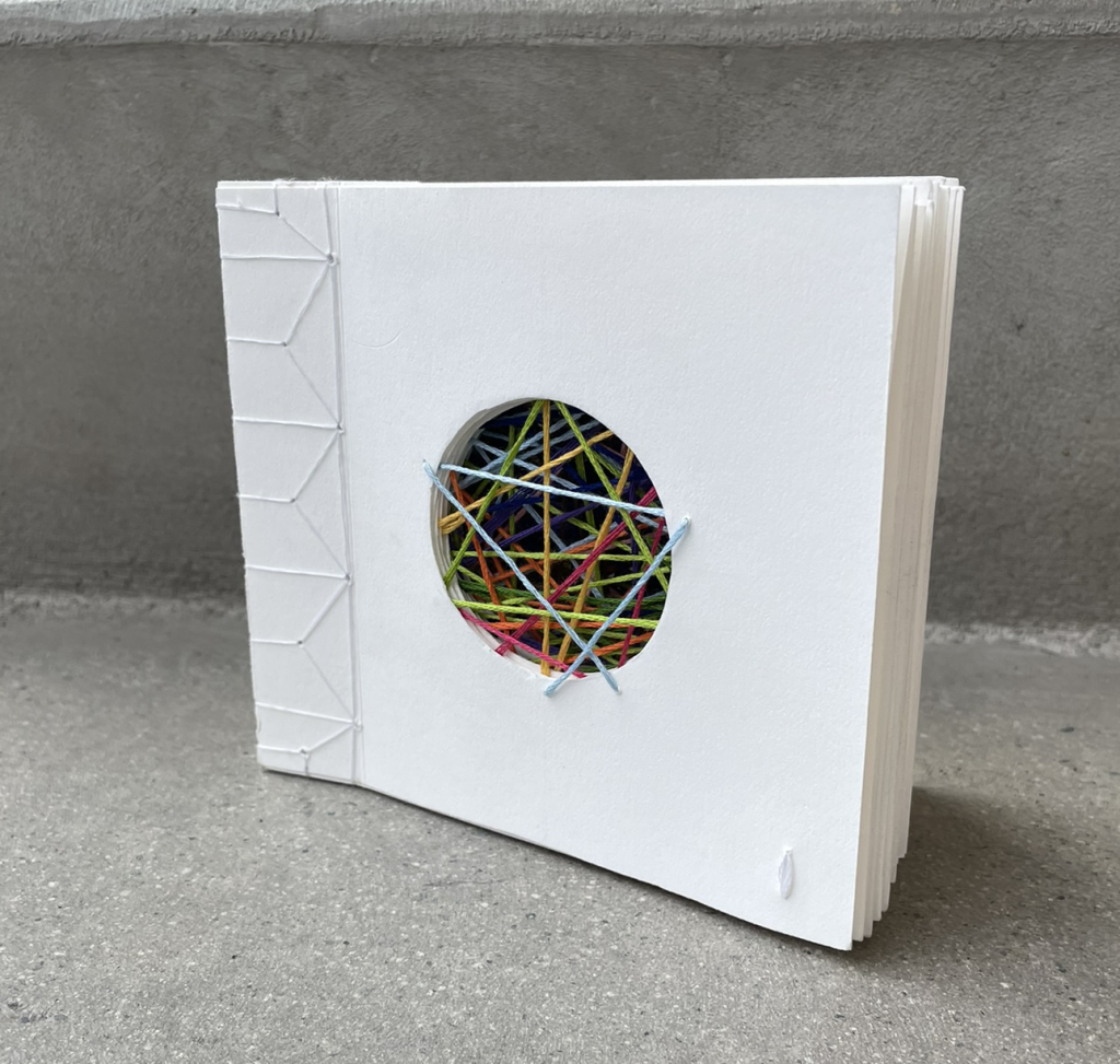
Reflections of Now
6-strand embroidery floss on Mohawk Via Vellum paper, Japanese 4-hole stab binding.
The first endeavour of this project and the last one to be completed, I forced myself to confront images that I had chosen to avoid since the loss of my grandmother by spending a lengthy amount of time with them. Embroidering them to remove her completely from the photos and mending the fragile paper as it deteriorated, Reflections of Now is a visual representation of losing someone. Depicting literal missing piece in the lives of more than just the lives of family and friends, but in memories and life experiences as well.
Past and Future
6-strand embroidery floss on Stonehenge paper, hemp leaf patterned Japanese stab-binding.
A page for each year of my life leading up to the loss of my grandmother, Past and Future explores how inklings of our futures can be seen in our pasts, how our pasts are ever-present in our futures, and how this book might be different for each of us. Where I am still adding pages, the books of others might already be complete.
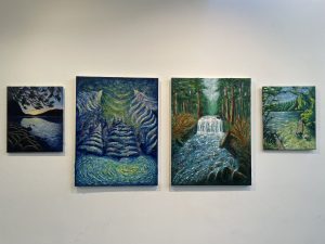
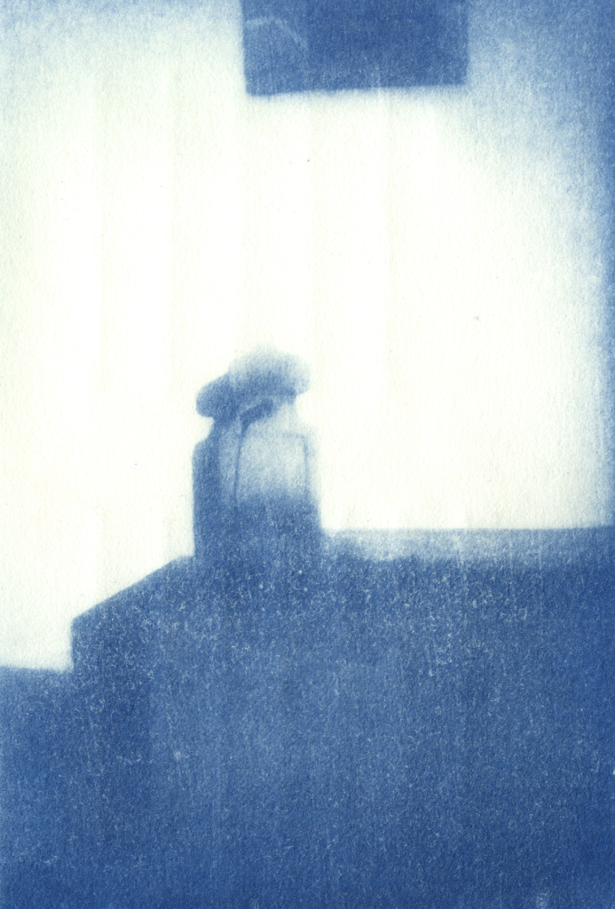
The Persistence of Memory
After experiencing a lot of brain fog regarding the time immediately after losing my grandmother, I took on an exploration of memories. By recreating them through age-old printmaking practices, experiences were taken from photos and pulled through a lengthy process of recreation to their final prints, to see how memories change over time, and as we try to recall them.
Each requiring several steps to move from their original photos to final prints, each piece ended up with 4-6 versions during the process of recreation, each print surrounding different elements of my experience navigating my day-to-day while mourning.
People in Moving Place
Woodcut relief print on Stonehenge paper
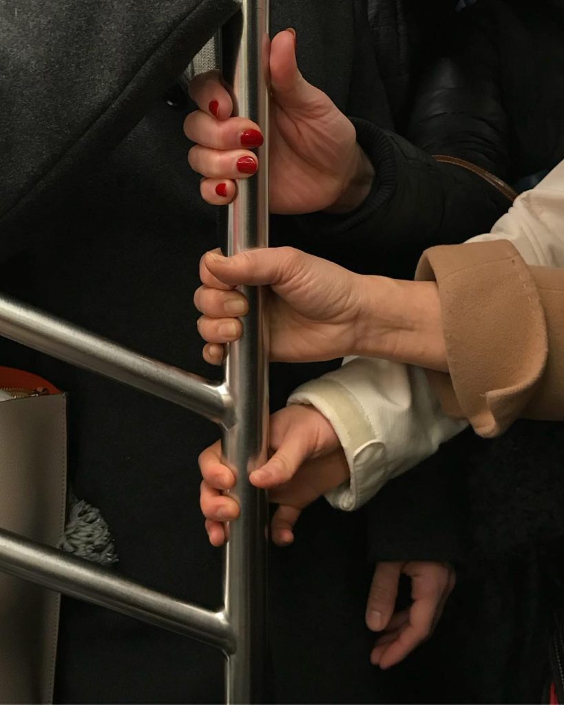
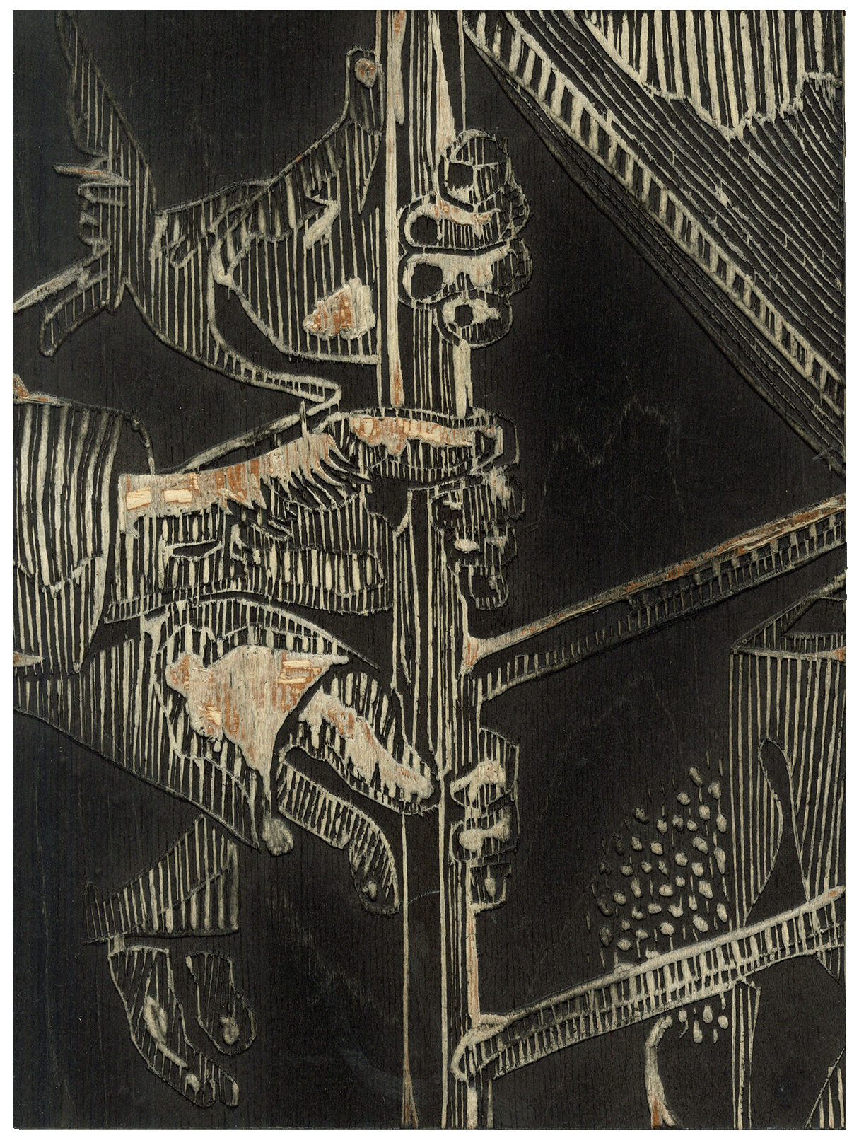
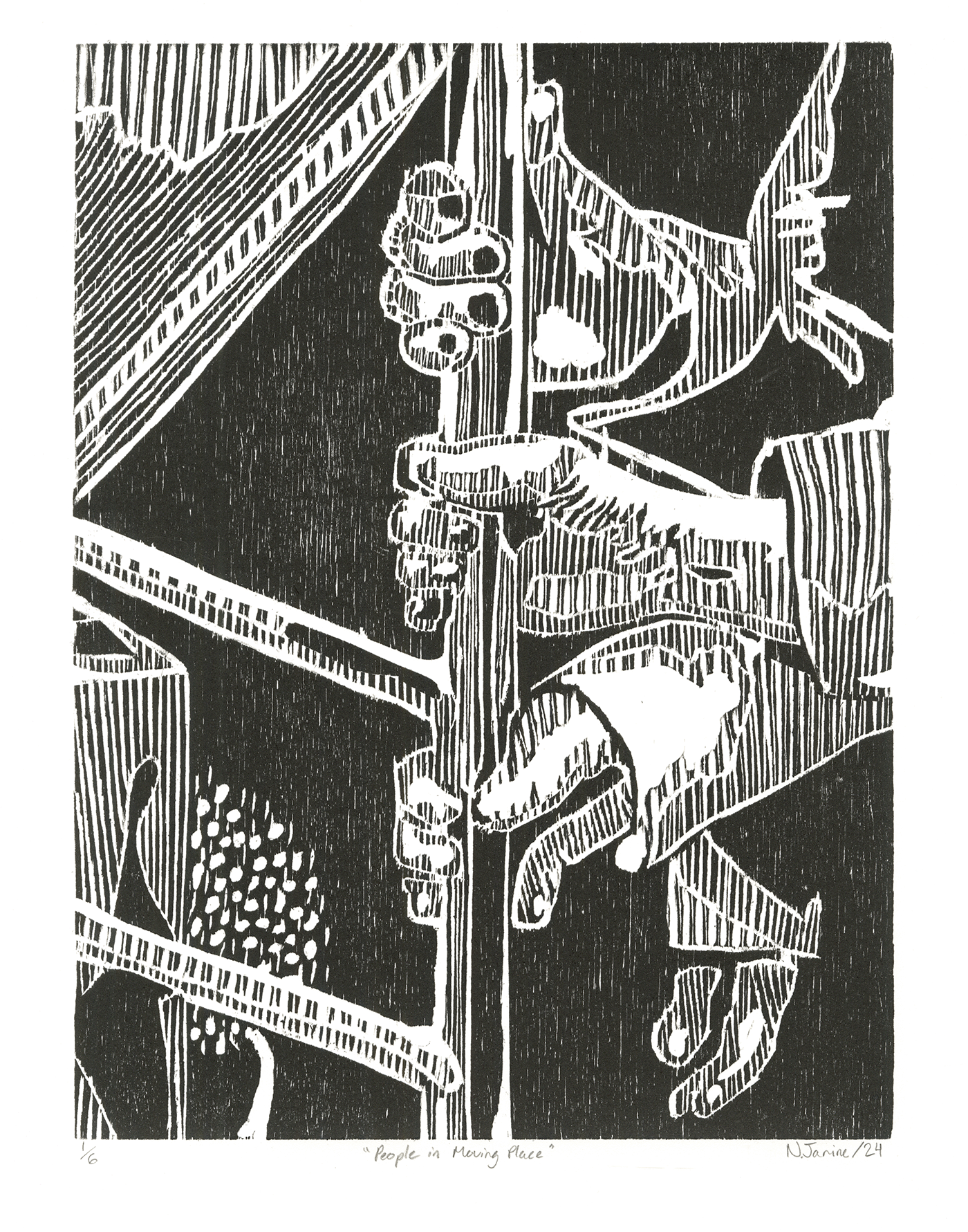
After my already deep fascination with the individual lives of strangers grew even stronger upon returning to Canada, I focused my first endeavour on the mundane moments we share as strangers.
Unable to get a photo I deemed useable from my own commute, I decided to begin with a photo by Hannah La Follette Ryan. The various tones were created with a variety of line frequencies and widths, recreating the image with ambiguity reflective of the same ambiguity present in these shared moments with total strangers.
Edition of 6, woodcut, 2024
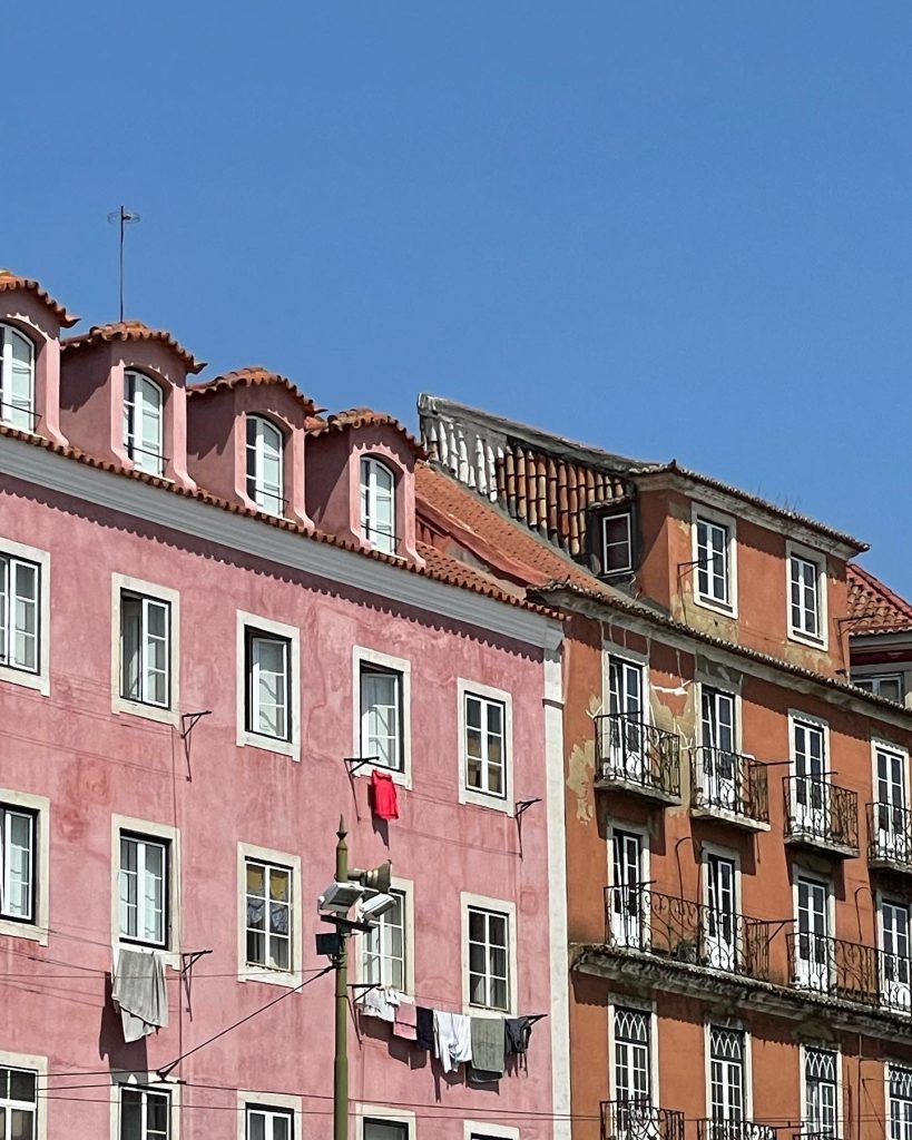
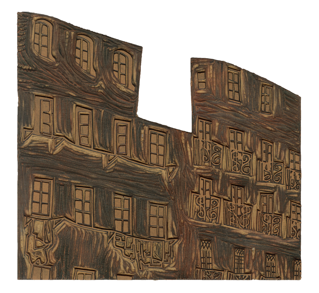
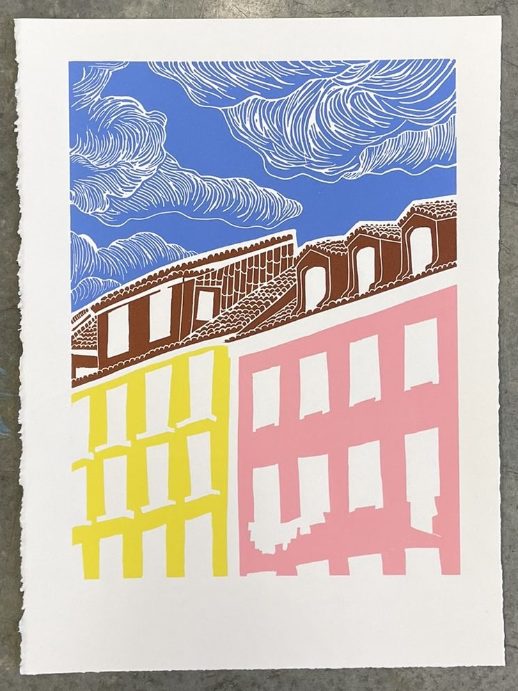
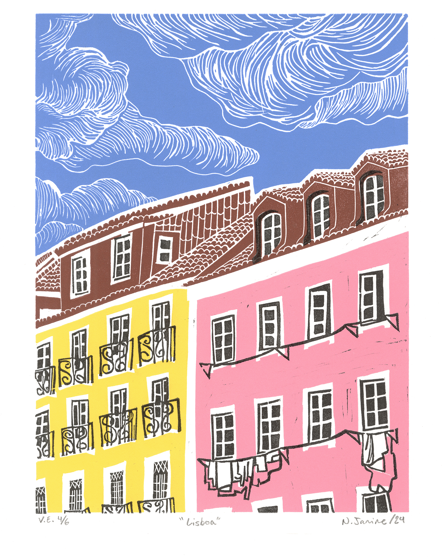
Lisboa
Linocut relief print on Stonehenge paper.
Looking back on the funeral service hosted in my grandmother’s village, immediately following it I got on a bus to Lisbon, about five hours away. Not ideal timing by any means, but with no way to change the bookings planned a year prior, and no other dates to hold the service, it was all that was in the cards.
With Lisbon known to be filled with beautiful, colourful buildings, I dug through photos I took of said buildings, which, at the time were not so beautiful or notable to me, and used them as a starting point for my next print.
A lengthy process, this print was made with two carved blocks, one for solid colours, and one for added details. Blocks were carved and then cut apart in order to be inked in different colours, the mixing of which took several rounds of adjustments and tests, cleaning all the tools in between each adjustment, before beginning to print the edition. This was also printed in two rounds over the course of three days.
Varied Edition of 6, jigsaw linocut, 2024

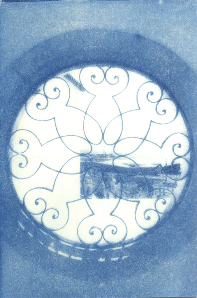
Vila Boa
Copper etching on BFK Rives paper.
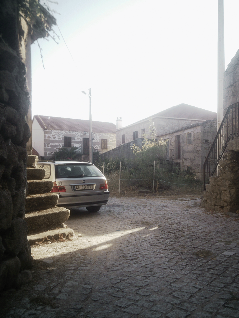
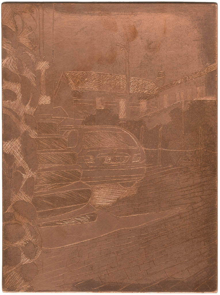
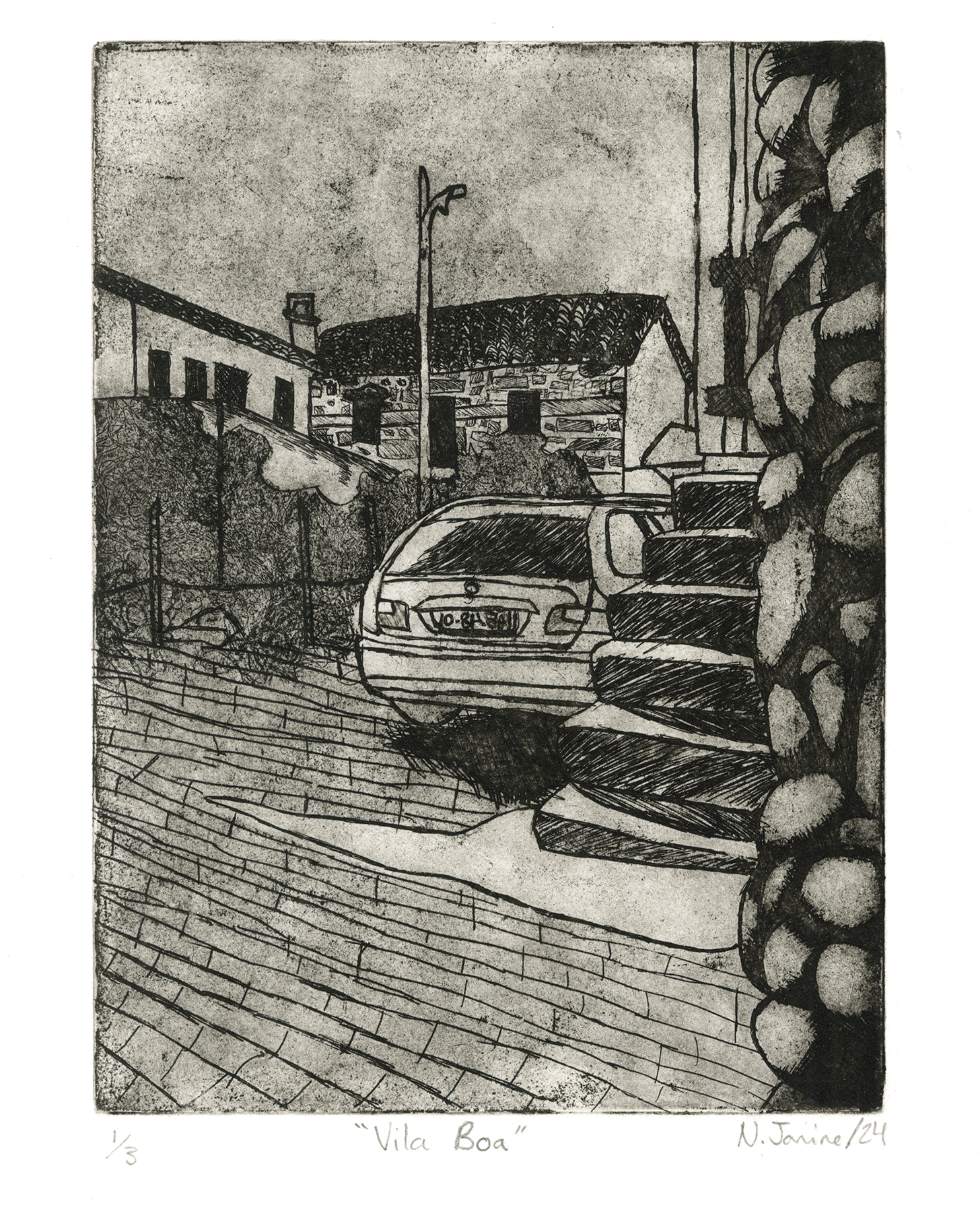
Once upon a time my grandmother’s village was bustling with people living their peaceful little lives, and tourists from across Europe every summer, nowadays, not so much. I walked through barren streets every night, except for one afternoon where I found one car, a newer one, parked amidst buildings that are hundreds of years old in this little village.
Using copper etching for my final print, I began a process that took several weeks.
Two full days to prepare the copper for mark-making, and a few rounds of sketching onto it and etching in a ferric acid bath, state prints taken after each round.
Once the etching process was completed, each print took approximately 45 minutes to ink, wipe with both tarlatan and phonebook pages, and pull. for a total process of about a week for the final edition.
Edition of 3, etching, 2024
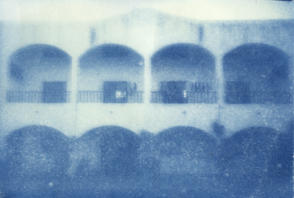
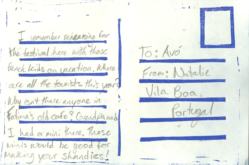
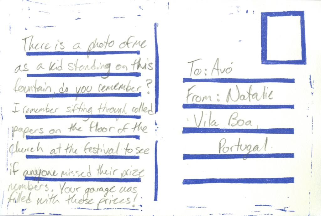
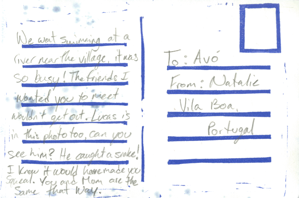
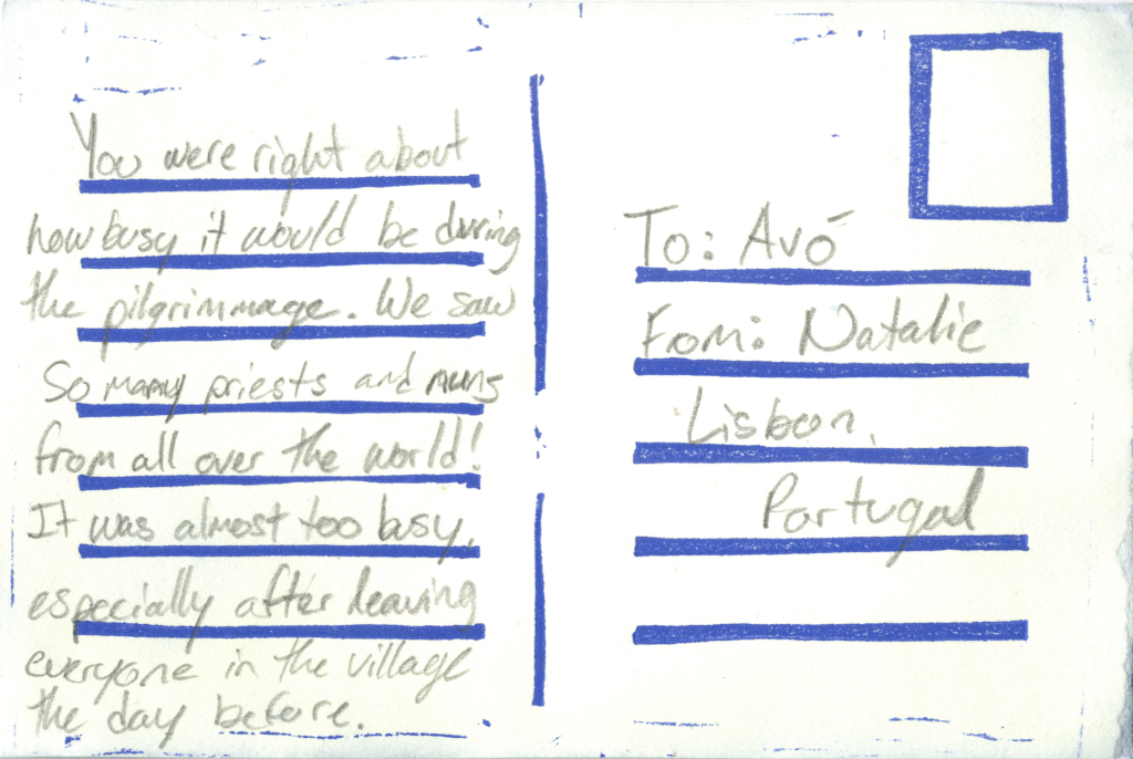
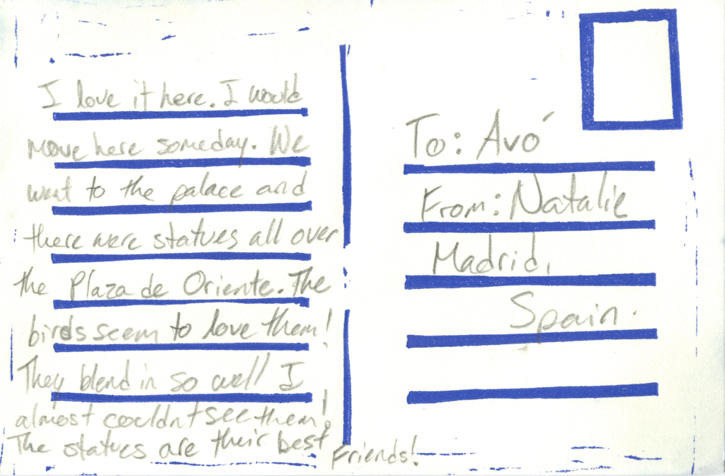
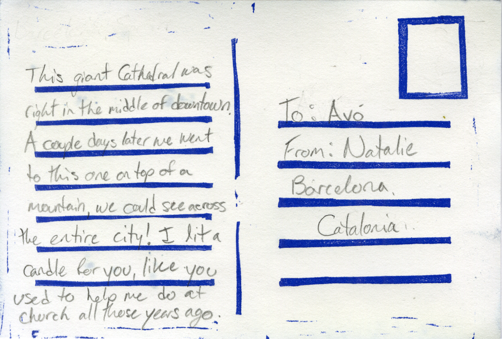
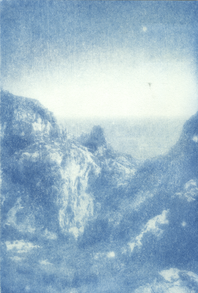
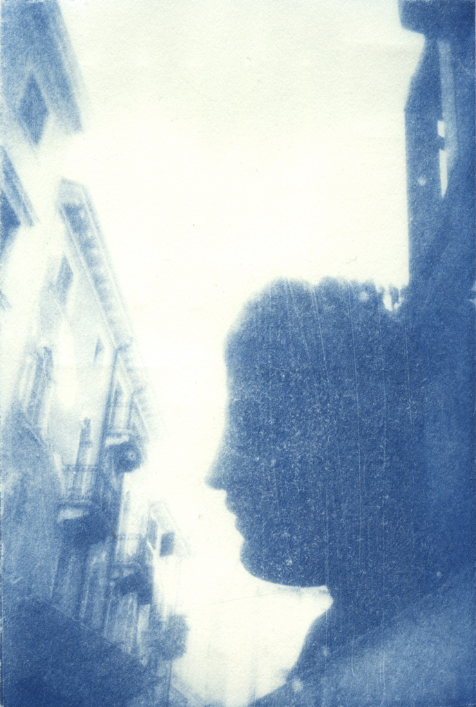
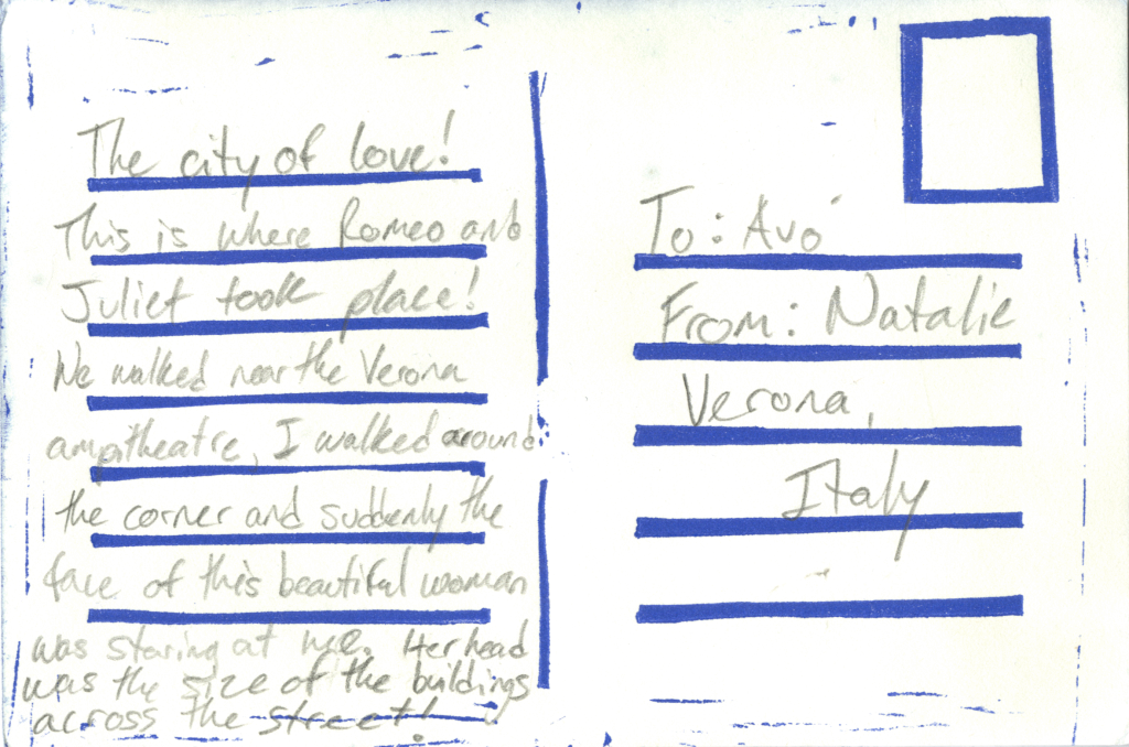
Postcards to Nowhere
Cyanotype photography and linocut on Stonehenge paper.
After my grandfather encouraged me to go through with my trip that had been planned for the better part of a year, I realized that I wouldn’t be able to share the experience with my grandmother upon my return. Postcards to Nowhere is a series of postcards from a handful of places I visited, allowing me to get out some of the stories I would have loved to share with her. The letters being shared, and read by everyone except the intended recipient became another sobering point in the process of this work.
A method used to print the first photography book in history, photos taken throughout my travels were cyanotype printed. First converted to negatives, transparent prints of the images were laid over papers soaked in cyanotype sensitizing solution and set in the sun to print. These photos were then rinsed, toned, and linoleum relief printed to resemble postcards on the opposite side, and the letters were written.
Risograph Zines
After completing all of the writing for the publication, I was left with a few notes that didn’t quite fit in anywhere on their own.
These were compiled into two single sheet, double-sided risograph-printed zines, exploring notes and advice to those experiencing grief, and the exploration of a phrase straight from my grandmother in the time leading up to her passing.
These zines are available for free at The Show on campus from May 10th-23rd 2024.
Please select “two-page view” from the bottom right of each window for accurate viewing.
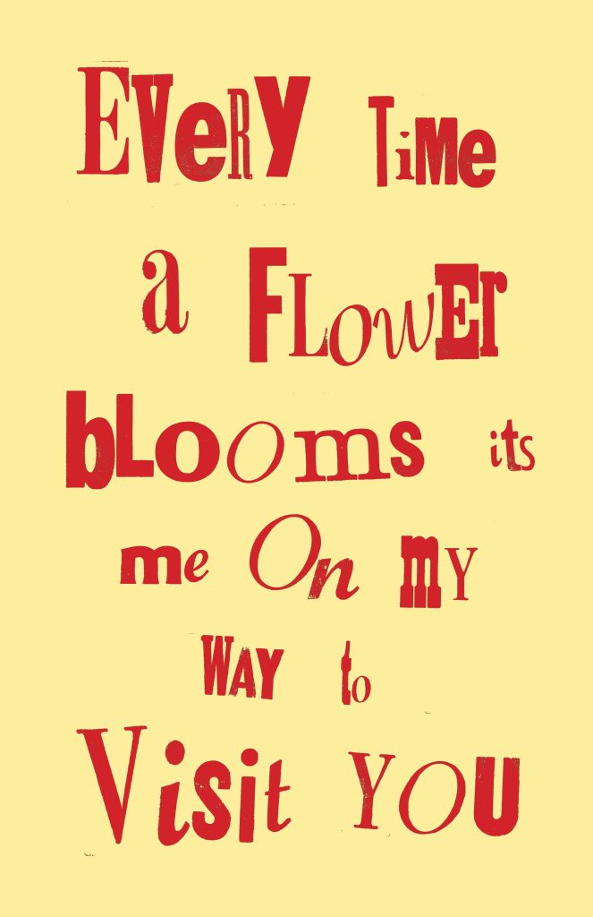

Type Explorations
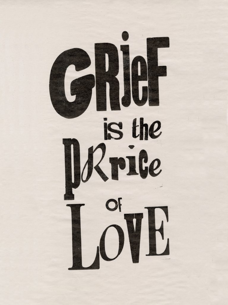
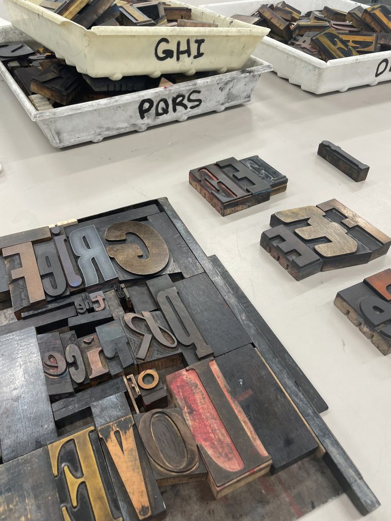
Keeping in line with repetitive age-old printing practices, I took a few hours just to dig through, choose, and arrange the mismatched woodblock letters, exploring the main and most poignant phrase that came up during my work (that would eventually become the title.) And this has been the takeaway from it all.
Grief and sorrow are honoured guests. They deserve a place at the proverbial dinner table, alongside joy and love.
Who stays for dessert is up to us.
Read about the full process in the main publication here.
The Internet Archive often does not prioritize visual quality of uploaded texts, in the event of this being an issue, an E-Publication or PDF version can be accessed through the archive for highest quality viewing.
A special thank you to my teachers Charlotte Falk and Robin Mitchell Cranfield for their encouragement and guidance, my friends and colleagues for their input, assistance, and support, and my grandmother, for passing down to me her boundless compassion and endless sense of style.